Rebuilding Trust and Evolving SkinnyFit.com for Its Next Phase of Growth
My Role Creative Direction • UX/UI Design • eCommerce Strategy
Project Breakdown:
Overview
Revisiting a Platform I Helped Build Nearly Six Years Earlier
BRAND TRUST
PLATFORM EVOLUTION
RAPID REDESIGN
In 2025, I returned to SkinnyFit.com nearly six years after helping lead the original redesign. Since then, the brand had evolved through new product launches, reformulations, expanded marketing efforts, and changing business priorities.
What started as a scalable foundation had grown into a much larger ecosystem. The experience needed to evolve alongside the brand and better reflect where SkinnyFit was headed next.
In many ways, the platform had simply outgrown the systems and structure it was originally designed around.
With only a three-week timeline, I led a rapid redesign focused on modernizing the experience, improving cohesion across the platform, and creating a more credible, lifestyle-driven digital presence for the brand’s next phase of growth.
The Challenge
Over time, SkinnyFit.com had become increasingly fragmented as different teams, quick fixes, and evolving priorities shaped the platform over several years. Navigation patterns drifted, visual consistency weakened, and parts of the experience no longer reflected the maturity of the brand or the quality of the products behind it.
Nobody intentionally set out to create that fragmentation. It was the natural result of a fast-moving company evolving over time.
At the same time, SkinnyFit was facing growing public criticism around its subscription model, which began impacting customer trust and overall brand perception. Rebuilding credibility became a major priority across the business, especially as the company pursued more partnerships and collaborations alongside a more lifestyle-focused direction for the brand.
The challenge wasn’t simply refreshing the visuals. The website needed to feel more trustworthy, cohesive, and elevated while still supporting the performance-driven foundation the business relied on, all within an aggressive three-week timeline.
The Approach
Designing Under Pressure Without Losing the Bigger Picture
Unlike the original SkinnyFit.com redesign years earlier, this project moved incredibly fast. There was no extended discovery phase or detailed wireframing process. The business needed visible progress quickly, so I moved directly into design exploration and focused on the areas that would have the biggest impact within the limited timeline.
This was less about reinventing the website and more about rebuilding trust through the moments customers interacted with most.


With only a three-week timeline, the process became highly iterative and execution-focused, balancing speed, consistency, and strategic prioritization across a rapidly evolving eCommerce ecosystem.
Rebuilding Trust Through the Digital Experience
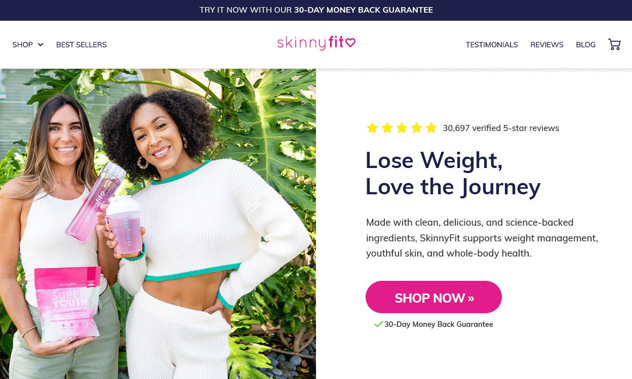
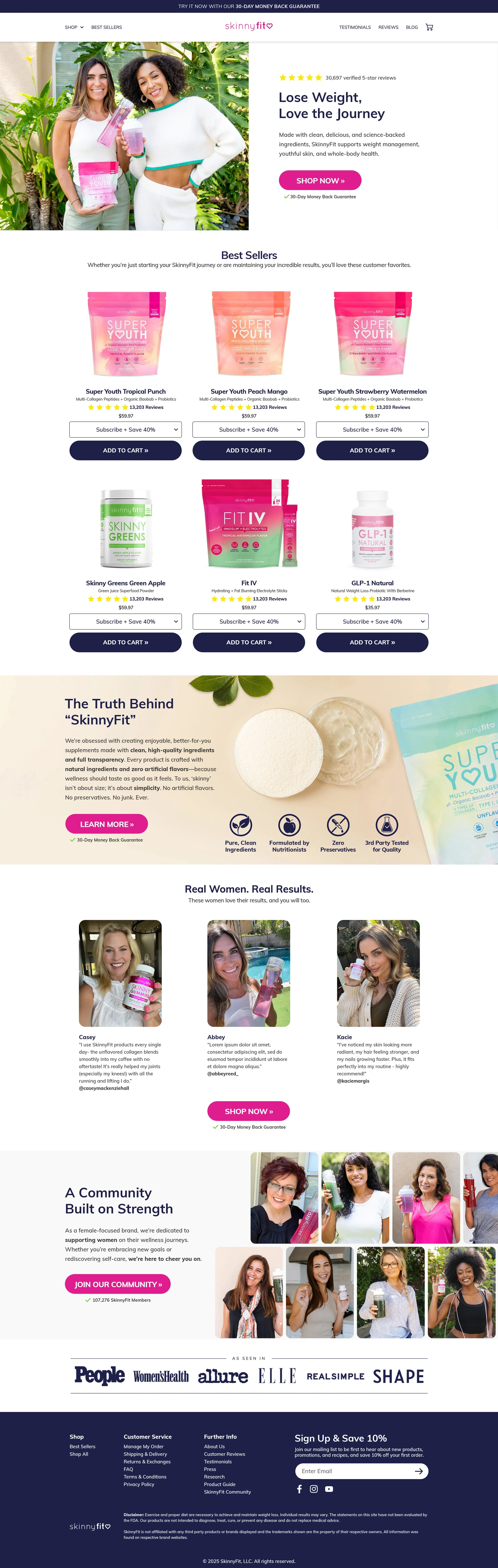
Homepage
The homepage became the foundation for introducing a more modern, trustworthy, and lifestyle-driven version of SkinnyFit. Over time, the previous experience had become increasingly crowded and inconsistent, so a major focus of the redesign was bringing clarity and cohesion back to the brand without losing the performance-driven foundation the business relied on.
I wanted the experience to feel lighter. More intentional. More reflective of where SkinnyFit was headed next.
The redesign focused heavily on cleaner hierarchy and stronger lifestyle storytelling. I wanted the experience to feel more elevated and aligned with the maturity of the evolving brand.
By the end of the three-week sprint, the homepage had quietly become the introduction to what internally became known as “SkinnyFit.com 3.0”
There was definitely pressure behind that. The homepage was ultimately setting the tone for the broader brand evolution, and eventually the entire company would see the direction during the final presentation.
Product Detail Pages
The product detail pages became some of the most important parts of the redesign because they were where customers ultimately decided whether SkinnyFit felt trustworthy or not.
Over time, many of the pages had become visually crowded and overly promotional. I wanted the experience to feel clearer, calmer, and easier to understand without losing the performance-focused foundation the business relied on.
The redesign focused heavily on simplifying the experience, creating stronger visual hierarchy, and making the products feel more approachable, credible, and aligned with the maturity of the evolving brand.
There was a lot riding on these pages. The PDPs were the core conversion engine of the business, so every decision needed to balance trust, storytelling, and performance without making the experience feel overwhelming.

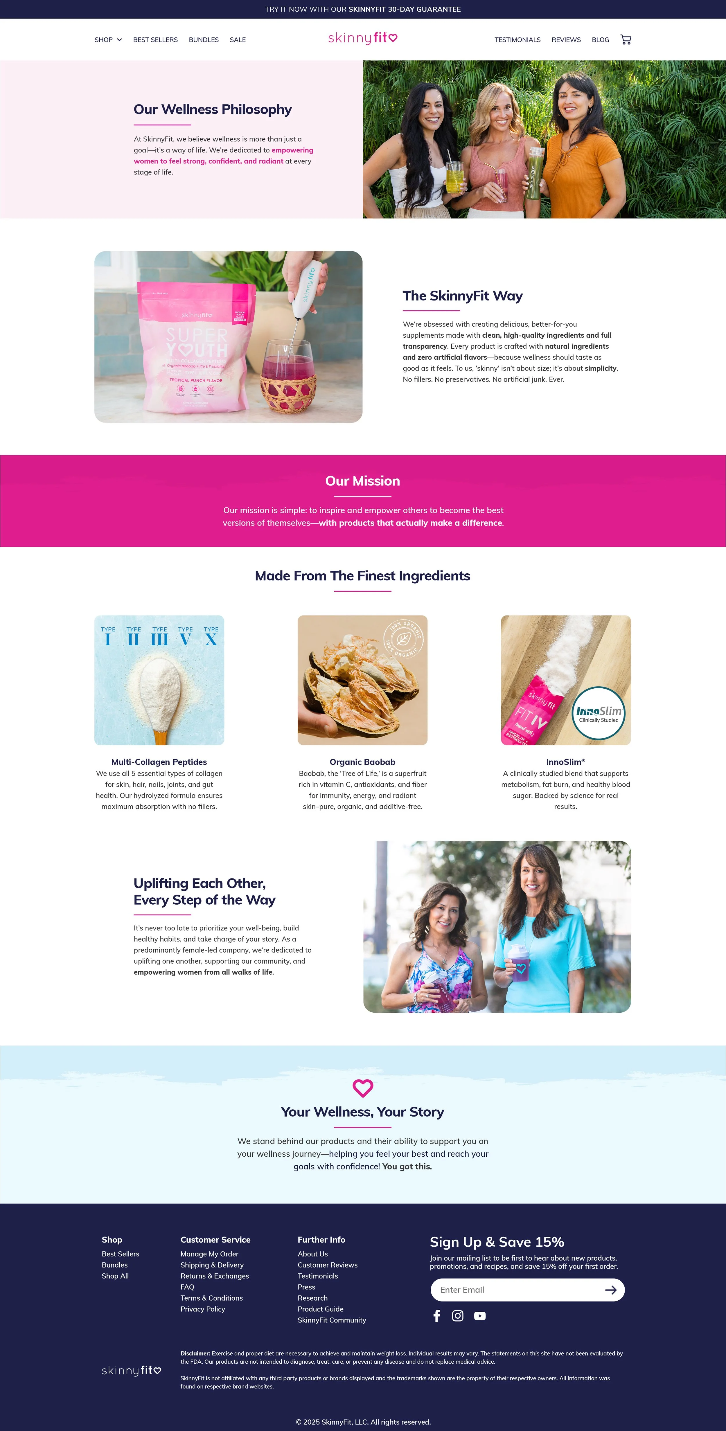
About Us
Surprisingly, SkinnyFit had gone nearly six years without a true About Us page after the original SkinnyFit.com redesign. As the brand continued to grow, it became increasingly clear that the company needed a dedicated space to communicate who it was beyond the products themselves.
The page became an opportunity to bring more heart, personality, and transparency into the experience. I wanted it to feel warm. Approachable. Supportive. Like a brand people could genuinely connect with and trust.
In many ways, this page felt long overdue. It had quietly lived in the back of my mind for years, so finally seeing it come to life during the SkinnyFit.com 3.0 refresh felt incredibly meaningful.
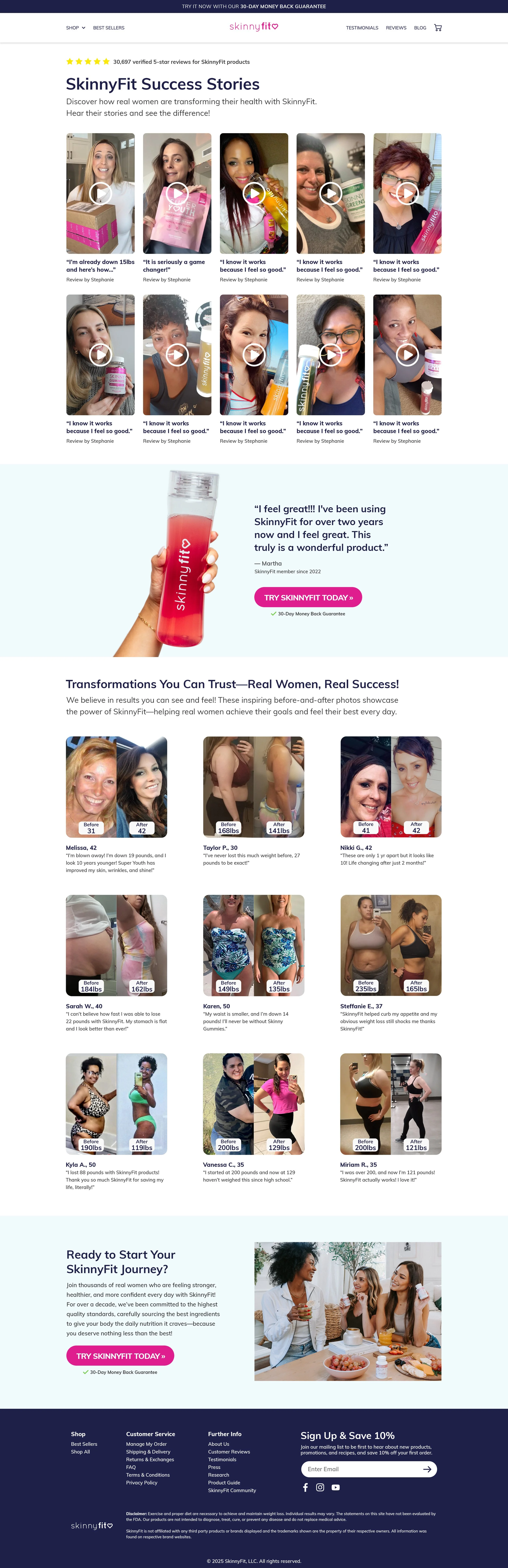
Testimonials
Trust and credibility became major priorities throughout the SkinnyFit.com 3.0 refresh, and the Testimonials page played an important role in helping make the brand feel more human, transparent, and relatable.
Rather than presenting social proof as an overwhelming wall of transformations, the experience was designed to feel more approachable and emotionally connected. Different formats of storytelling naturally lived alongside each other, allowing customers to engage with real experiences in the way that felt most meaningful to them.
At its core, the page was less about showcasing perfect results and more about creating a stronger sense of trust through real people, real stories, and real wellness journeys.
Contact Us
As SkinnyFit continued to grow, customer support volume grew with it. Teams became leaner. Questions became more frequent. Customers needed faster and easier ways to find help without always having to reach out directly.
The Contact Us page became less about submitting a support ticket and more about creating a clearer, more approachable support experience. I wanted customers to feel like answers were easier to find, easier to navigate, and less frustrating during moments when they needed help.
At its core, the page was really about accessibility. Making support feel simpler. More supportive. More human.

Rebuilding Confidence in the Brand Experience
One of the biggest outcomes of the SkinnyFit.com 3.0 refresh was creating a digital experience that finally felt more aligned with the maturity of the evolving brand. After years of rapid growth, product expansion, and shifting priorities, the redesign helped bring a stronger sense of cohesion, clarity, and credibility back to the customer journey.
More than anything, the project reinforced how important perception and trust are within eCommerce. Customers were no longer just evaluating products. They were evaluating the brand itself. The experience needed to feel modern, supportive, transparent, and intentional across every major touchpoint.
The redesign also created a stronger foundation for future storytelling, partnerships, and community-building opportunities. From the Homepage and PDPs to the new About Us and Testimonials experiences, the platform began feeling less transactional and more connected to the people and wellness journeys behind the brand.
Looking back, SkinnyFit.com 3.0 was less about reinventing the business and more about helping the digital experience finally catch up to how much the brand had evolved over the years.
Key Lesson Learned
When Experience Becomes Instinct
Revisiting SkinnyFit.com nearly six years later gave me a completely different perspective on the brand, the business, and the role digital experience plays in shaping customer trust.
By that point, I had lived through years of product launches, reformulations, creative testing, evolving customer behavior, and constant iteration across nearly every touchpoint of the brand.
What initially felt like an incredibly aggressive timeline slowly became something else entirely. Once I fully locked in, the years of context, brand familiarity, and hands-on experience started connecting naturally.
Decisions became clearer. Priorities became easier to identify.
The bigger picture was already living in my head because I had spent years helping shape it in real time.
The project reinforced that good design isn't always about endless time, extensive documentation, or perfect processes.
Sometimes it comes from deeply understanding the brand. Knowing what matters most. Having the confidence to execute quickly when the moment calls for it.
More than anything, the experience showed me that when I'm fully immersed in a brand and understand it from the inside out, I'm capable of moving incredibly fast without losing the bigger picture.