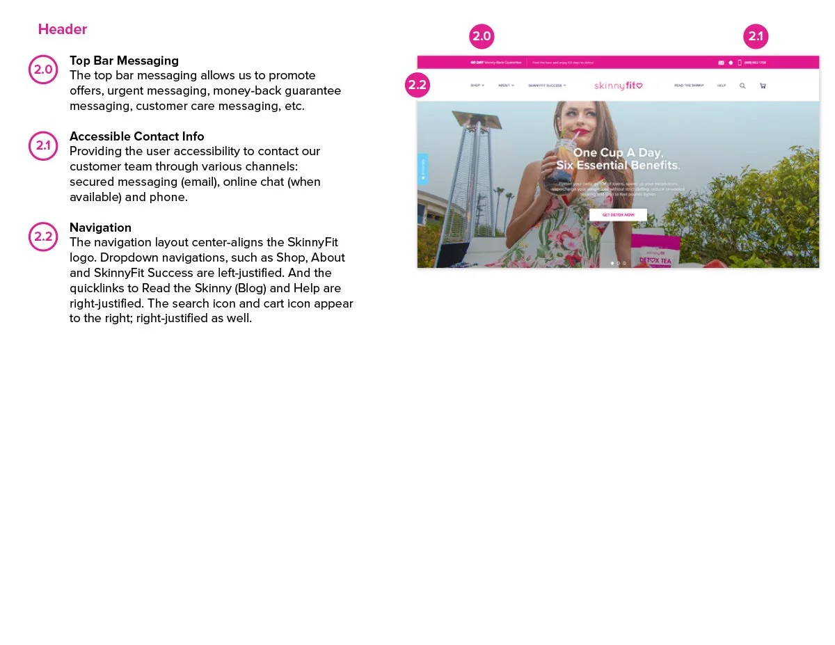
Turning a Stalled Redesign into a Revenue-Ready eCommerce Platform
My Role Lead Designer • eCommerce UX Strategy • Cross-Functional Creative Direction
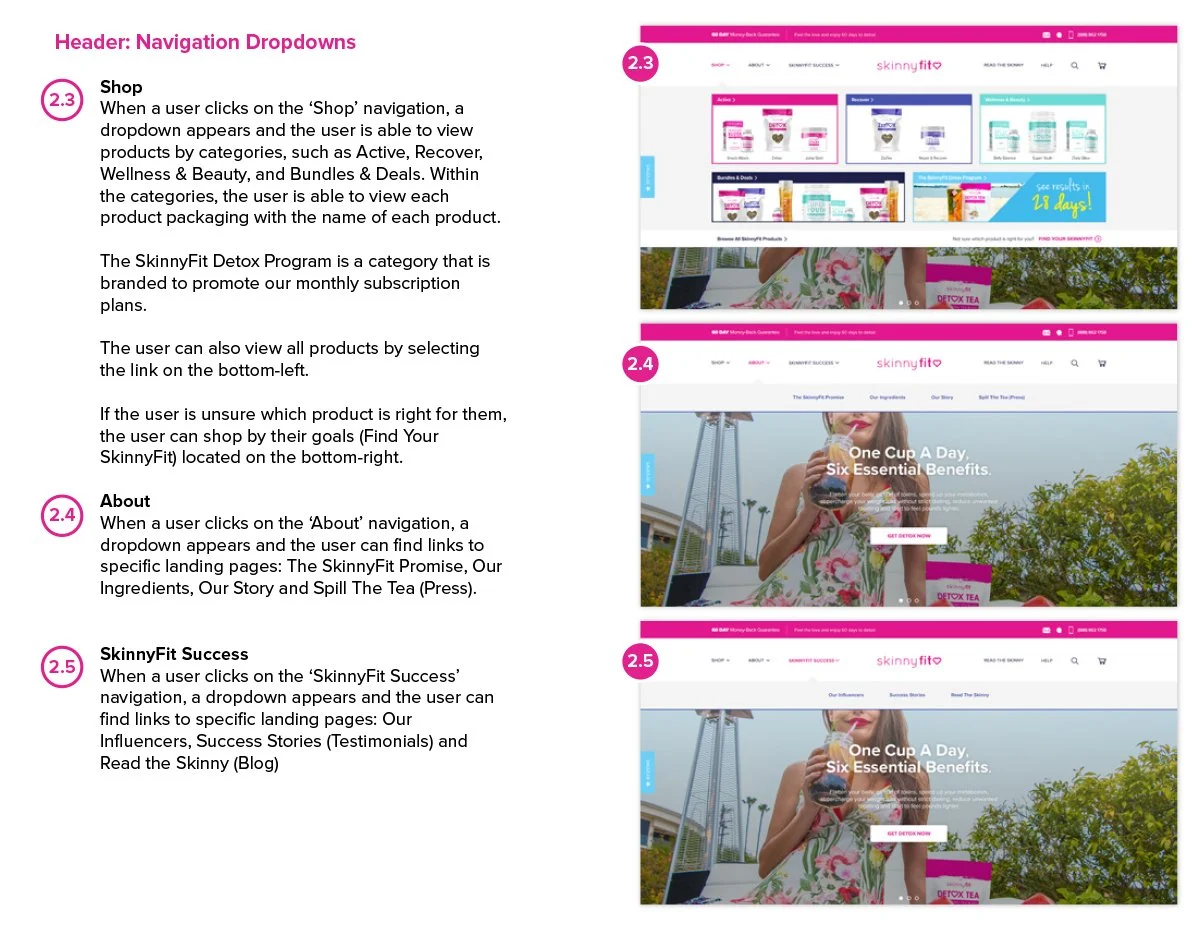
Project Breakdown:
Overview
Transforming SkinnyFit.com into a Scalable eCommerce Experience
ECOMMERCE UX STRATEGY
WEBSITE REDESIGN
CONVERSION OPTIMIZATION
PDP SYSTEMS
CROSS-FUNCTIONAL COLLABORATION
SkinnyFit is a wellness and beauty brand known for its weight loss and health products. When I joined Smashtech, SkinnyFit.com had been sitting in redesign limbo for quite some time and was missing many of the foundational eCommerce systems needed to support long-term growth.
What started as a stalled redesign gradually became something much bigger.
Over the course of the project, I led the UX strategy, wireframing, page architecture, visual design, and cross-functional collaboration needed to move the redesign forward. The work touched multiple teams, competing priorities, and plenty of shifting business needs along the way.
As acquisition, lifecycle, and content channels scaled, the limitations of the existing experience became harder to ignore. The business needed a stronger eCommerce foundation that could better support how customers discovered, learned about, and purchased products across channels.
The Challenge
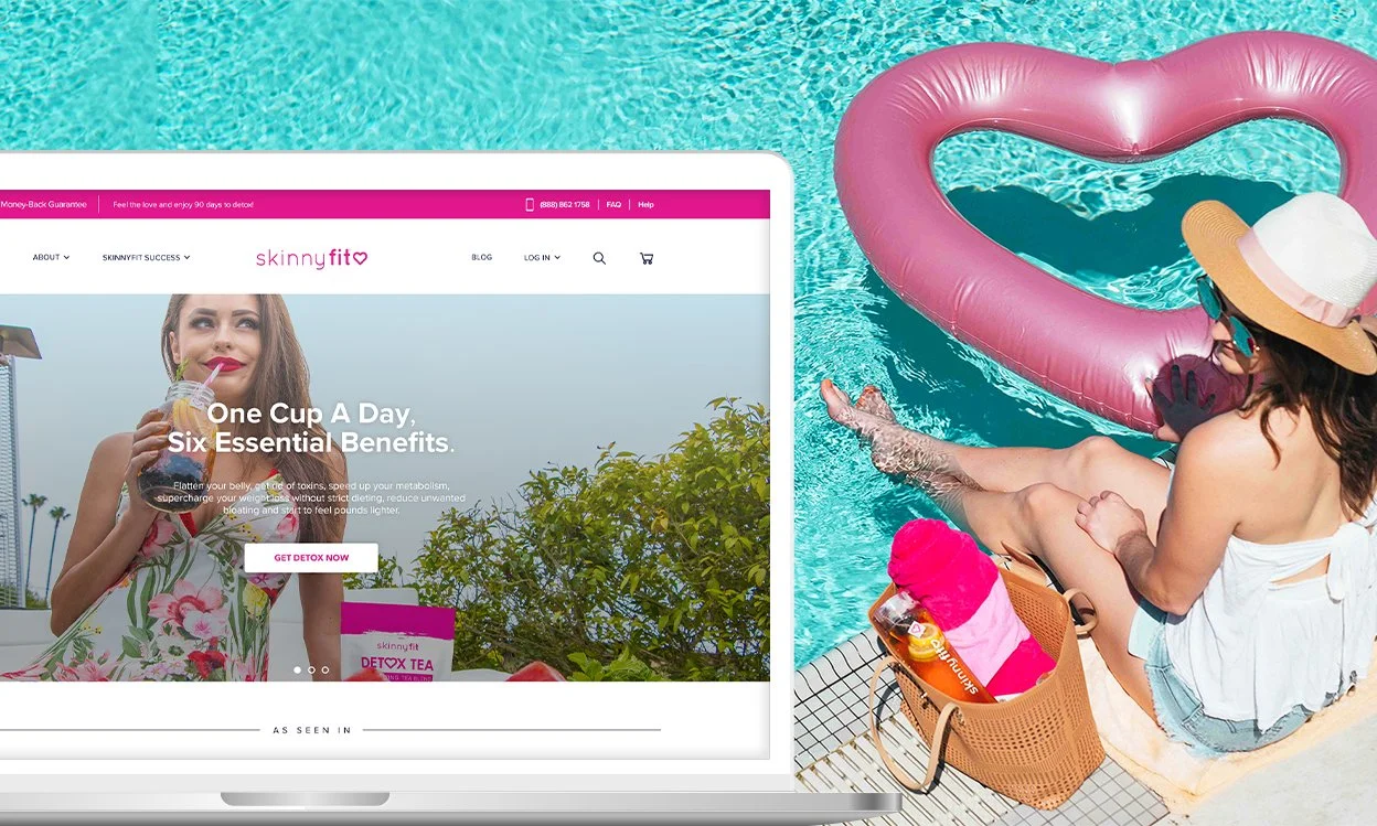
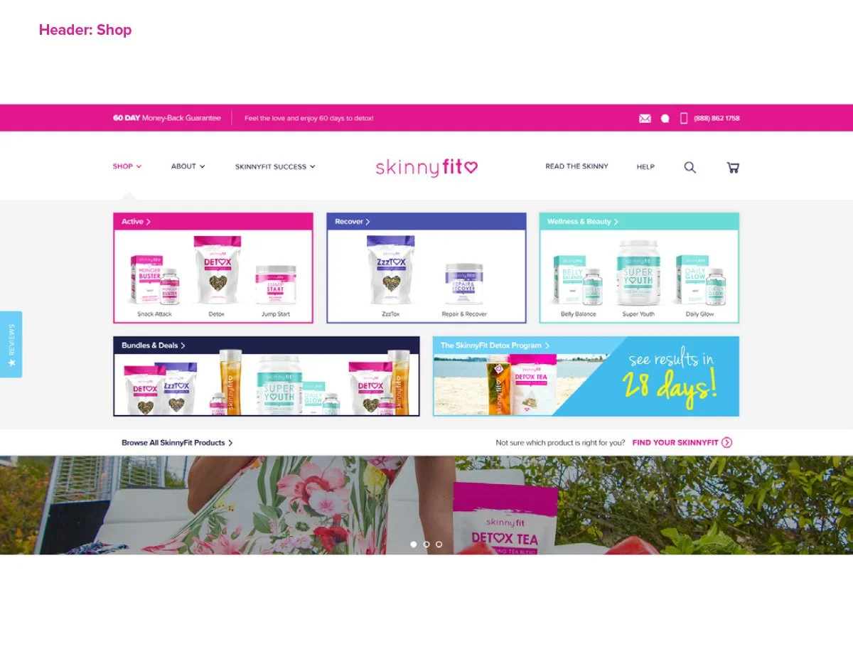
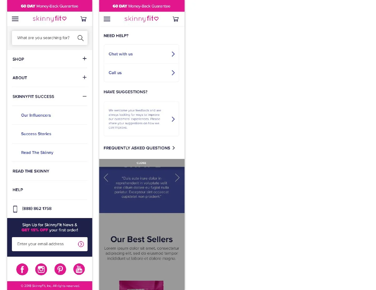
SkinnyFit.com was missing many of the foundational eCommerce systems needed to support a growing DTC brand. Customers were being directed to a single Shop All experience with limited category segmentation, minimal product education, and no dedicated product detail pages.
Previous redesign efforts had stalled. That created the challenge of not only modernizing the website, but also rebuilding confidence in the direction of the project internally.
At the same time, the redesign often competed against immediate business needs and shifting priorities. As a result, the project evolved gradually over time rather than through a single large rollout.
The challenge ultimately became balancing long-term eCommerce improvements with the day-to-day realities of a fast-moving DTC business.
Building Momentum
The Pitch That Helped Move the Redesign Forward
When I joined the project, the redesign had already lost momentum internally. To help get everyone aligned again, I put together a pitch deck that reframed the opportunity around scalability, user experience, and long-term business growth.
Mind you, I had only been at Smashtech for about three weeks at the time and was preparing to give my very first pitch to the founders of the company. I was definitely nervous.
Thankfully, I wasn’t doing it alone. I had the support of my boss, the Director of Marketing, along with the rest of the Marketing team. That support gave me the confidence to keep pushing the vision forward.
I wasn’t interested in presenting a few isolated page designs. I wanted to show how the entire shopping experience could evolve over time and where the brand could eventually grow into. The deck helped shift the conversation from surface-level updates to a more intentional eCommerce strategy and ultimately became the catalyst that moved the redesign forward.


Phased Rollout Strategy
Building the Foundation First
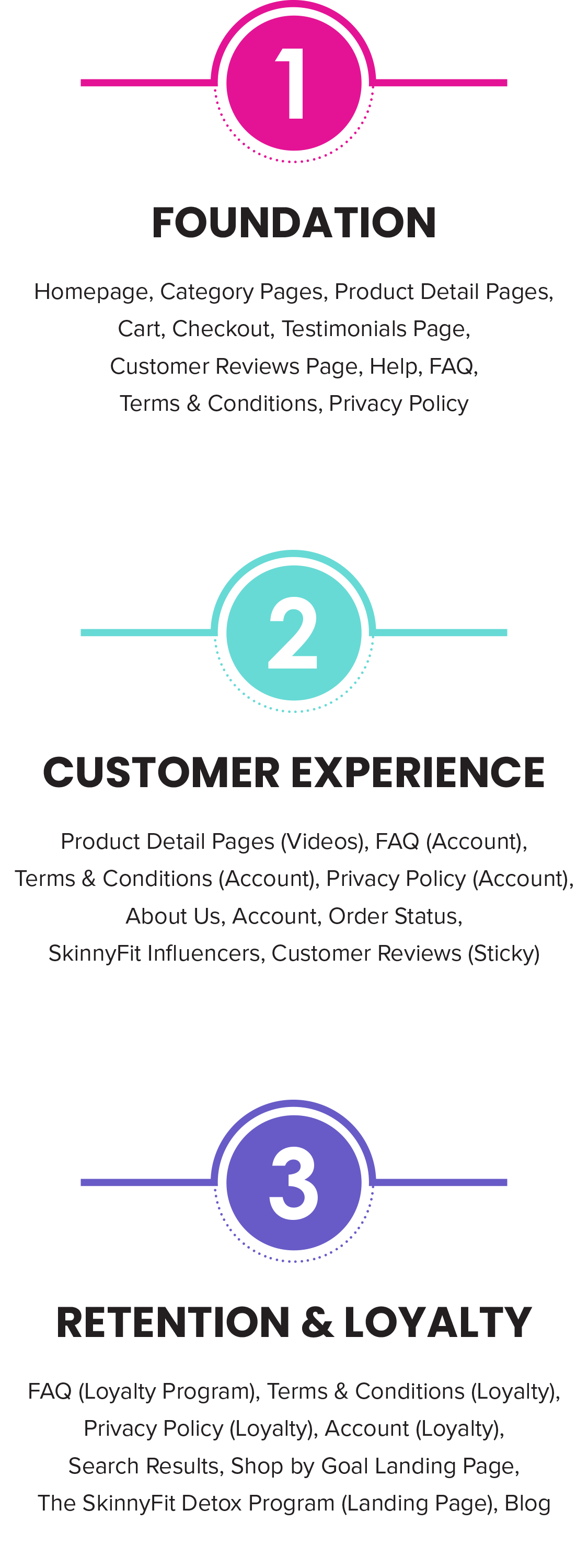
I knew trying to rebuild everything at once wasn’t realistic. The business was moving fast, priorities were constantly shifting, and there was no guarantee we’d always have dedicated time to focus on the redesign. Breaking the project into phases gave us a practical way to keep making progress while still supporting the needs of the business.
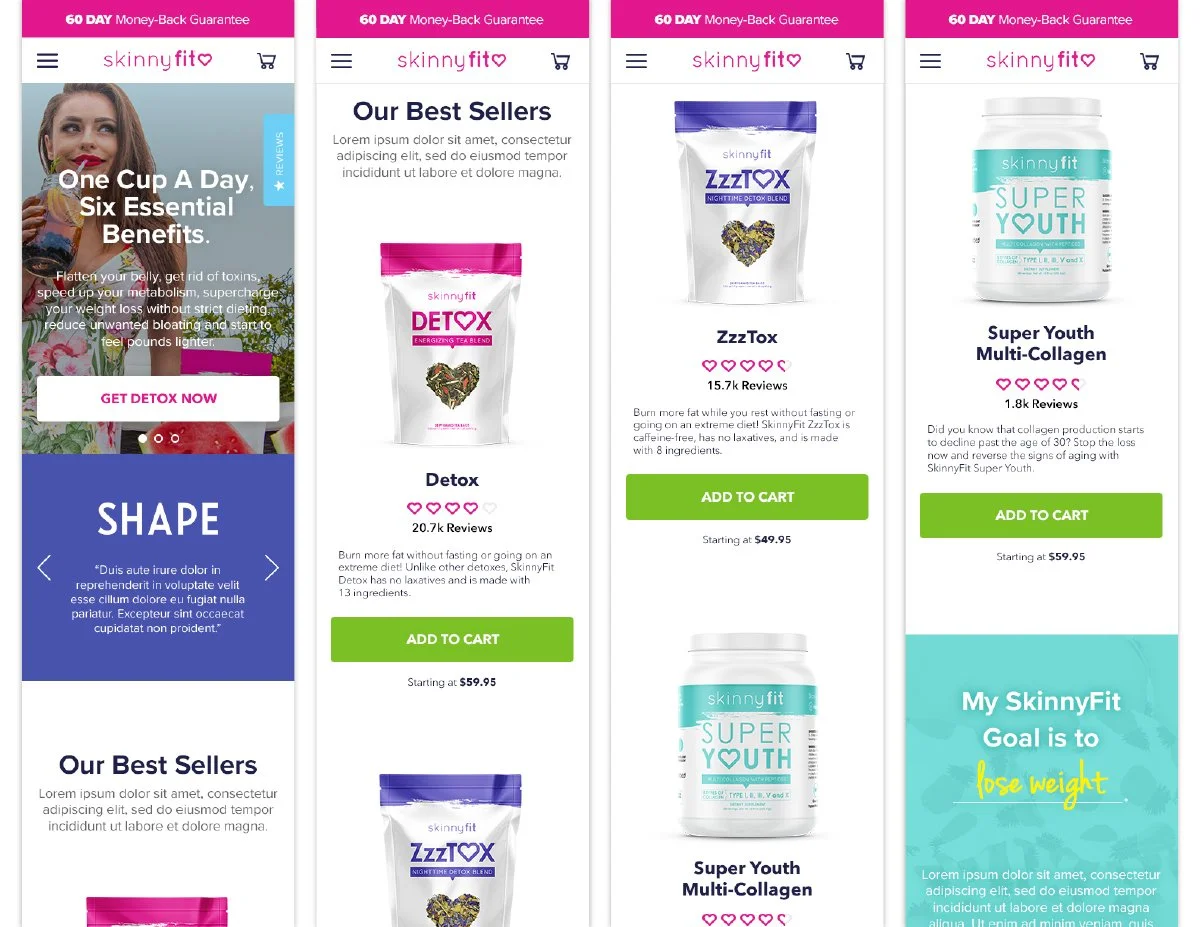
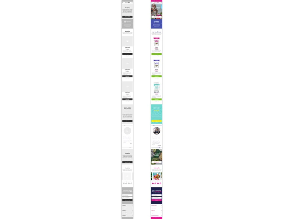
Phase 1 focused on rebuilding the core shopping experience from the ground up. At the time, SkinnyFit.com had zero dedicated PDPs, limited category segmentation, and very little flexibility to support growing marketing initiatives across channels.
Introducing 19 PDPs, a more scalable homepage structure, and conversion-focused user flows felt like a huge win at the time. Looking back, it was probably the first moment where the redesign started feeling like a real eCommerce platform instead of a collection of disconnected pages.
At some point, my mentality shifted from “fix what’s missing” to “okay, let’s build something the brand could continue growing into.”
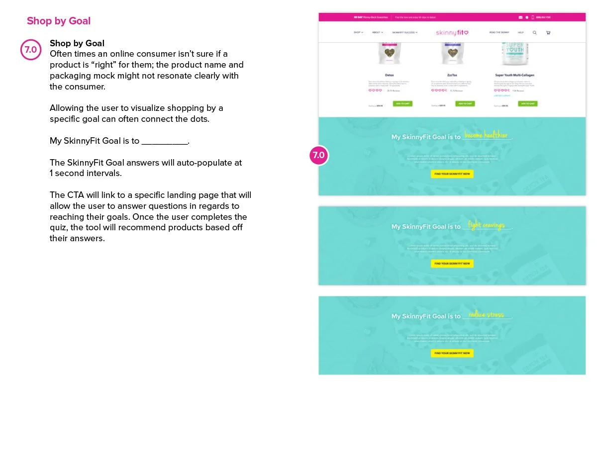
Once the foundation was in place, the conversation shifted from fixing gaps to creating better customer experiences. Later phases focused on account functionality, retention systems, loyalty integrations, subscriptions, and goal-driven shopping experiences that could support the next stage of growth.
Creating Structure
Turning Ideas Into a Scalable Framework
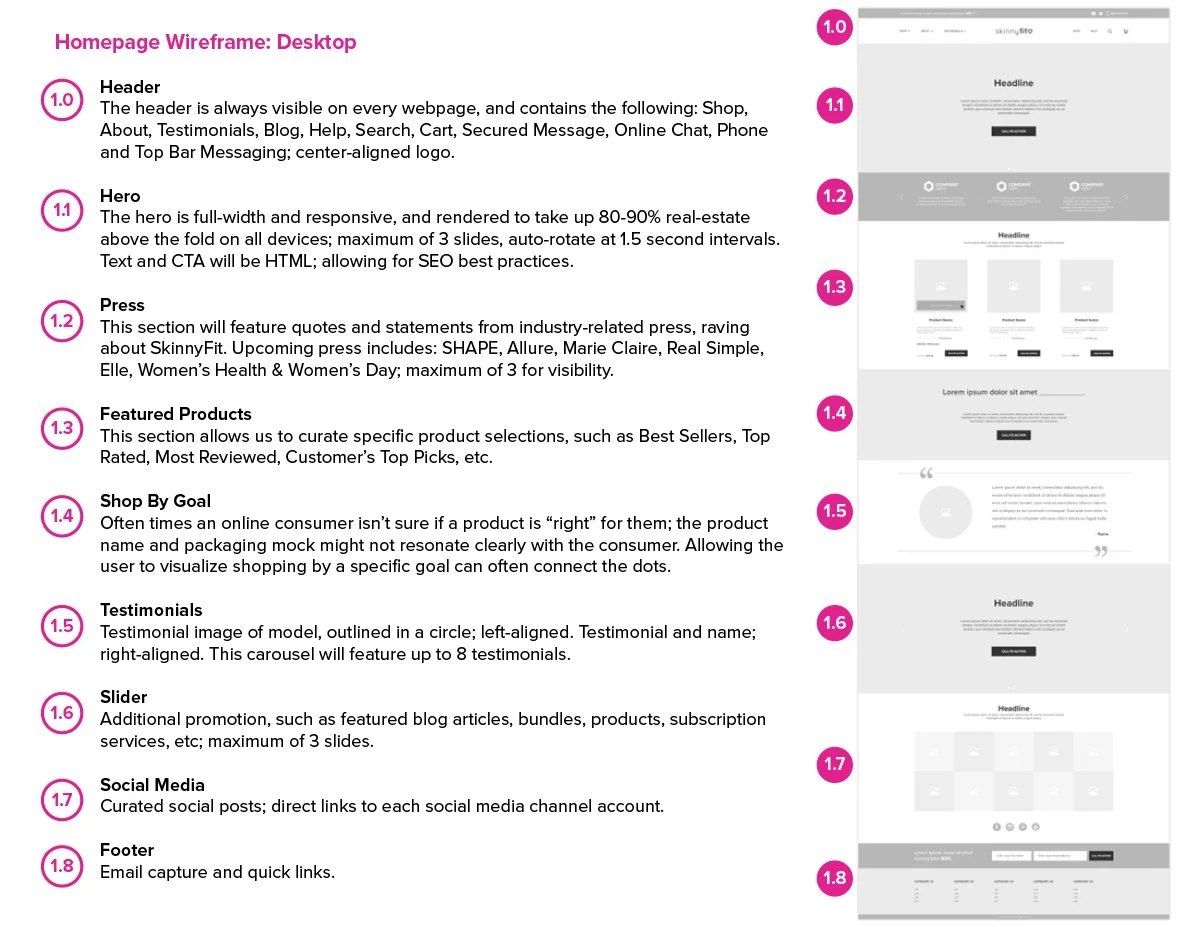
As the project continued to grow, the wireframes became much more than rough page layouts. They evolved into a working blueprint that helped organize the shopping experience, align teams, and create consistency across a growing ecosystem of pages and features.
Early on, I realized the founders were much more accustomed to reviewing polished UI concepts than wireframes. There was definitely some pressure to jump straight into visuals. But I knew that if I could get alignment around the structure and user flow first, the rest of Phase 1 would be significantly easier to build and scale.
Instead of focusing on polished visuals right away, I prioritized structure, hierarchy, content organization, and user flow. It helped simplify conversations early, reduce ambiguity during development, and create a clearer path for how the experience could continue evolving over time.
At some point, the wireframes stopped feeling like deliverables and started feeling like the foundation that everything else was being built on.
Looking back, they became one of the most valuable tools for keeping the project focused as the scope continued growing.
Reimagining the Shopping Experience
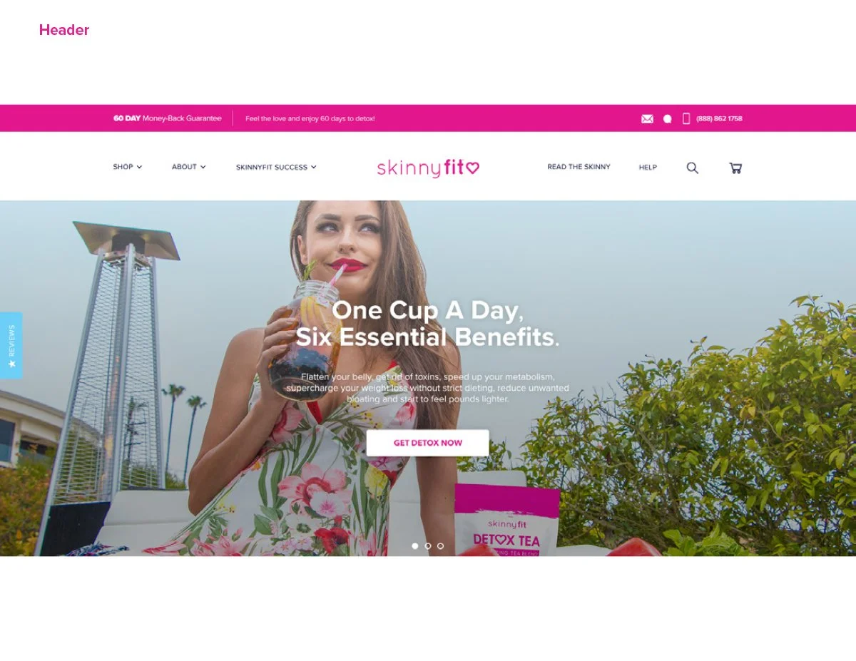
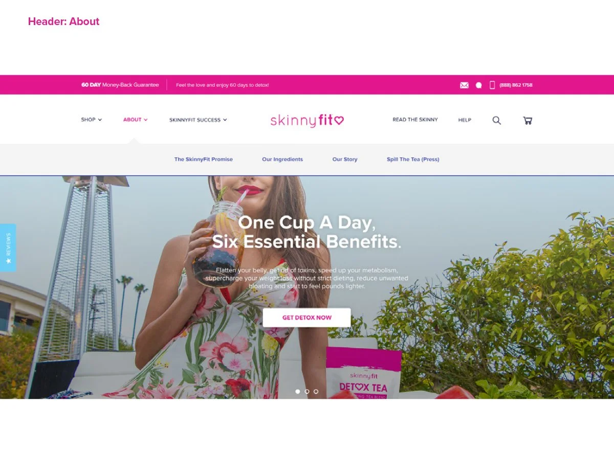
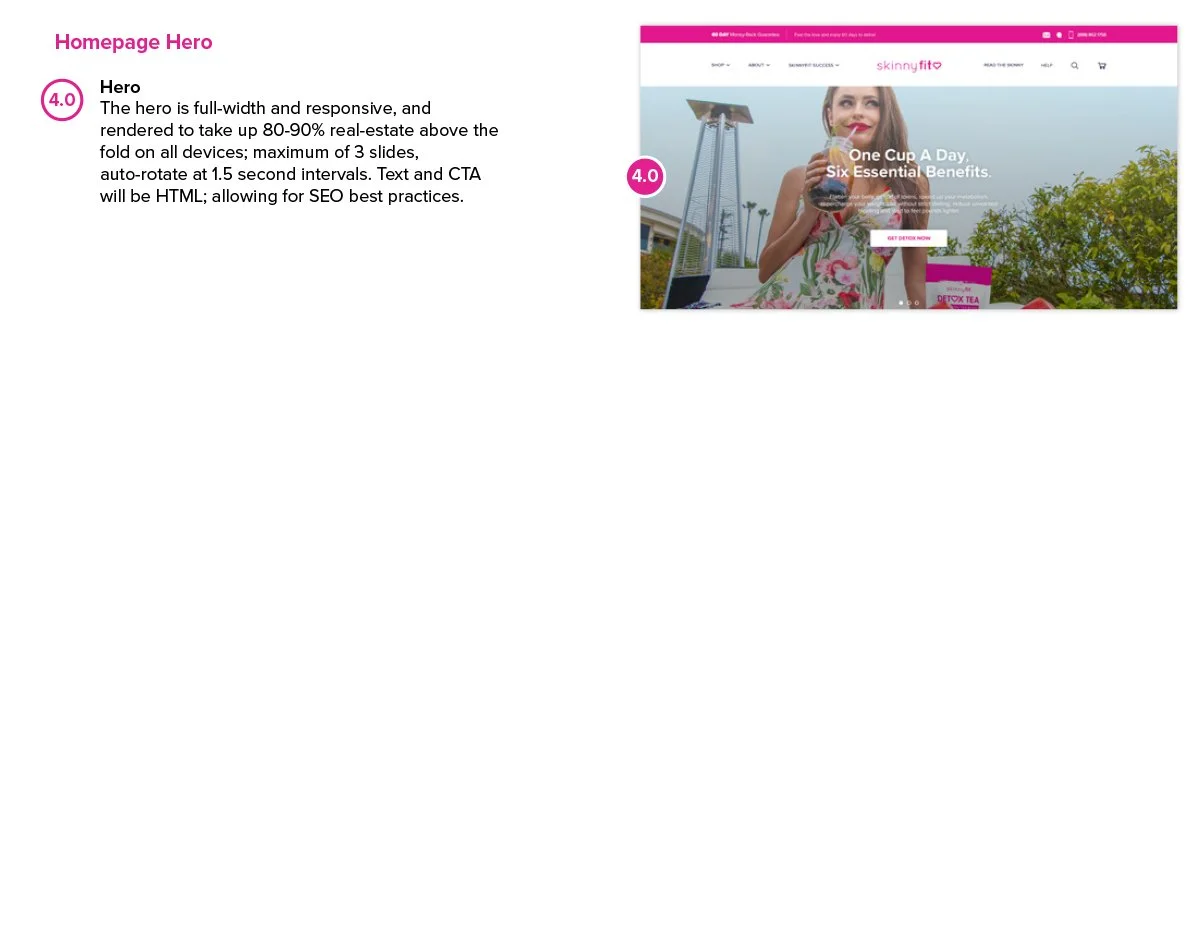
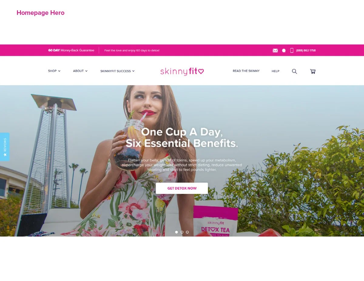
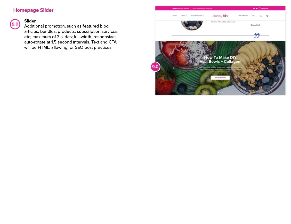
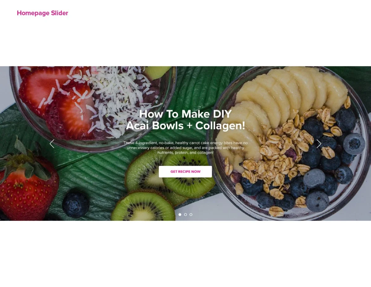
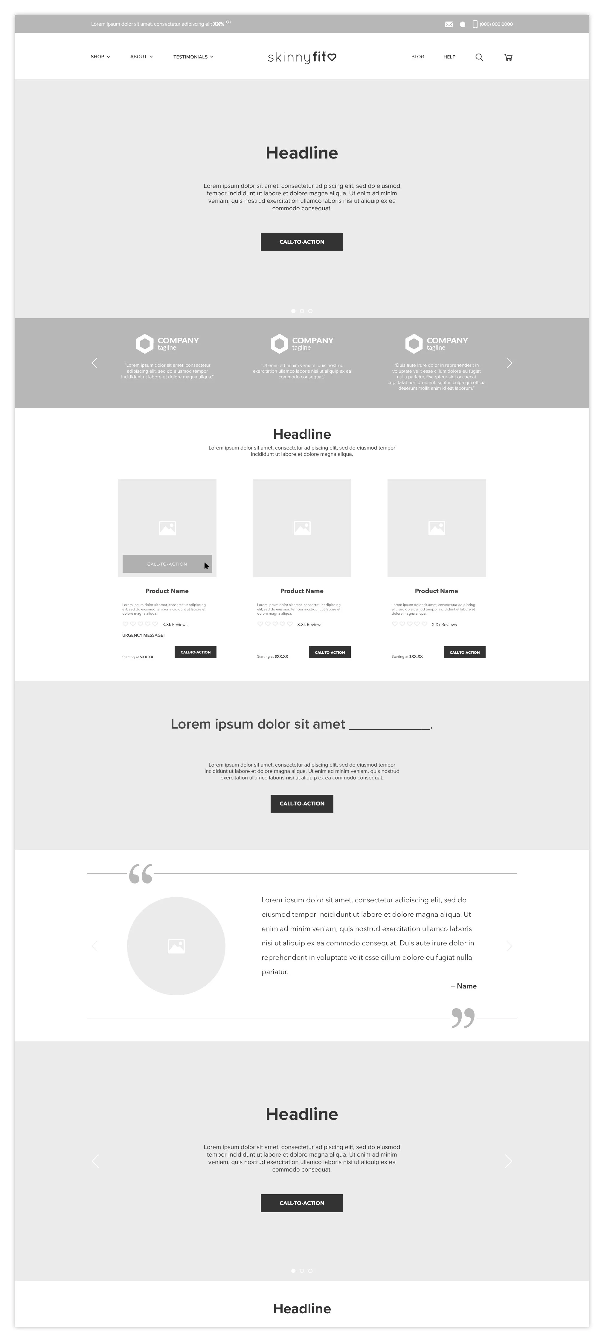
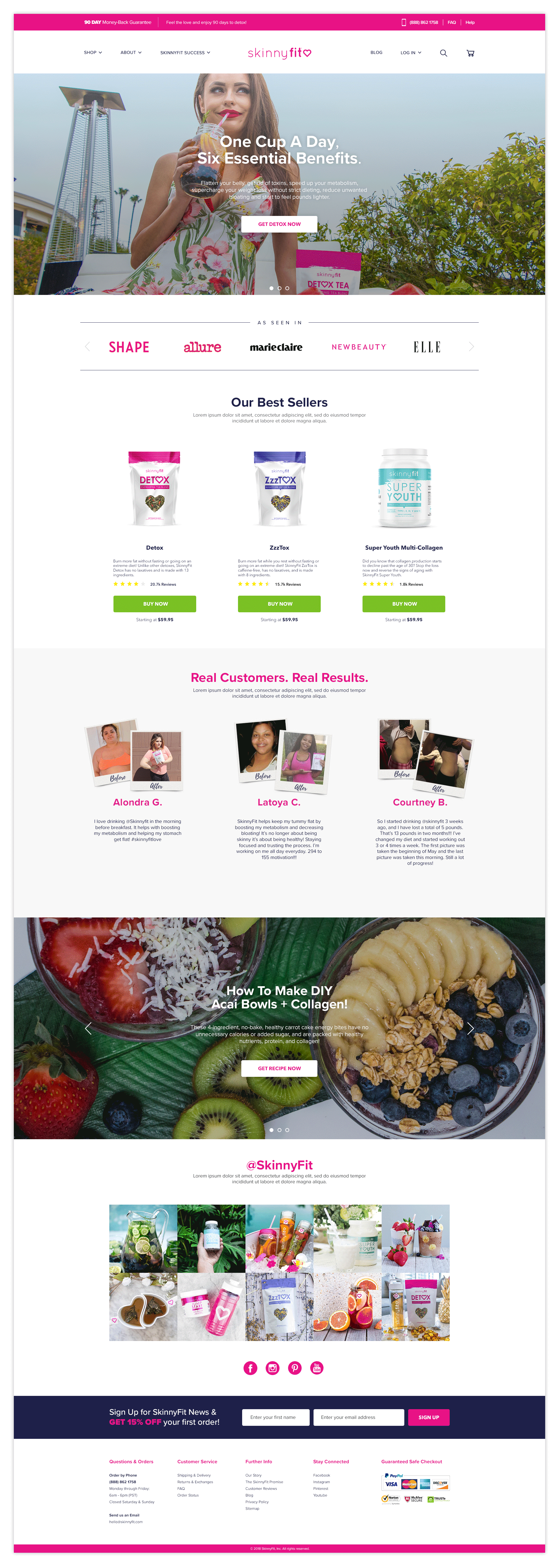
Homepage
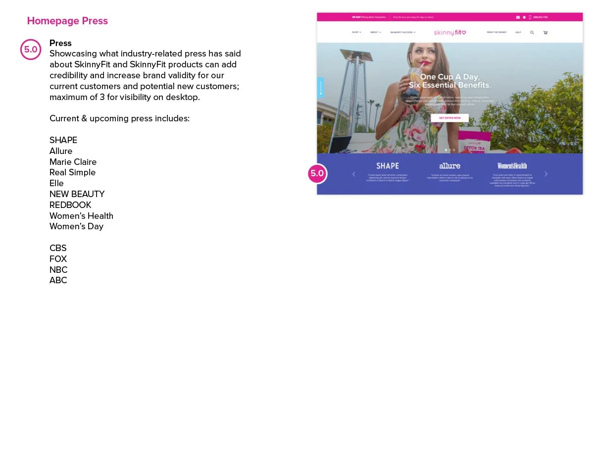
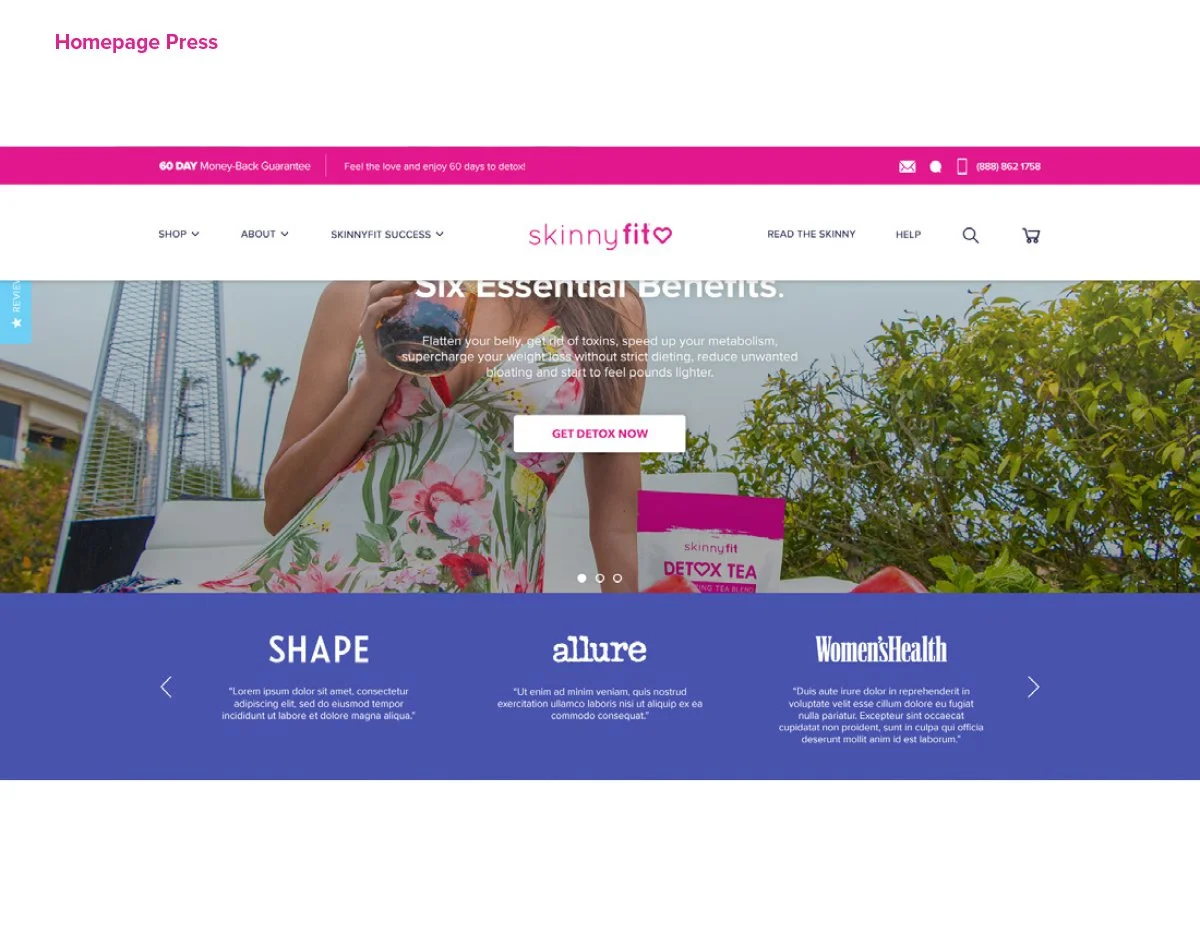
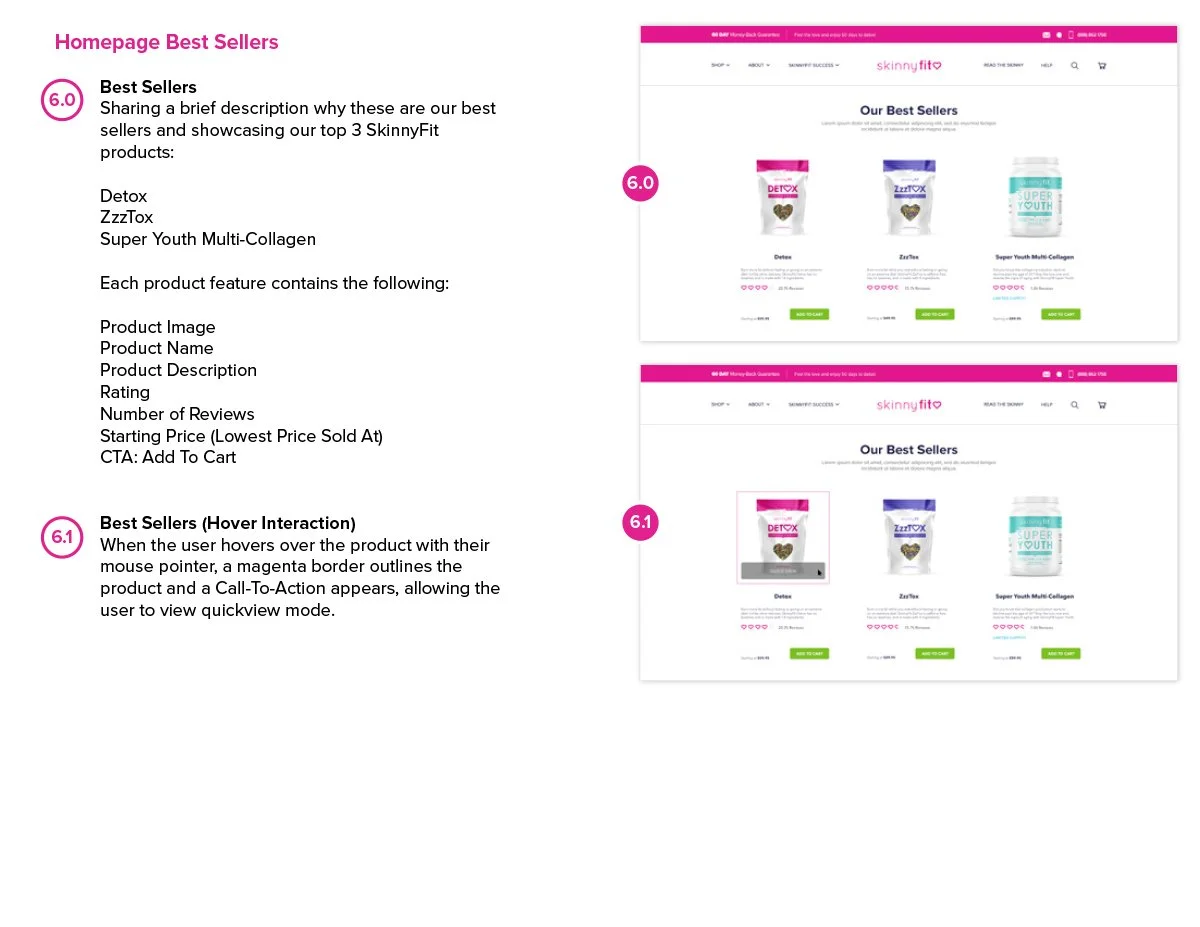
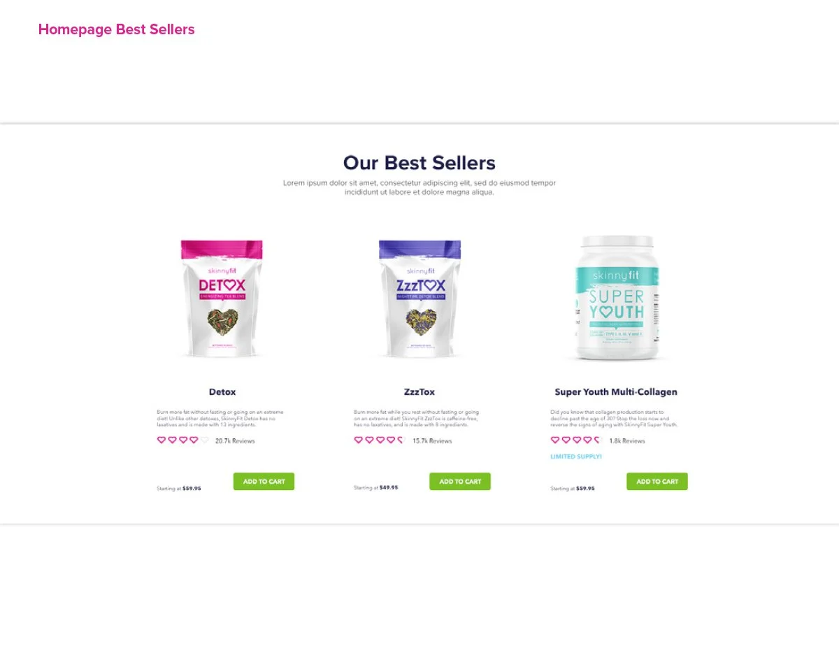
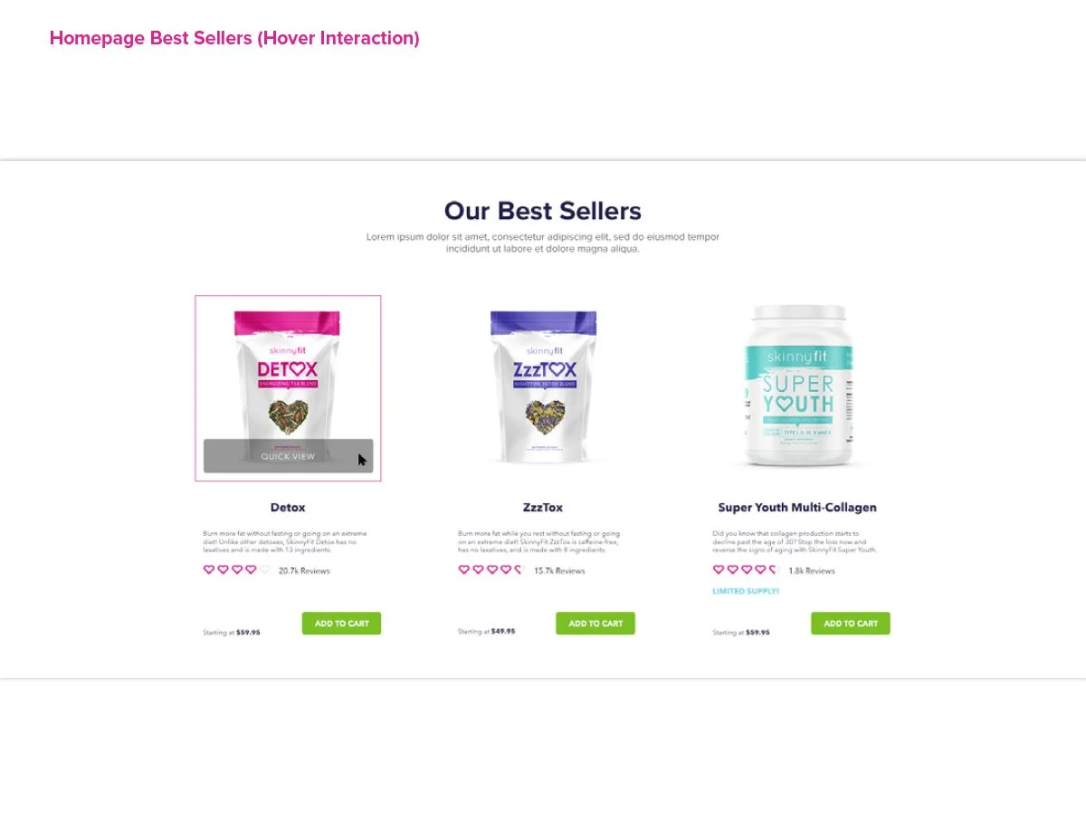
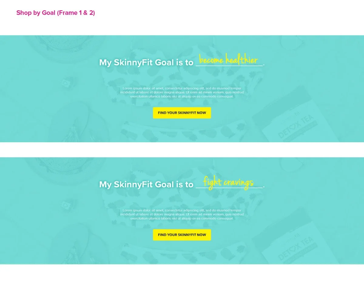
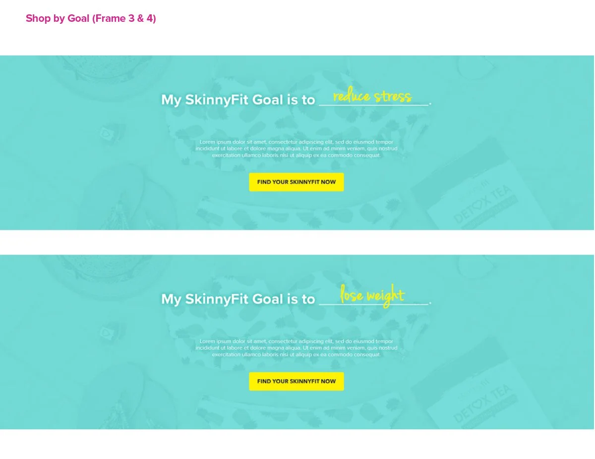
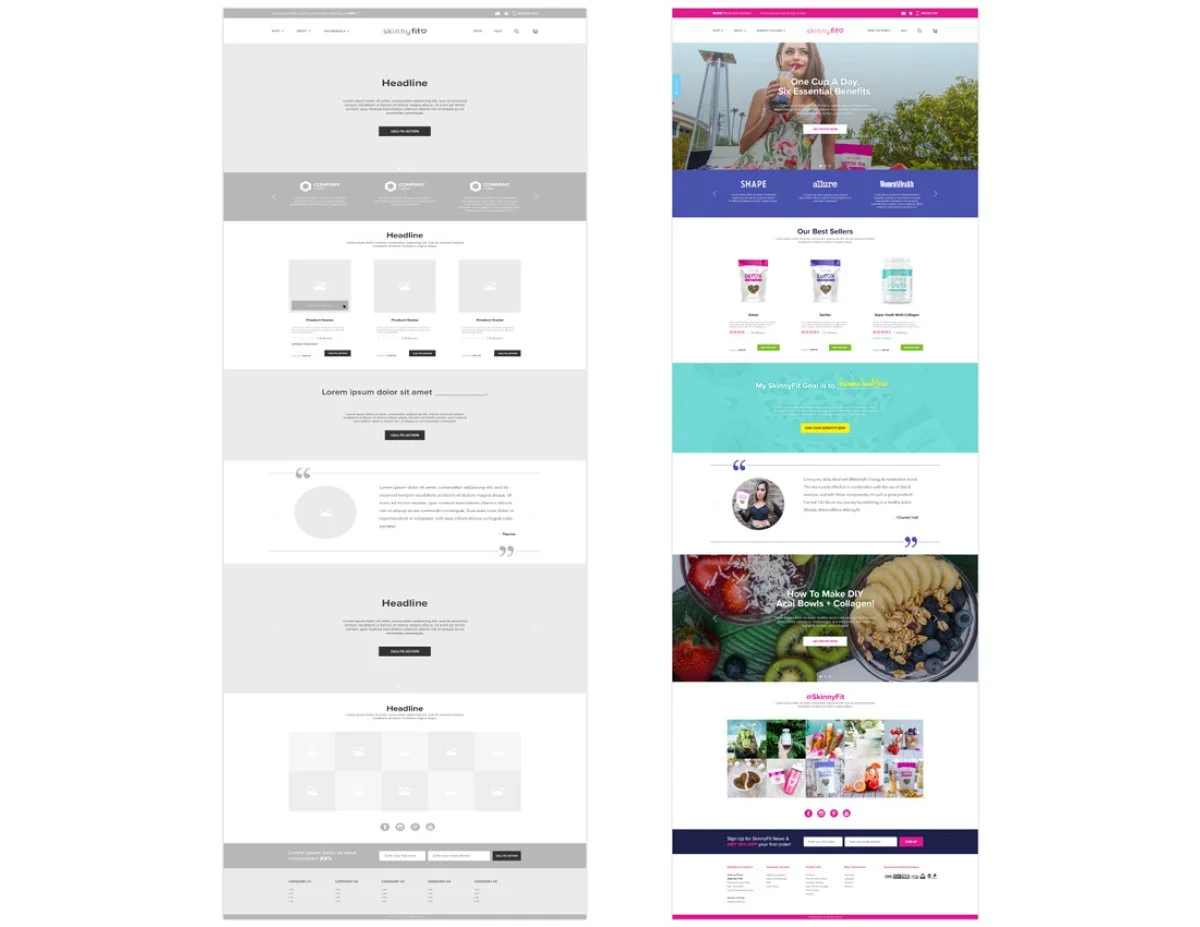
The original homepage offered very little flexibility for supporting campaigns, product education, or evolving marketing initiatives. As the business continued growing across paid media, email, social, and retention channels, it became increasingly clear that the homepage needed to evolve alongside the brand.
One of the biggest opportunities was creating a more modular homepage structure. At the time, launching a new promotion, product, or seasonal campaign often required much more effort than it should have. Introducing a flexible hero carousel and modular content system gave the team far more freedom to highlight launches, best sellers, promotions, and brand storytelling without constantly reinventing the experience.
Beyond the visual refresh, the homepage was redesigned to improve product discovery, strengthen category navigation, and create clearer entry points into the broader shopping experience.
What seems fairly standard today felt like a huge step forward at the time. For the first time, the homepage could evolve alongside the business instead of constantly struggling to keep up with it.
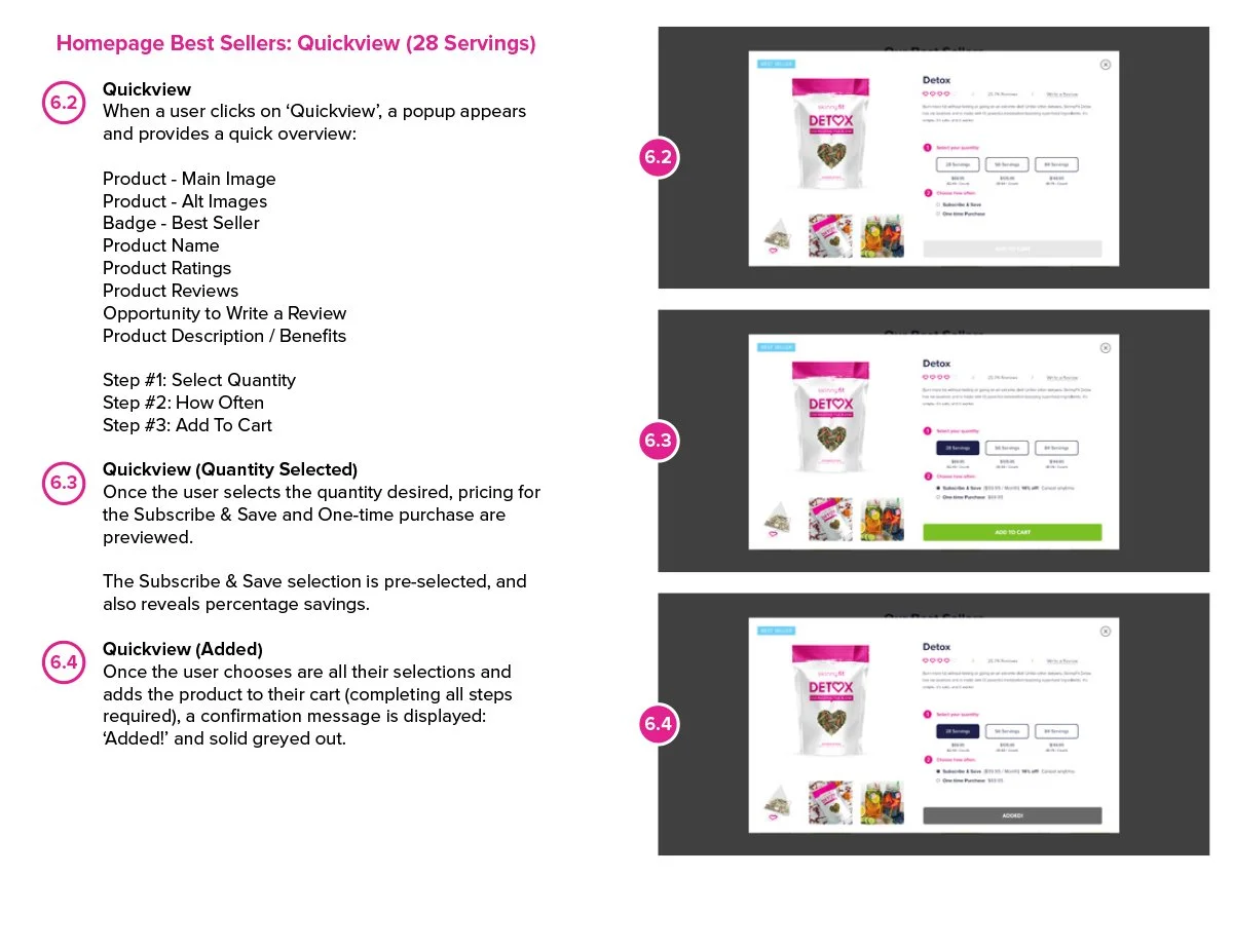
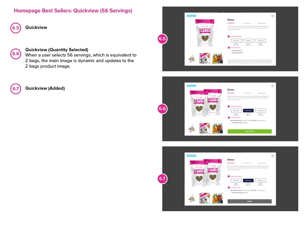
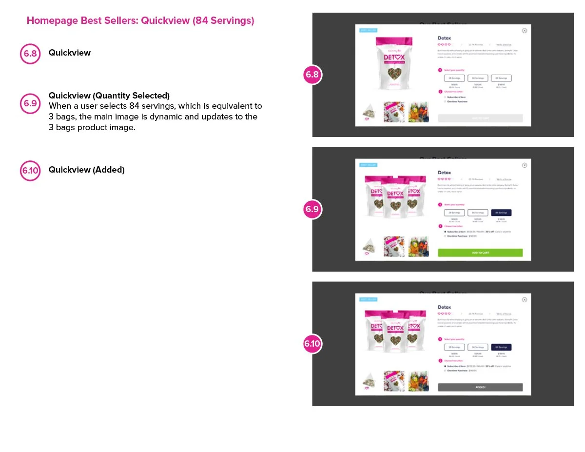
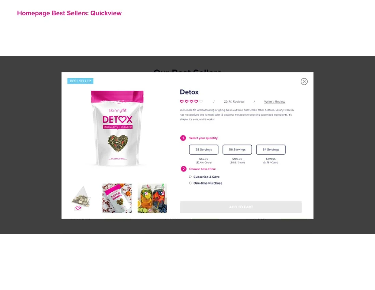
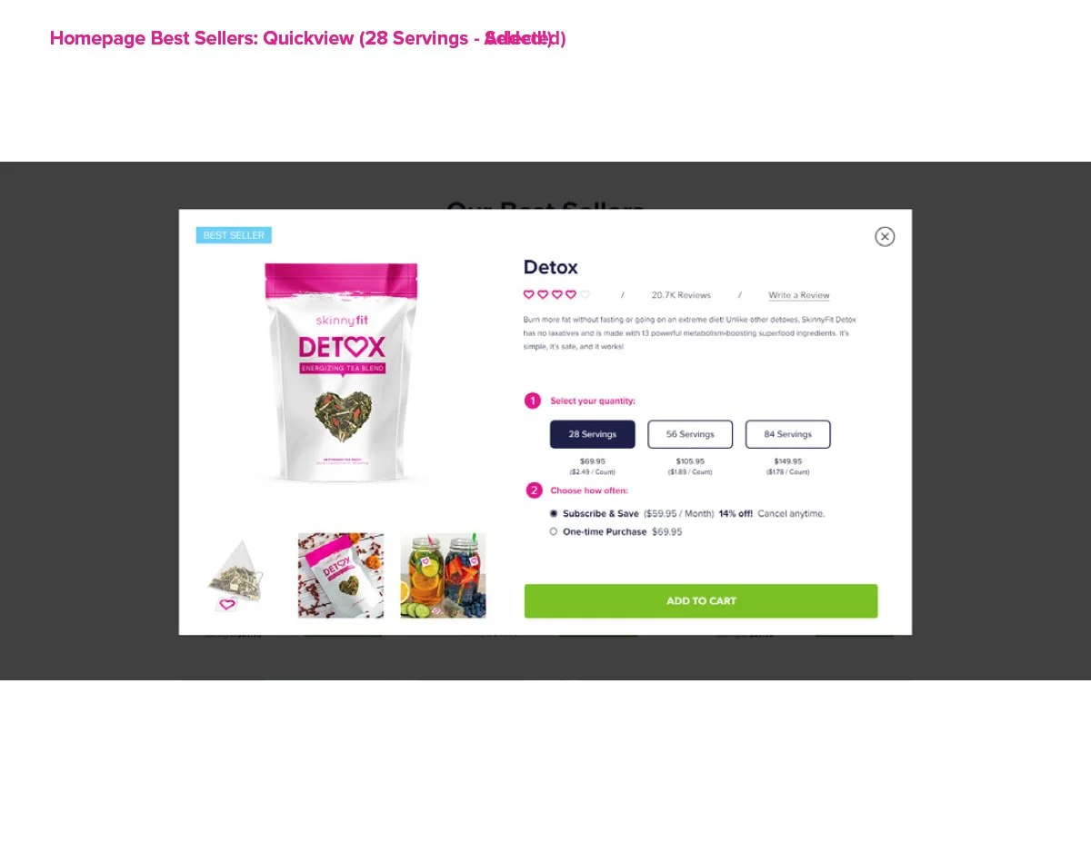
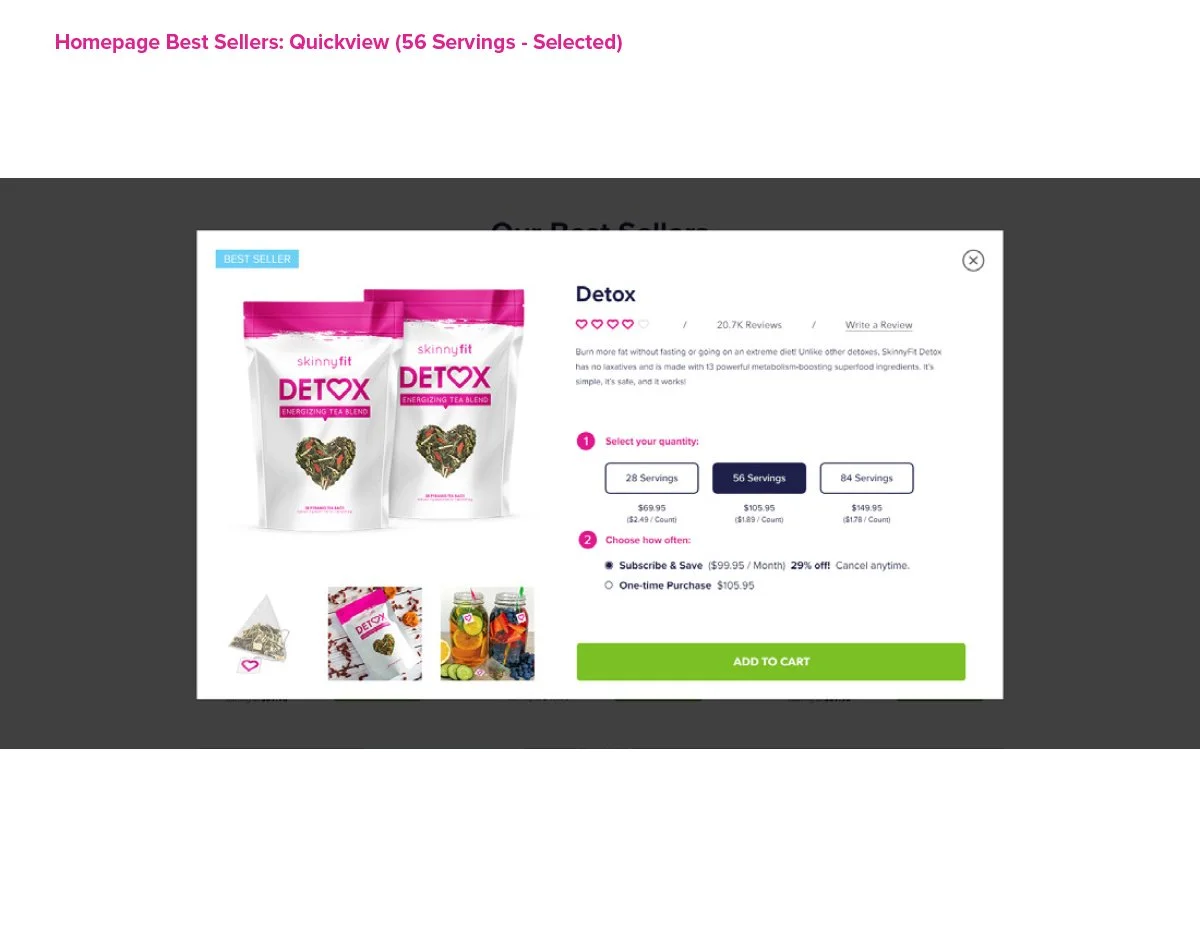
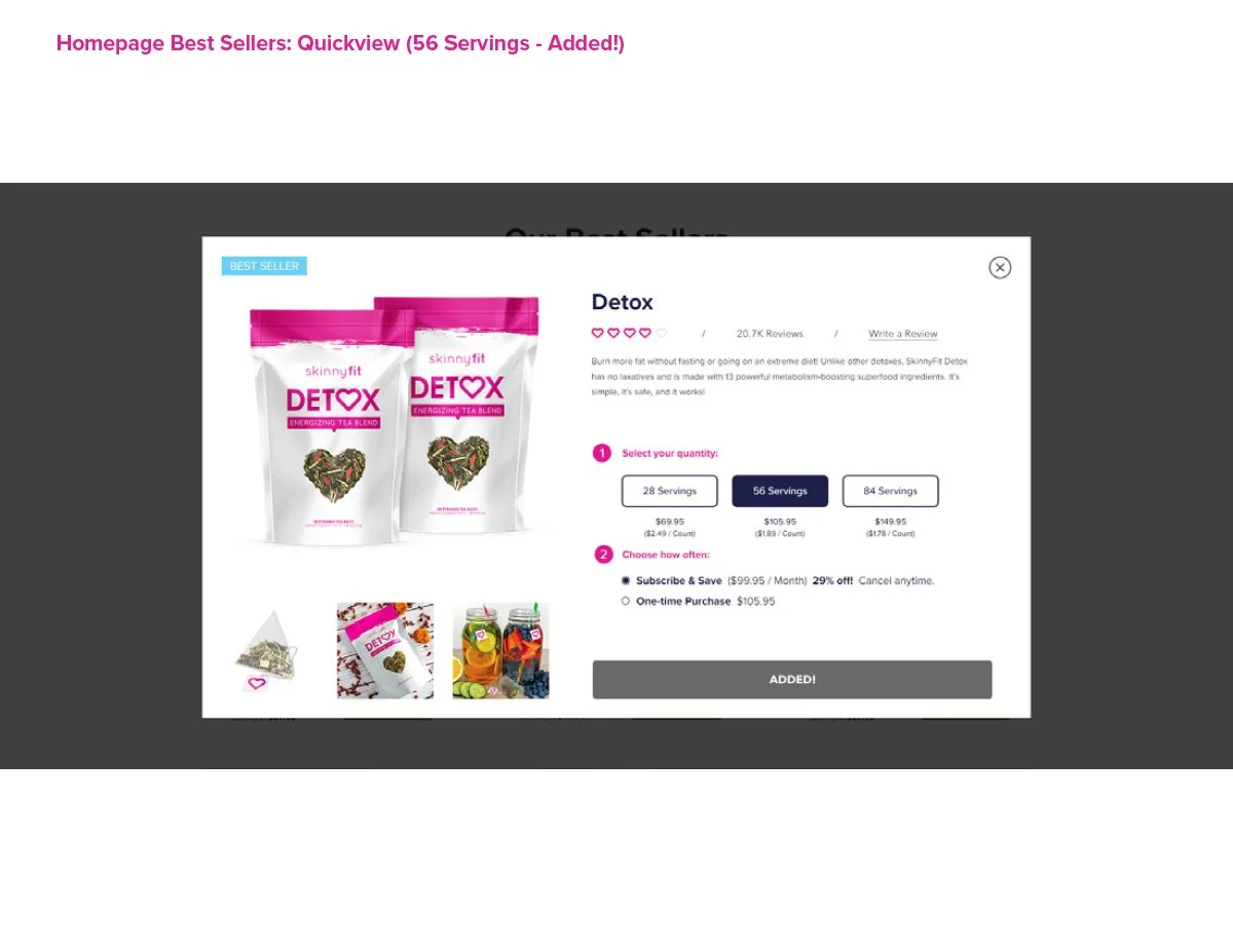
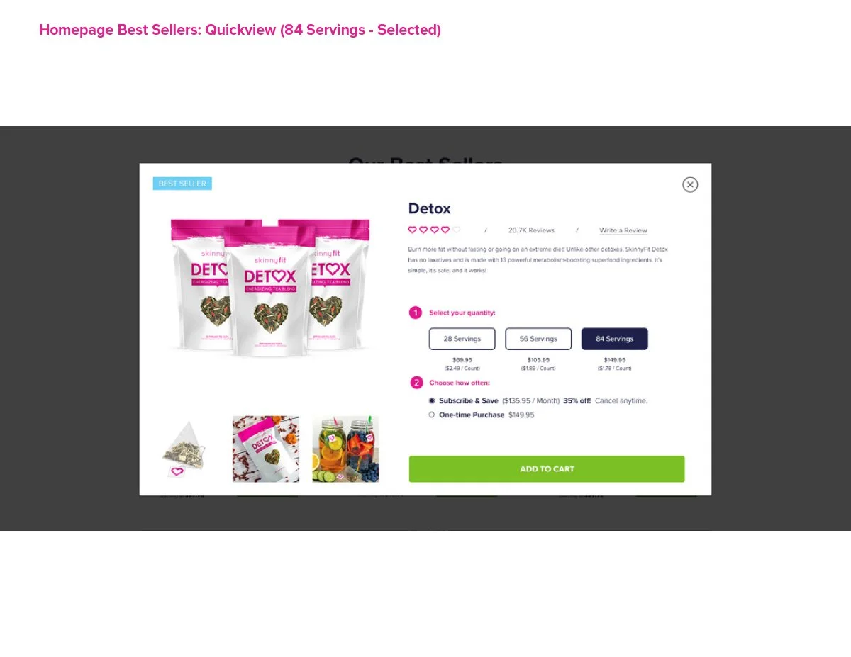
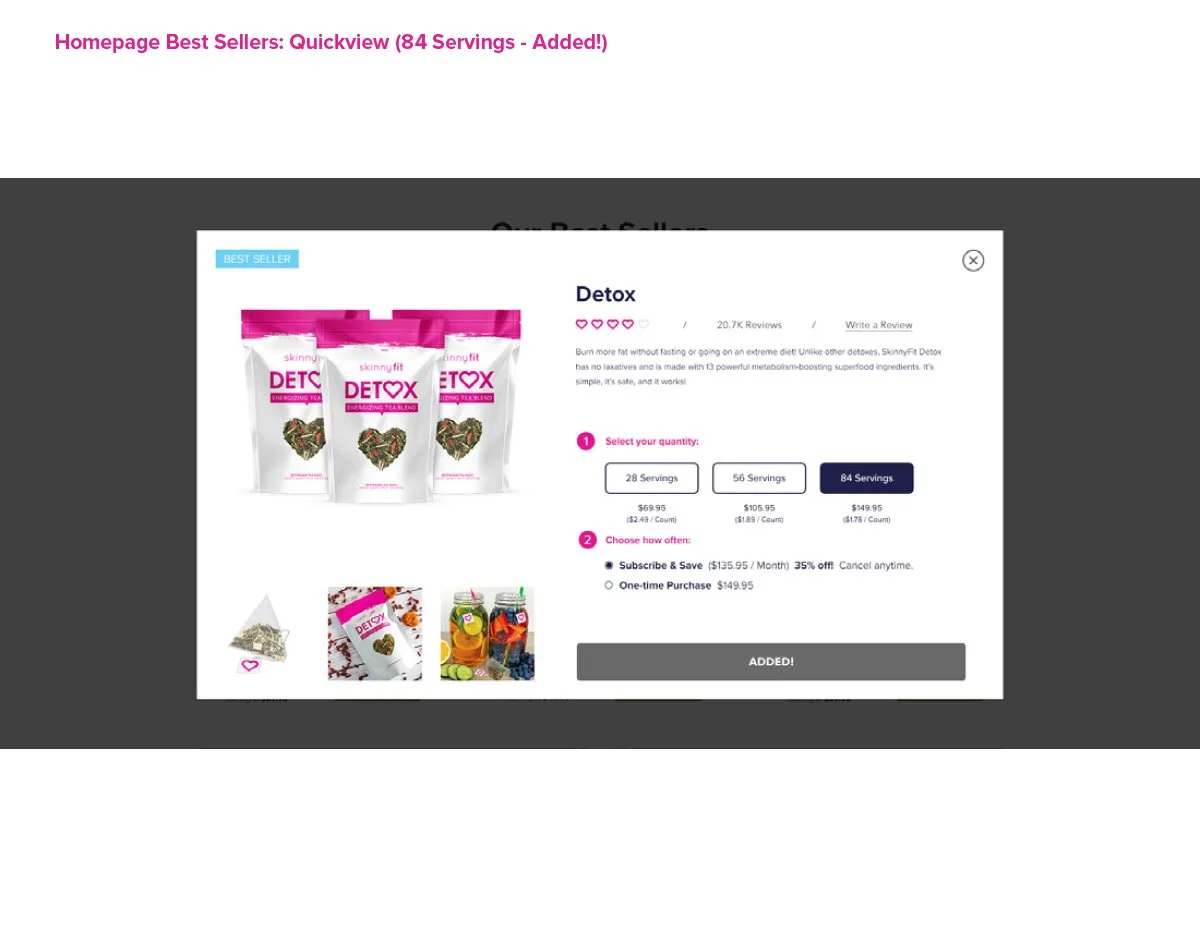
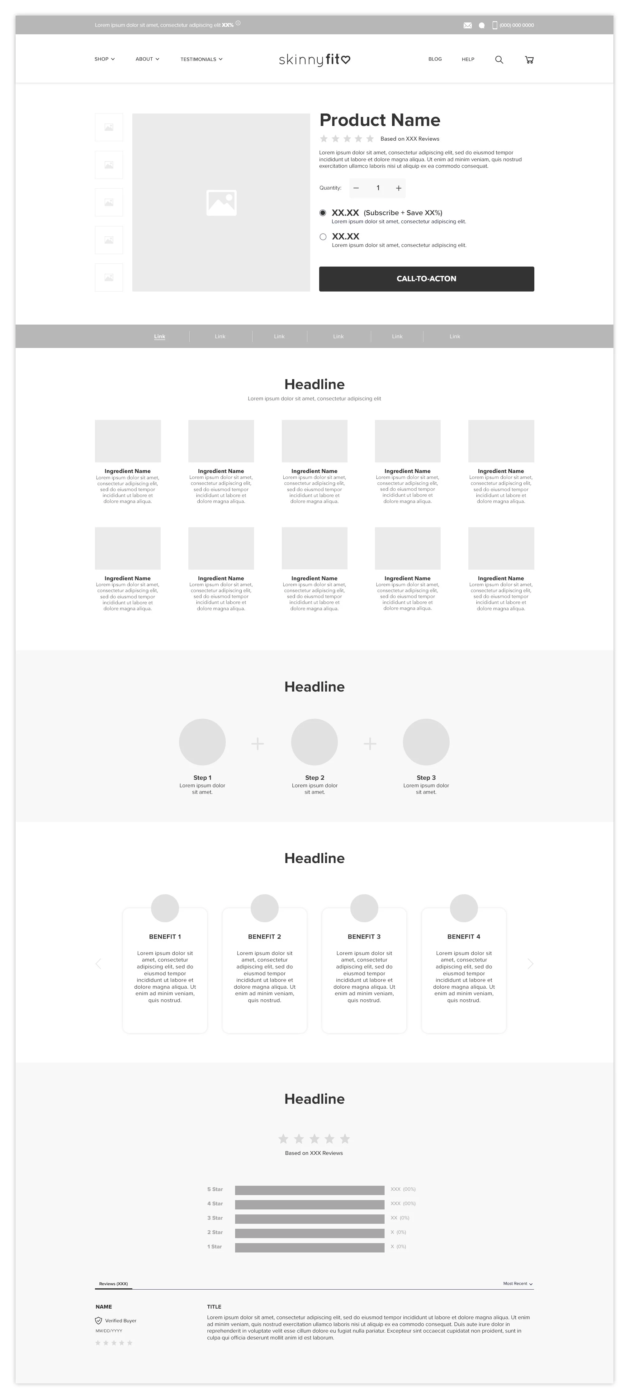
Product Detail Pages
One of the biggest gaps in the original experience was the complete absence of dedicated Product Detail Pages. Customers were often directed to broad shopping experiences with very little product education, storytelling, or conversion-focused structure.
Building the PDP system from the ground up became one of the most important parts of the redesign. At the time, I wasn’t just designing individual product pages. I was creating a framework that could scale across different products, bundles, categories, and future launches while still maintaining consistency throughout the experience.
The new PDPs were designed to better support product education, ingredient storytelling, customer reviews, FAQs, bundles, subscriptions, and conversion-focused user flows. They also created much stronger landing destinations for paid media, email campaigns, SEO initiatives, and broader lifecycle marketing efforts across the business.
At some point, it stopped feeling like I was designing product pages and started feeling like I was building the foundation for how the entire brand would sell online.
Going from zero dedicated PDPs to a fully structured product ecosystem completely changed how SkinnyFit could market, educate, and sell products online.
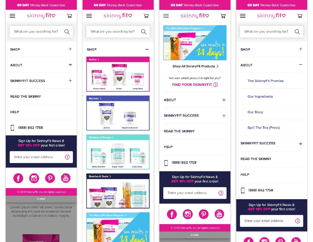
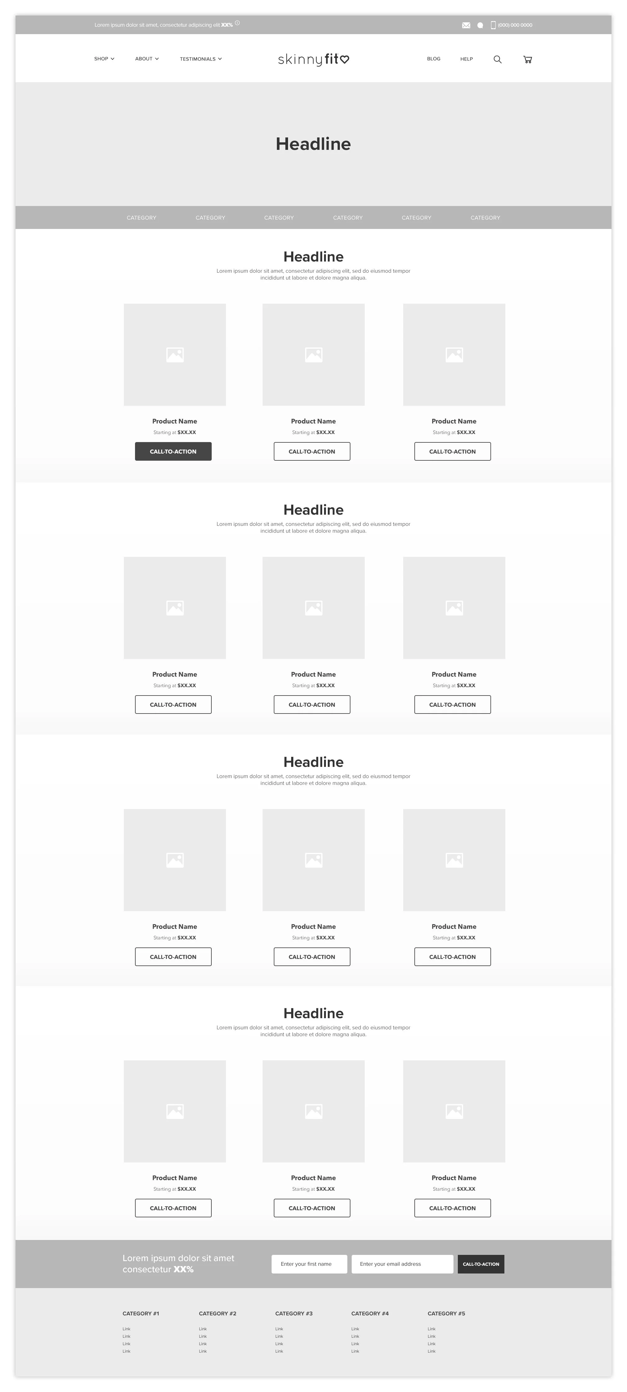
Category Pages
Prior to the redesign, SkinnyFit.com did not have dedicated category pages, which made product discovery feel limited and often pushed customers into a broad “Shop All” experience without much guidance or segmentation.
Introducing category pages became an important step toward creating a more intuitive shopping experience. Instead of treating the site as a single product feed, the goal was to organize products in a way that felt easier to browse, understand, and scale as the brand continued expanding.
The new category structure created clearer pathways into key product types, supported stronger merchandising opportunities, and gave marketing channels more intentional landing destinations tied to customer interests and shopping intent.
At some point, the conversation shifted from “here are all of our products” to “here’s how we can help customers find the right products.” That simple shift completely changed how I thought about product discovery and navigation.
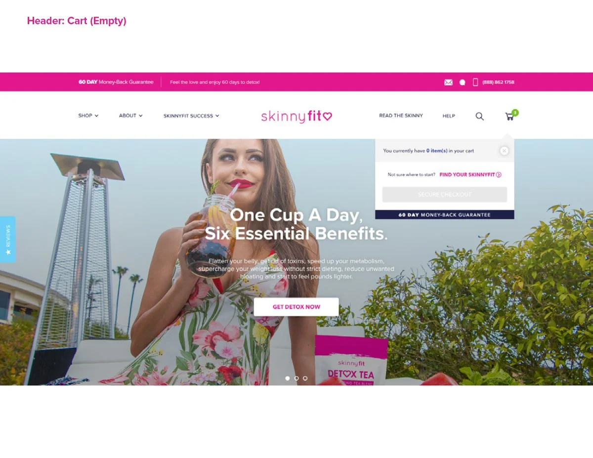
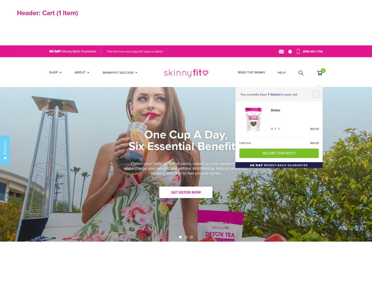
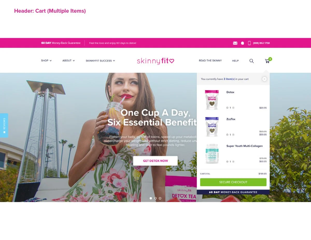
Cart
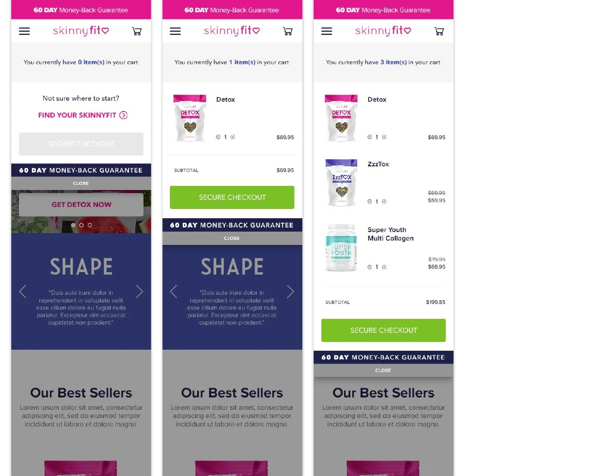
The Cart experience was designed to feel more helpful, informative, and conversion-focused rather than simply functioning as a final checkpoint before checkout.
I explored multiple cart scenarios to better support different customer behaviors and purchase types. For empty carts, the experience introduced a more friendly re-engagement moment paired with curated Best Sellers to help guide shoppers back into the purchase journey instead of leading to a dead end.
For subscription products, the cart included clearer explanations around recurring benefits and long-term value. The goal was to reinforce retention-focused messaging during a critical decision point in the conversion flow.
I started realizing that even small moments in the shopping journey could influence how customers felt about the brand. The cart wasn’t just a place to review products. It was another opportunity to educate, reassure, and guide shoppers toward the next step.
Checkout
Checkout was easily the most sensitive part of the redesign.
While I explored several directions to modernize the experience, there was understandable hesitation around introducing major changes too quickly. When revenue runs through a single experience, every decision carries a little more weight.
Early on, the priority became finding the balance between improving the experience and protecting what was already working. Rather than forcing a dramatic redesign, Phase 1 focused on smaller, lower-risk improvements that helped modernize the layout, improve organization, and create a cleaner overall experience without disrupting existing customer behavior.
Over time, those early updates helped build more confidence around the redesign direction and created a stronger foundation that could continue evolving incrementally.
This was one of the first times I truly understood that good eCommerce design is not always about changing everything. Sometimes it’s about knowing what not to change, earning trust over time, and improving the experience one step at a time.
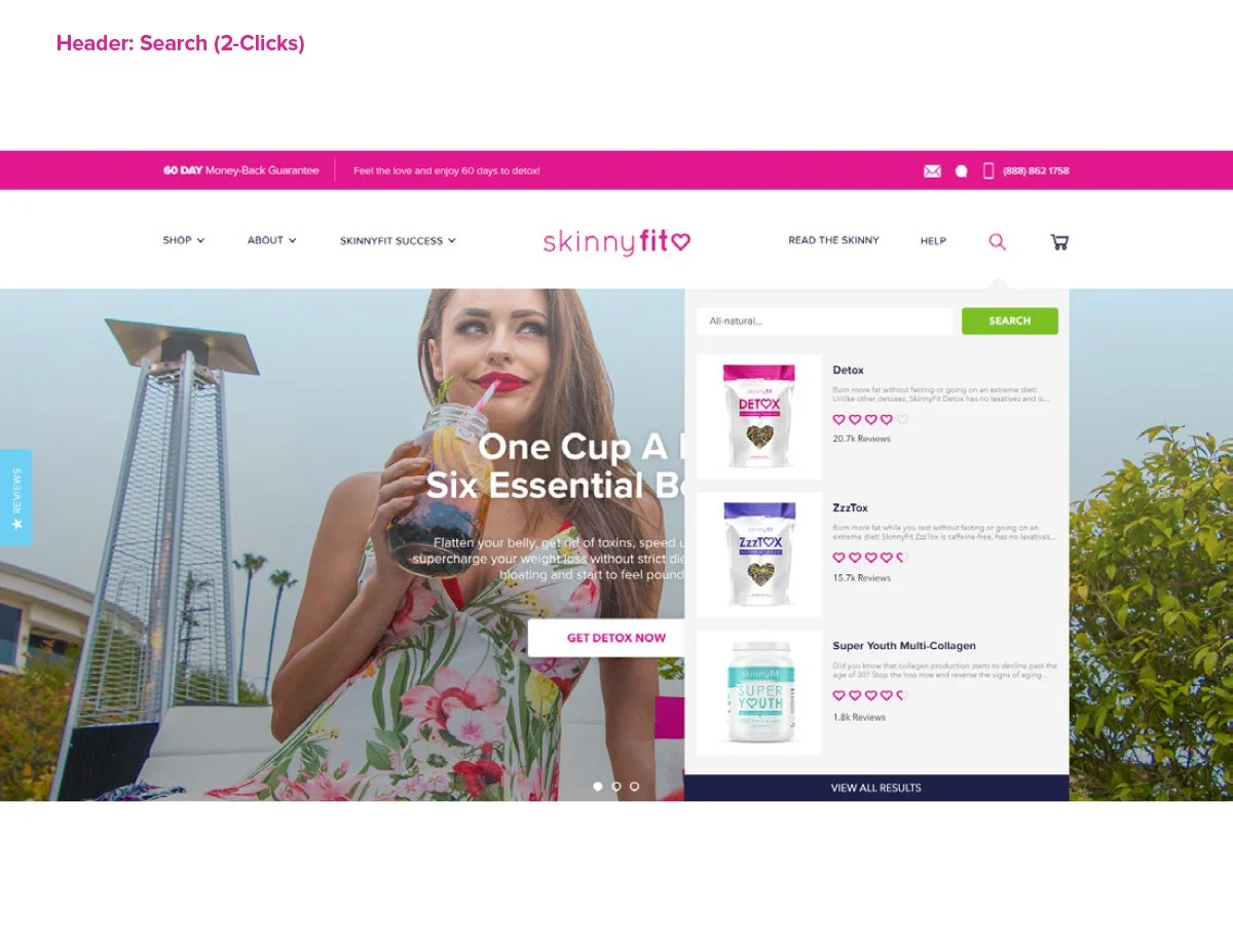
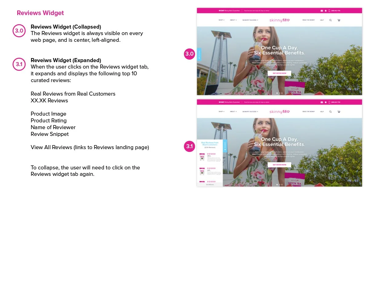
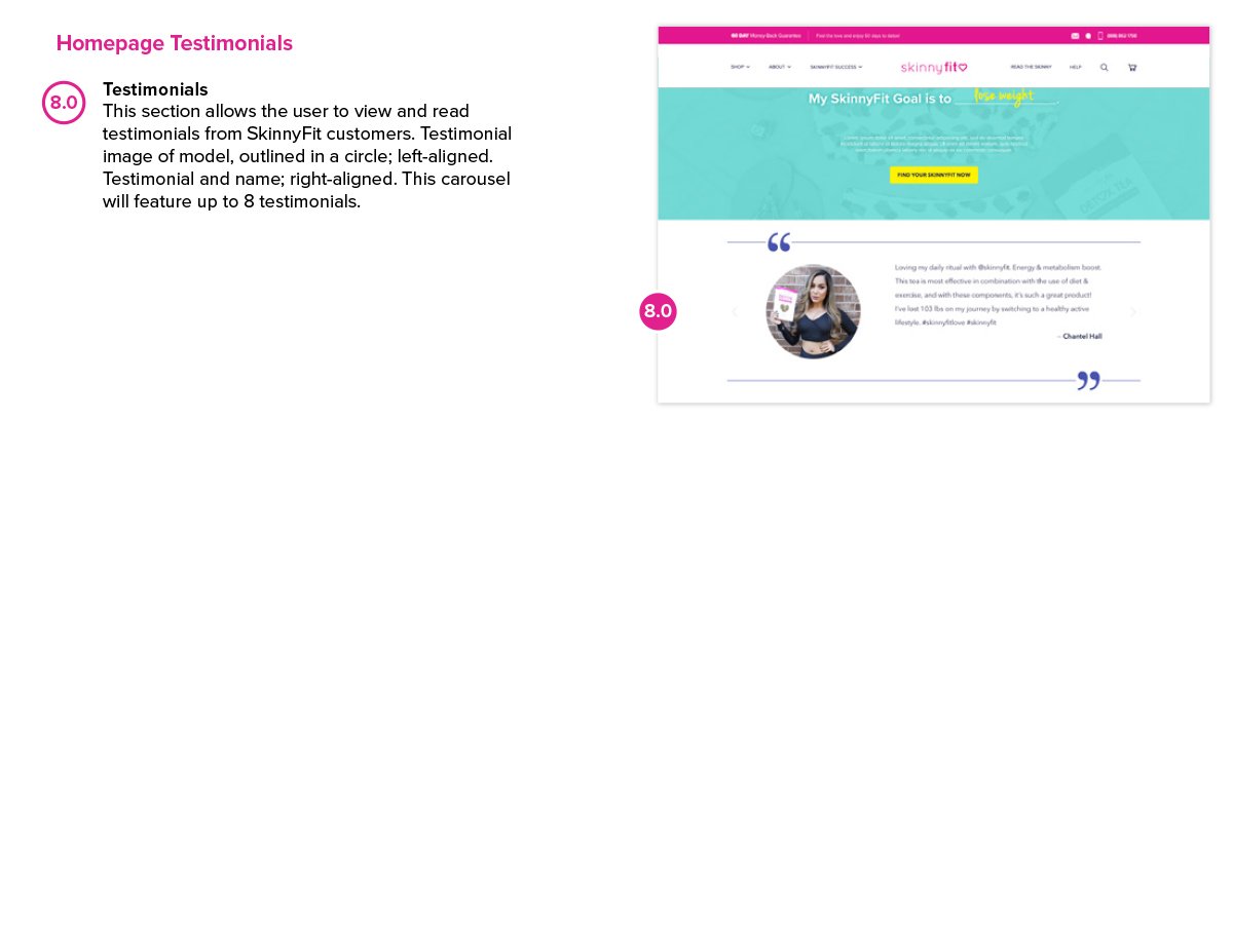
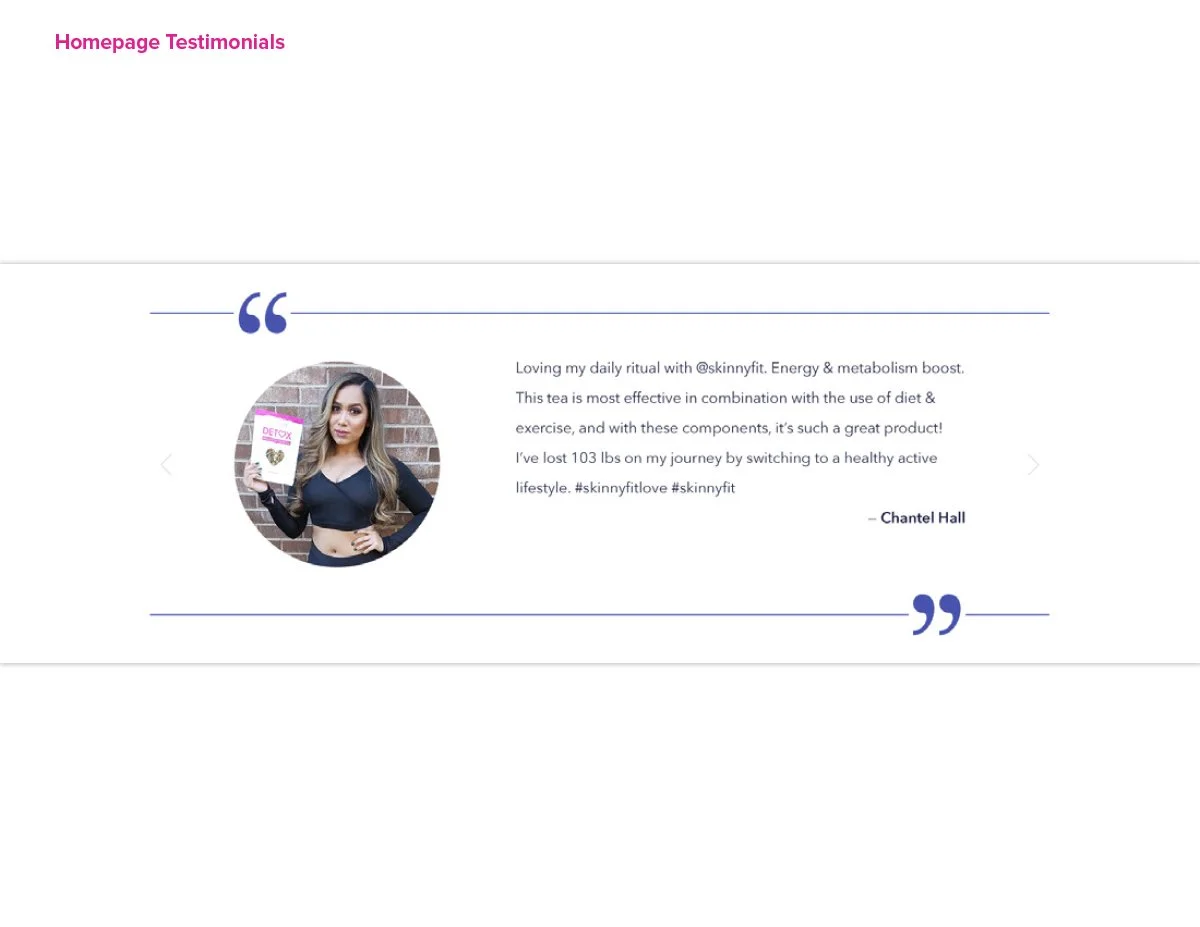
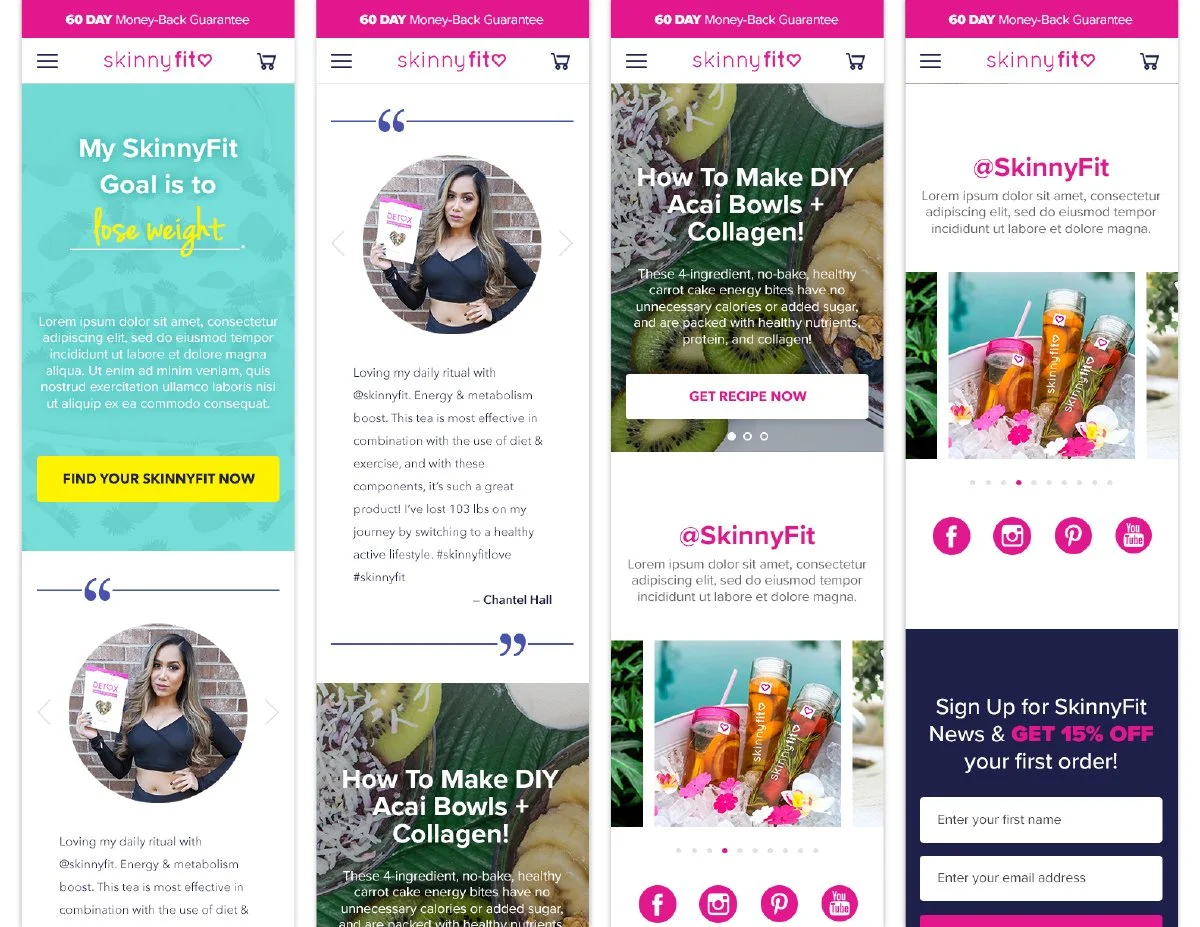
Customer Reviews
One of the biggest things I learned while working in direct response marketing was how important social proof really is.
SkinnyFit already had thousands of verified customer reviews flowing through YOTPO’s automated email system, but none of that feedback was actually visible throughout the shopping experience.
I proposed creating a dedicated Customer Reviews page that surfaced the full YOTPO feed and gave shoppers a place to explore real customer experiences, browse reviews by product, and build confidence before purchasing.
Beyond simply displaying ratings, the goal was to make customer feedback feel like an active part of the brand experience. The reviews helped reinforce credibility, highlight real product results, and create stronger trust throughout the customer journey.
The more I worked in eCommerce, the more I realized customers often trust other customers more than they trust brands. Giving those voices a place to be seen became one of the most valuable additions to the experience.
Supporting the Customer Experience
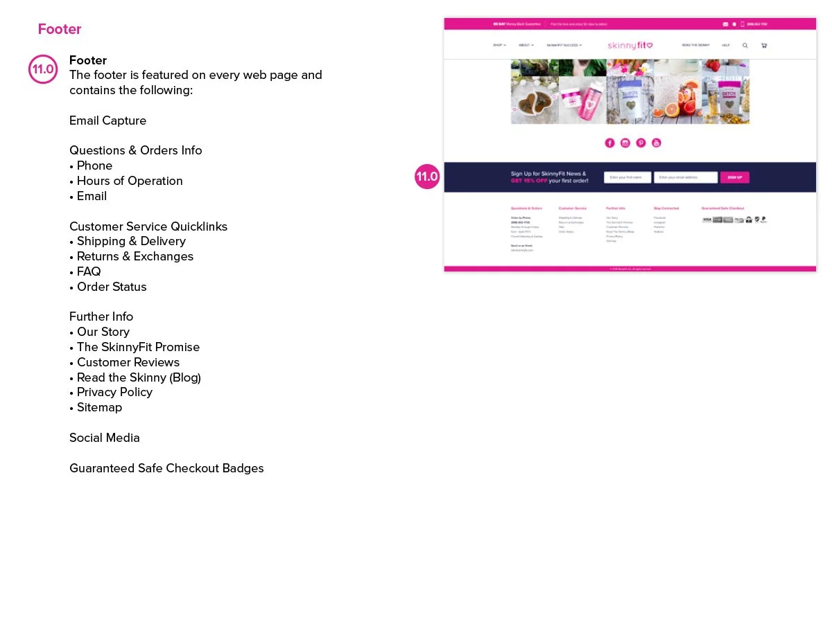
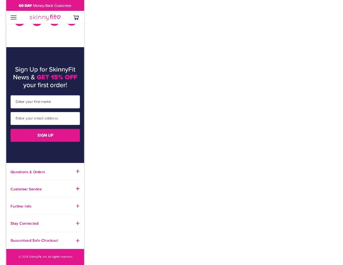
Beyond the core shopping experience, I also redesigned several supporting pages to help create a more helpful, trustworthy, and customer-friendly ecosystem throughout the site.
These weren’t necessarily the most exciting pages to design, but they played an important role in improving clarity, answering common questions, and helping customers feel more confident throughout their journey with the brand.
The FAQ, Help, and Privacy Policy pages gave customers easier access to information they were already looking for while helping reduce friction throughout the experience.
One thing this project reinforced for me is that customer trust is often built through the small details. Sometimes the pages that receive the least attention end up doing some of the most important work.
The Old Experience
Prior to the redesign, SkinnyFit.com was essentially a large product catalog.
Customers were funneled into a broad “Shop All” experience with limited category segmentation, minimal product education, and no dedicated Product Detail Pages.
As the business continued growing across paid media, email, SEO, and retention channels, it became clear the site was no longer supporting the way customers actually discovered, learned about, and purchased products.
Building the Foundation for Growth
One of the biggest outcomes of the redesign was finally giving SkinnyFit a scalable eCommerce foundation that could support the pace at which the business was growing.
Before the redesign, the site lacked many of the systems needed to properly support product education, category discovery, paid traffic, retention marketing, and future product expansion. Introducing dedicated PDPs, category architecture, modular homepage systems, and more structured customer flows fundamentally changed how the brand could market and sell products online.
As more channels continued scaling across paid social, email, blog content, SEO, and lifecycle marketing, the redesigned experience created stronger landing destinations that felt more aligned with customer intent and purchase behavior. The project also reinforced how important trust and education are within the customer journey. From customer reviews and FAQs to ingredient storytelling and subscription education, many of the redesign decisions focused on helping customers feel more informed and confident throughout the shopping experience.
More than anything, this project taught me that good eCommerce design is not just about making a site look better. It’s about building systems that give a brand the ability to grow, adapt, and evolve over time.
Lessons Learned
Progress Needs Ownership
One of the biggest lessons I took away from this project was realizing how much large-scale creative work depends on consistent ownership and momentum over time.
I was handed the SkinnyFit.com redesign on my third day at Smashtech while still onboarding, learning the business, meeting new team members, and trying to understand how everyone worked. I quickly realized very little structure or process existed around the project. Much of the redesign had already stalled internally.
So naturally, I was excitedly nervous. There was definitely new-hire pressure to prove what I could bring to the table and whether I could actually help get this project off the ground.
Over the next year and a half, the project moved through periods of progress. Then pauses. Then shifting priorities. Then new business needs.
There were many moments where it finally felt like we had momentum again, only for something else in the business to suddenly take priority.
And honestly, that stop-and-go cycle takes a toll over time. You get excited. Re-energized. Fully locked back in. Then suddenly you’re pausing, regrouping, and revisiting the project again later.
I quickly realized a big part of my role wasn’t just designing the experience itself. It was helping move the project forward. Creating structure where there wasn’t any yet. Maintaining alignment across teams. Pulling in the right collaborators when needed. And continuing to advocate for the long-term vision while balancing day-to-day business demands.
More than anything, this experience taught me that successful creative projects are rarely sustained by good ideas alone. They require consistent ownership, communication, adaptability, and the willingness to keep pushing momentum forward even when the path is not fully defined yet.
This project will always hold a special place in my heart because it was my first real introduction to the company and, quite honestly, one of the most rewarding experiences to look back on now.
Sometimes Flexibility Becomes Complexity
One of the biggest long-term lessons I took away from this experience was understanding the tradeoff between customization and scalability.
When I first joined Smashtech, the founders were very passionate about building and keeping everything in-house, including the technical side of the business.
Looking back, it made complete sense why.
The company was founded by two brothers who had experienced difficult business partnerships and outside vendor issues in the past. There was a strong desire to build a talented internal team and maintain full ownership over the systems powering the business.
At the time, that mindset honestly felt exciting and ambitious to me. The idea of building fully custom eCommerce experiences in-house felt like a huge stride forward and something that made the company unique.
But as the business continued scaling over the years, we started running into the realities that come with heavily customized systems. Many new platforms, integrations, and tools we wanted to implement either required complicated workarounds or simply weren’t easily compatible with our ecosystem.
What once felt like flexibility slowly became friction.
More development complexity. More workarounds. More ideas and improvements sitting in a backlog waiting for resources.
We still found ways to make things work.
But this experience completely changed how I think about scalability, integrations, and long-term platform sustainability within eCommerce.
One of the biggest things I learned is that building custom systems can feel empowering early on. But without the ability to evolve alongside the industry, that same flexibility can eventually become a limitation.
We eventually made it over to Shopify… finally.