From Stagnant to Strategic:
Reinventing SkinnyFit’s High-Impact Landers
My Role: Lead Designer • Creative Direction • Conversion-Driven UX Design
Overview
Elevating direct response into a scalable, high-converting landing experience
LANDER DESIGN UI/UX DESIGN
DIRECT RESPONSE
SkinnyFit’s acquisition landers hadn’t changed in years, despite being a major revenue driver. In 2023, I was asked to reimagine them, bringing a modern, performance-driven approach to a long-stagnant system. I created a cleaner, scalable framework that elevated direct response best practices, improved clarity and credibility, and supported multiple products with easier development maintenance. The result was a new generation of high-converting, future-ready SkinnyFit landers.
The Challenge
SkinnyFit’s acquisition landers had become outdated, inconsistent, and difficult to scale across products. Despite being a key revenue source, they relied on an old design system that no longer reflected the brand or modern direct response standards. The business needed a fresh approach that could boost performance while still being efficient for the development team to maintain. My challenge was to rethink the entire experience—elevating clarity, credibility, and conversion—while creating a flexible framework that could be replicated across multiple product lines without reinventing the wheel each time.
Landers Template
Designing a Scalable, High-Converting Template for SkinnyFit’s Product Line
For SkinnyFit, I was tasked with creating a direct-response landing page template that could serve as the foundation for 15 different products across the brand. The goal was to build a system that didn’t just look modern, but worked hard — a template rooted in performance best practices, clear storytelling, and conversion-driven layout decisions. My role was to concept and design a flexible structure that balanced direct response principles with a cleaner, elevated visual approach.
Instead of designing one-off landers, I built a modular framework that could be quickly adapted by the team with minimal development overhead. Each section was crafted to highlight key benefits, credibility elements, and product value, while maintaining consistency across the entire SkinnyFit portfolio. The result was a scalable, easy-to-maintain template that helped streamline production, support cross-product launches, and present a stronger, more cohesive brand experience.
Key Lander Sections
A Clear, Welcoming First Impression
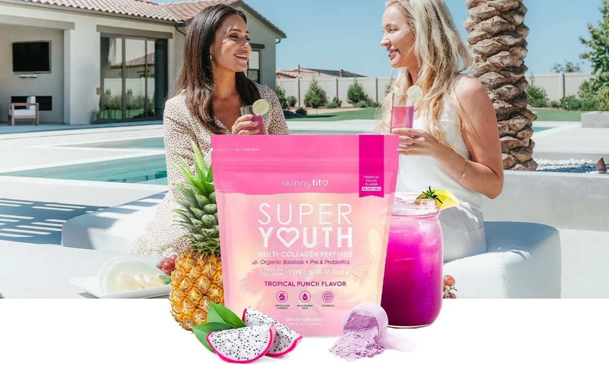
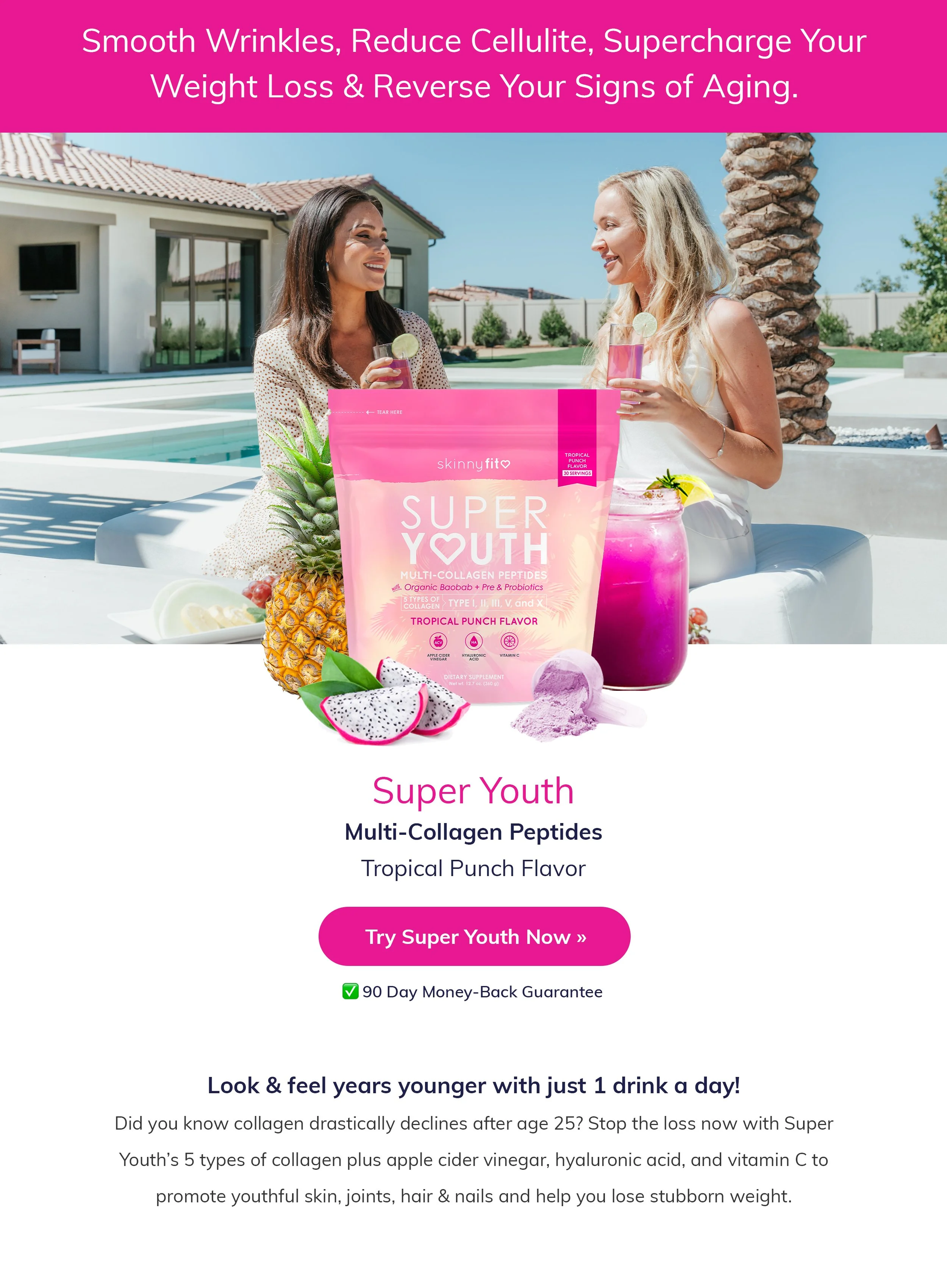
The hero section was redesigned to create a clear, welcoming first impression. The headline sits in a SkinnyFit pink color block for instant readability, paired with an aspirational lifestyle photo that sets a natural, inviting tone. A refreshed product rendering showcases the packaging, flavor cues, drink, and scoop at a glance, with the product name, flavor, and a direct CTA placed beneath it to guide users from the first fold.
Results That Speak for Themselves
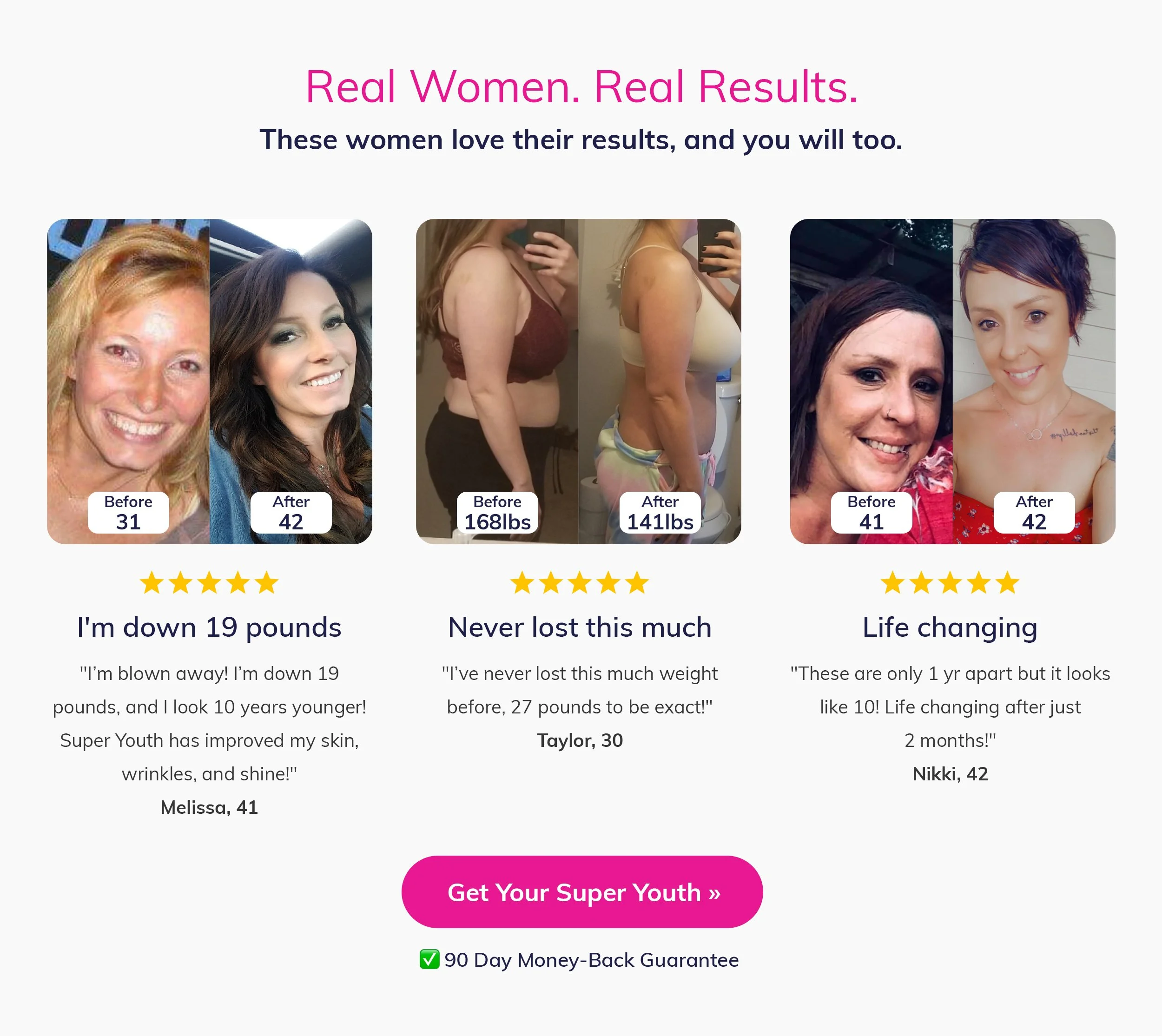
The testimonials section was moved to section 2 to build trust early in the user journey. Before & after photos are some of our strongest-performing assets in direct response, so highlighting three real customer transformations immediately validates the product’s weight-loss and skin benefits. Featuring these results near the top of the page boosts credibility, sets clear expectations, and gives users the confidence to continue scrolling and learn more about how the product works.
Benefits That Matter
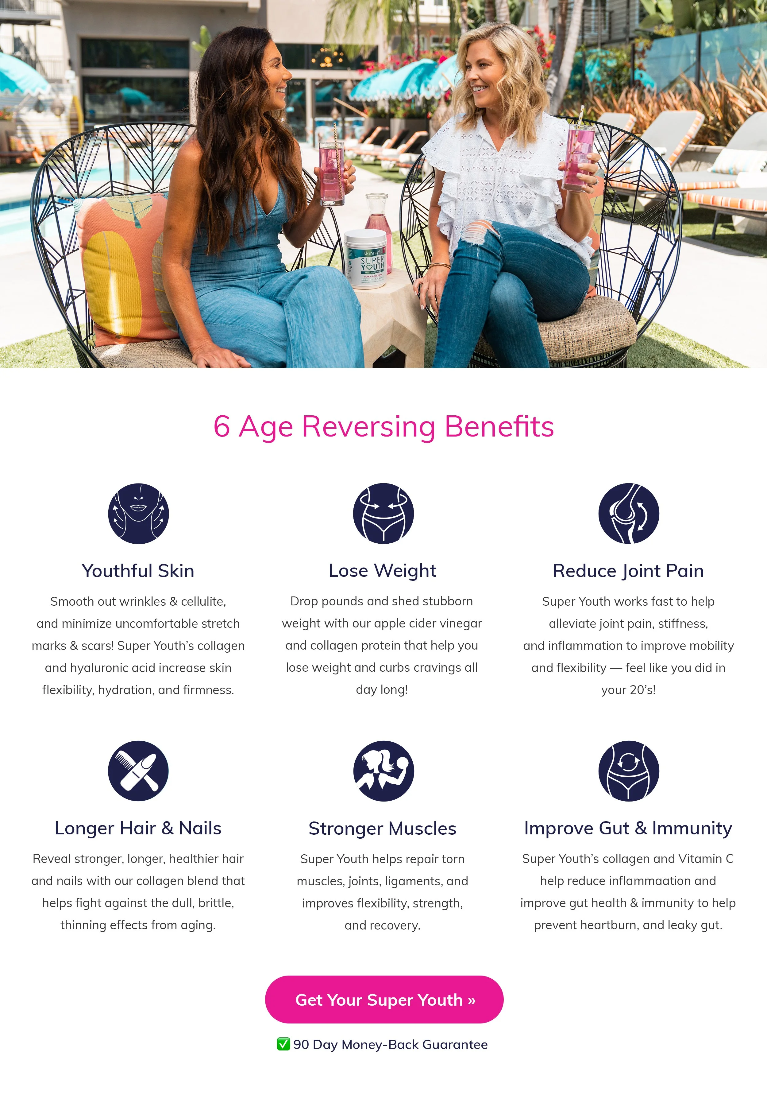
The benefits section uses another aspirational lifestyle photo to reinforce the positive, everyday experience of using SkinnyFit. Below it, six icon-driven benefits provide a quick, easy-to-scan overview of the product’s key advantages. This template is consistent across all products, giving users a clear and trustworthy snapshot of how SkinnyFit supports their goals.
Five Types for Better Results
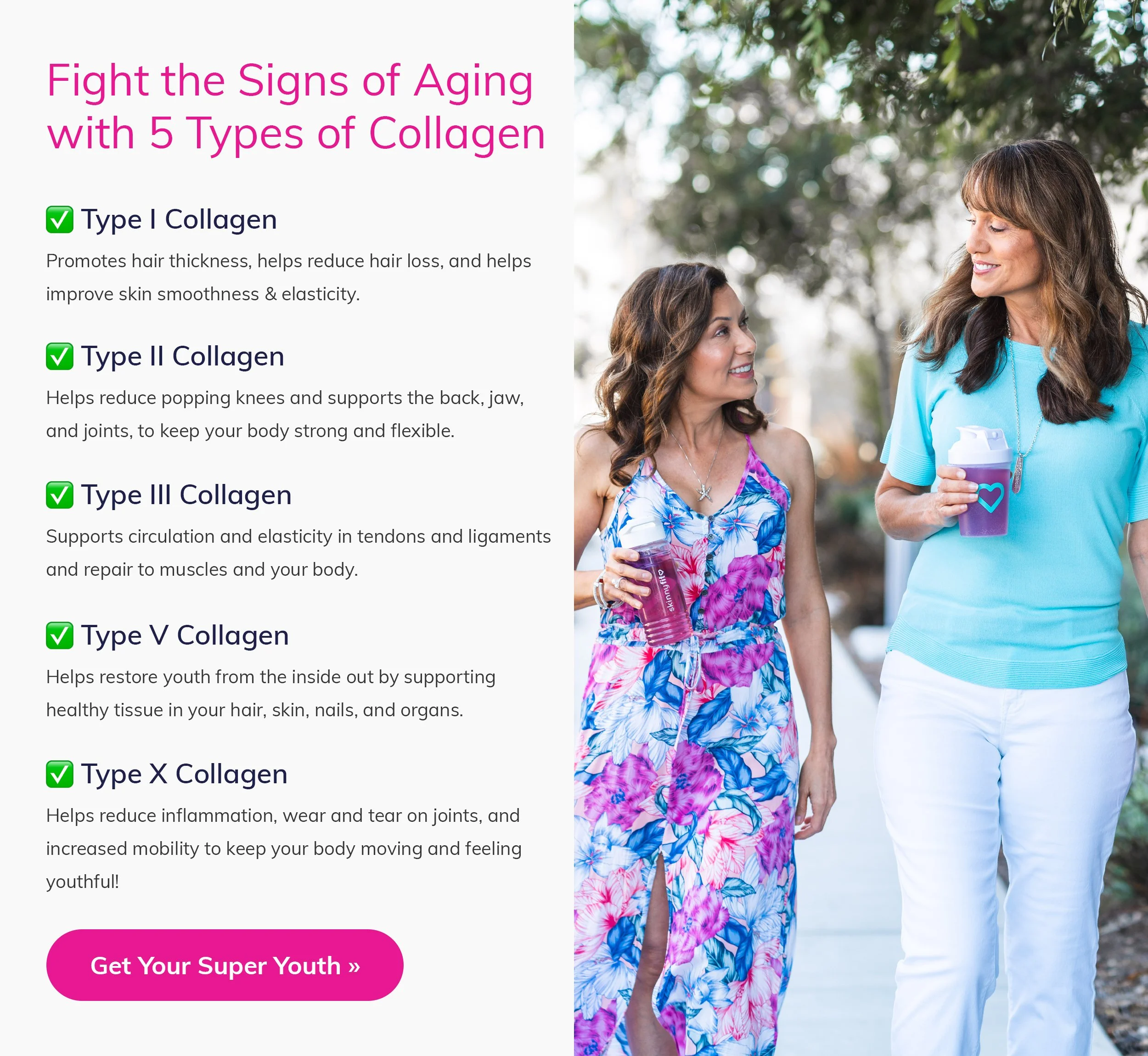
SkinnyFit’s collagens stand out by including all five types — I, II, III, V, and X — giving users a more complete, full-spectrum formula than most options on the market. To spotlight this differentiator, this section uses a split layout with benefit-driven content on the left and an aspirational lifestyle image on the right. The design balances clear education with emotional appeal, helping users understand both what’s inside the product and why it matters for their results.
All-Natural Ingredients You Can Trust
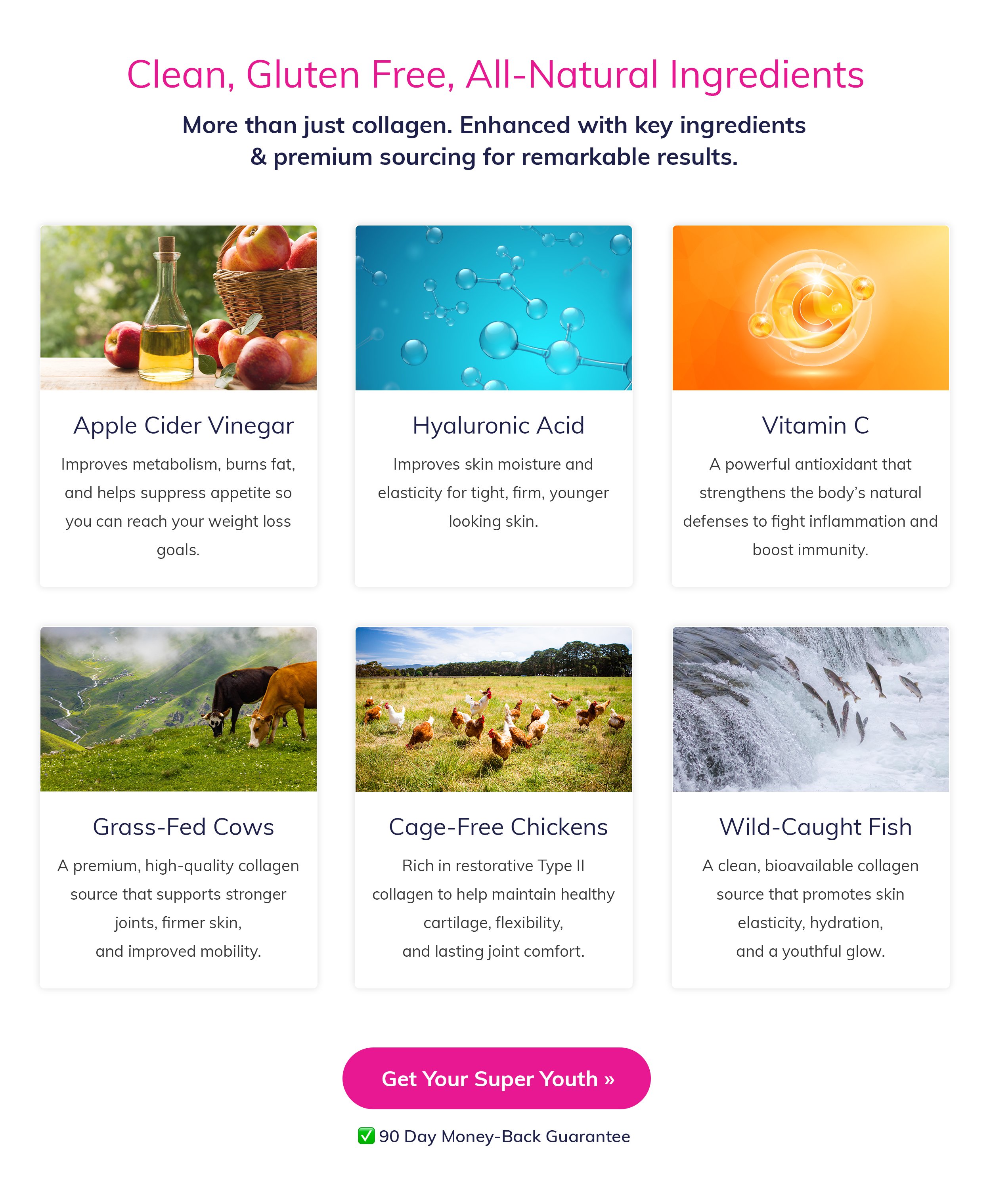
This section highlights SkinnyFit’s commitment to clean, all-natural ingredients. Each product showcases six key ingredients — carefully selected and often trending — that users already know and trust. By presenting these ingredients with clear benefits, this section helps reinforce transparency, strengthen credibility, and show exactly what makes each formula effective.
Simple Steps to Get Started
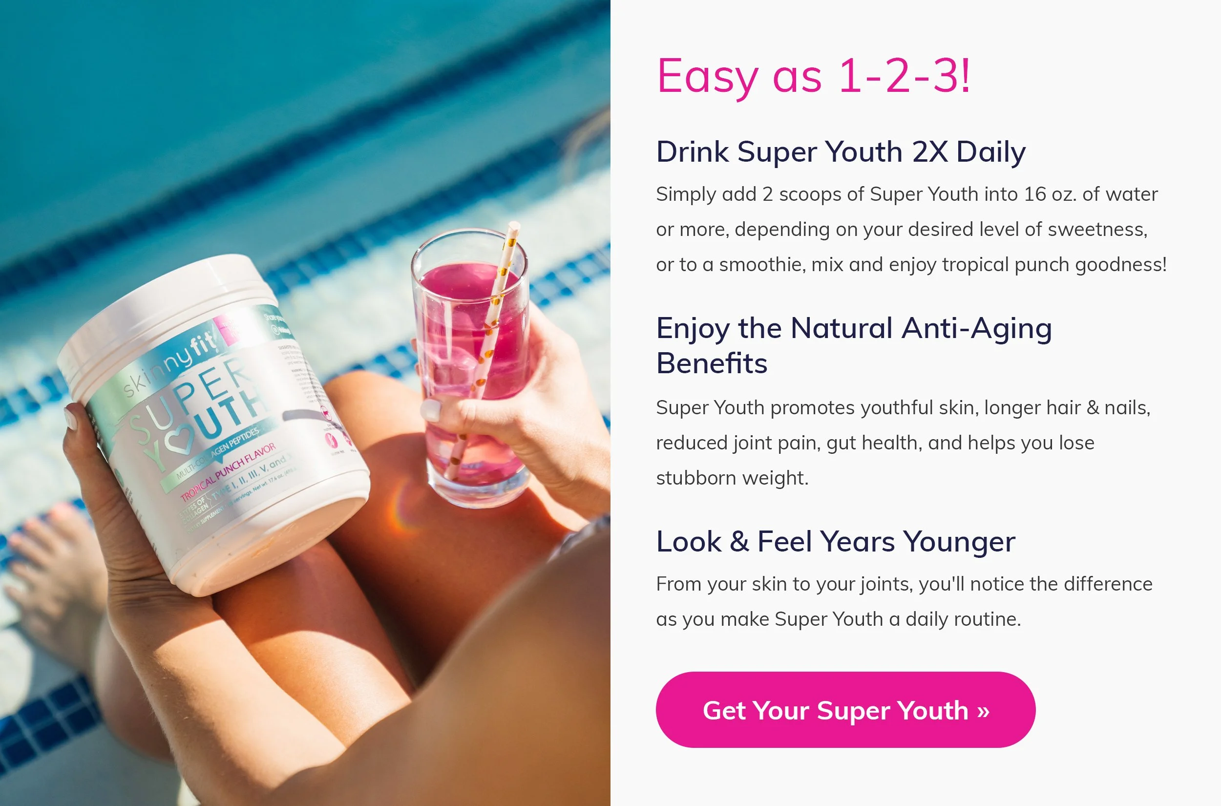
This section walks users through a simple three-step process for using the product, making it easy for anyone to get started. The module is split with a supportive instructional image on the left and clear, concise steps on the right, creating a straightforward flow that’s easy to follow. Every product uses this same format, giving users a familiar, consistent guide and reinforcing how effortless it is to incorporate SkinnyFit into their daily routine.
Shop With Confidence
The 90-day money-back guarantee is one of SkinnyFit’s strongest conversion drivers, reducing hesitation and giving customers confidence to buy risk-free. In previous designs it wasn’t highlighted well, so I elevated this section with a warm lifestyle image of happy SkinnyFit customers to create a more inviting, trustworthy moment. Giving the guarantee more visual weight helps remove resistance and encourages users to move forward.
What Customers Ask Most
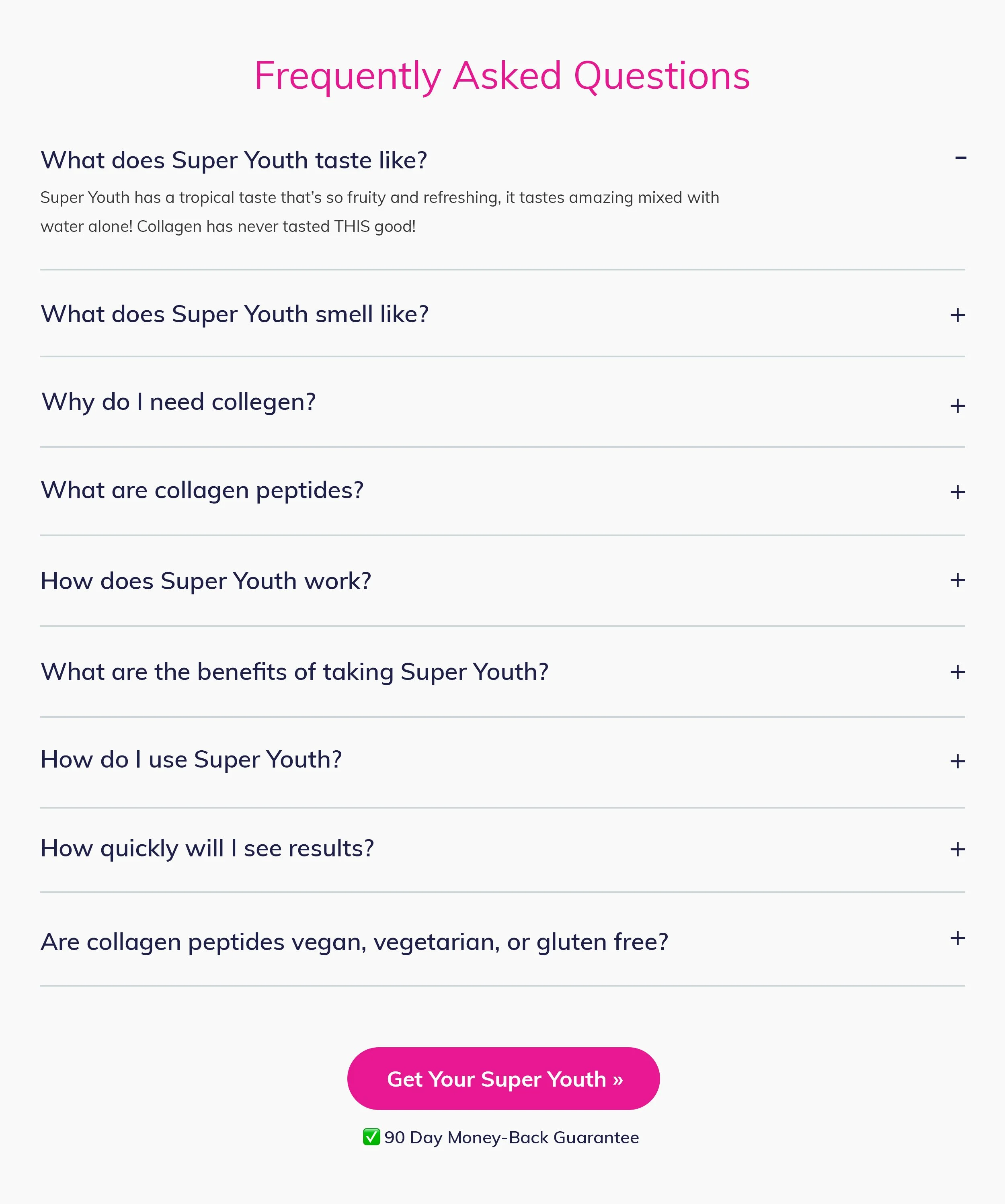
This section uses an accordion-style layout to keep all questions visible while keeping answers neatly collapsed. It allows users to quickly scan for what they need without overwhelming the page or taking up valuable real estate. By making information easy to access and digest, this section helps remove resistance, address common concerns, and support users as they move toward a confident purchase.
Three Options, One Easy Decision
The pricing table presents three clear options — 1, 2, or 3 products — making it easy for users to compare at a glance. I designed this section to be clean, distraction-free, and visually organized so the value of each offer is immediately understood. With savings increasing as users buy more, the layout highlights the best deal without overwhelming the page, helping guide customers toward the option that fits their needs and budget.
A Cleaner, More Branded Footer
The footer was redesigned to be cleaner, more organized, and far easier to read. The previous landers didn’t feature the SkinnyFit logo anywhere on the page, so I incorporated it here to strengthen brand recognition and create a more cohesive experience. By simplifying the layout and improving legibility, this new footer provides a polished, trustworthy ending to the page while reinforcing the SkinnyFit identity.
Product Line
Scaled Across 15 SkinnyFit Products
Super Youth
Tropical Punch
Super Youth
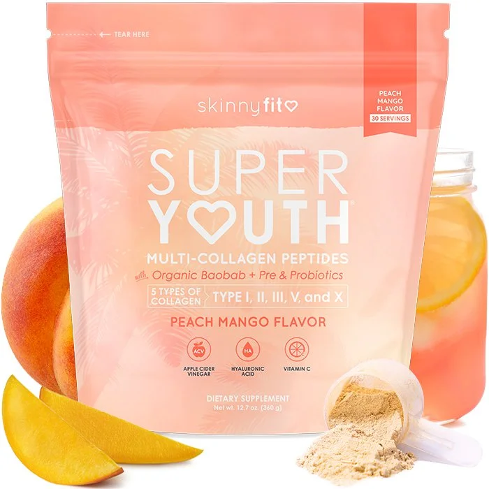
Peach Mango
Super Youth
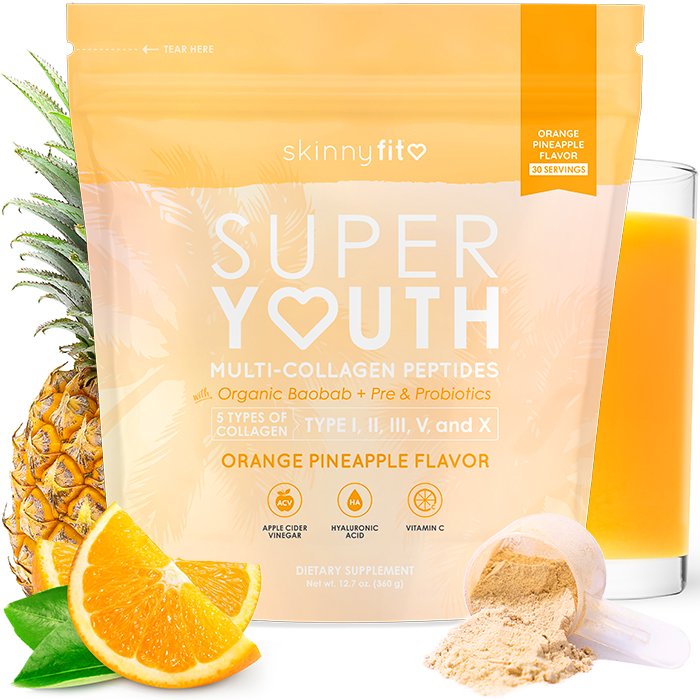
Orange Pineapple
Super Youth
Strawberry Watermelon
Super Youth
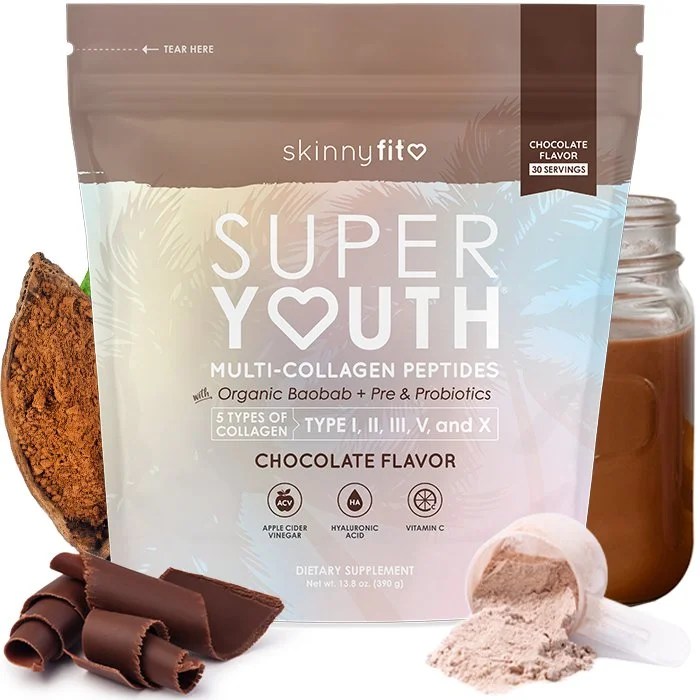
Chocolate
Super Youth
Unflavored
Liquid Collagen
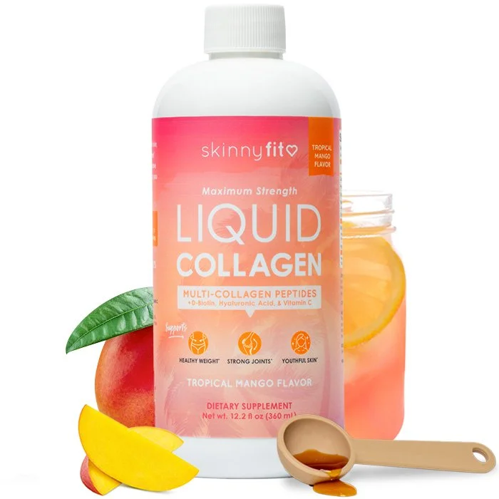
Tropical Mango
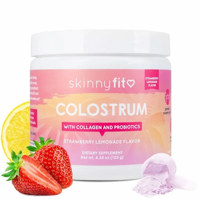
Colostrum
Strawberry Lemonade
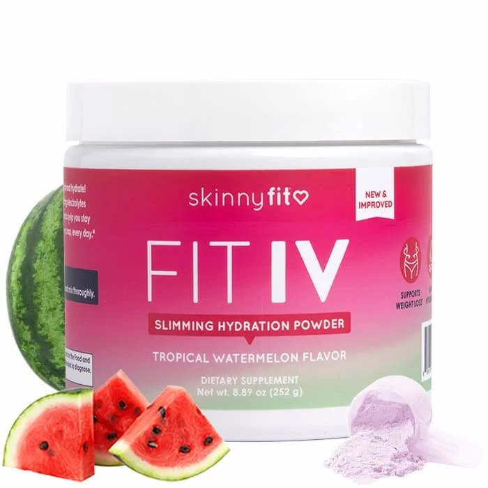
Fit IV
Tropical Watermelon
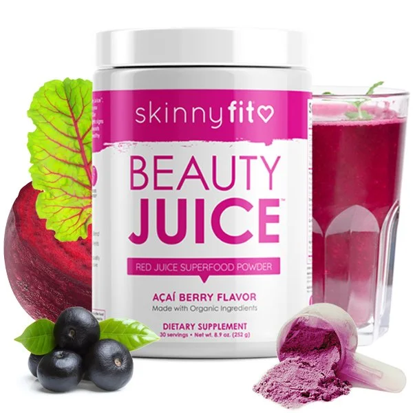
Beauty Juice
Acai Berry
Skinny Greens
Green Apple
Skinny Greens
Mango Splash
Detox
Peach
GLP-1 Natural
w/ Berberine
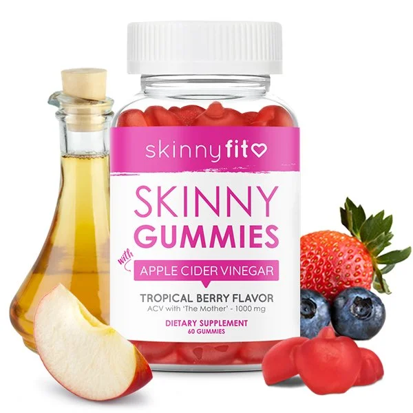
Skinny Gummies
Tropical Berry

