Rebuilding the FitFinder into a Modern, Confidence-Driven Discovery Experience
My Role: Lead Designer • Creative Direction • UX/UI + Web Strategy
Inside This Project:
Overview
Redesigning the Decision Framework Behind the FitFinder Experience
UX + UI DESIGN
Road Runner Sports is a premier retailer known for helping runners and athletes find high-performance footwear tailored to their individual needs. As the UX/UI designer leading the redesign of the FitFinder experience, I transformed an outdated digital tool into a modern, performance-driven discovery platform that better aligned with the brand and guided users more confidently toward the right product.
The Challenge
The existing ShoeDog shoe finder was visually inconsistent, difficult to navigate, and disconnected from the premium, performance-focused identity of Road Runner Sports. Its static, multi-page flow created unnecessary friction and cognitive load, particularly on mobile, limiting engagement and reducing confidence in the recommendation process.
The challenge was to reimagine the experience as a streamlined, interactive discovery system that simplified progression, reinforced brand credibility, and improved how customers moved from assessment to product selection.
Discovery
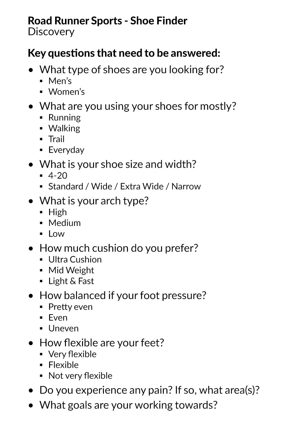
Asking the Right Questions
After meeting with the Senior Product Developer, we aligned on one clear priority: asking the right questions. By focusing on what truly mattered to athletes—their goals, preferences, and pain points—we could create a more personalized and engaging experience. This approach aimed to not only guide users to their perfect fit but also turn first-time visitors into confident, loyal customers.
Project Roadmap
A Better Experience, Built in Phases
Approaching the redesign in phases—starting with usability and mobile optimization, then evolving toward a sleek, performance-driven interface built for today’s digital athlete.

Phase 1: Mobile Optimization
The first phase addressed mobile usability. I restructured the flow for small screens, simplifying interactions and prioritizing speed. This allowed users to complete all eight steps in under three minutes while maintaining clarity, accessibility, and engagement on any mobile device.

Phase 2: Responsive Design
The original experience was desktop-only, creating friction for most users. I implemented a responsive framework with fluid layouts and scalable components to ensure adaptability across devices. This approach streamlined development and delivered a cohesive experience that felt native on every screen.
Design Phase
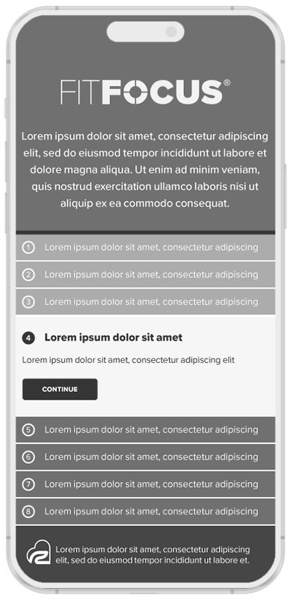
Wireframes
The wireframes established the structural blueprint for the UI components and interactive features developed in later phases.


Updated Features
Simplified Introduction
The original ShoeDog introduction page was visually dense and failed to orient users. I simplified the composition with targeted imagery, clear messaging, and structured hierarchy to create a more intuitive and engaging first impression.

Old Introduction

Redesigned Introduction
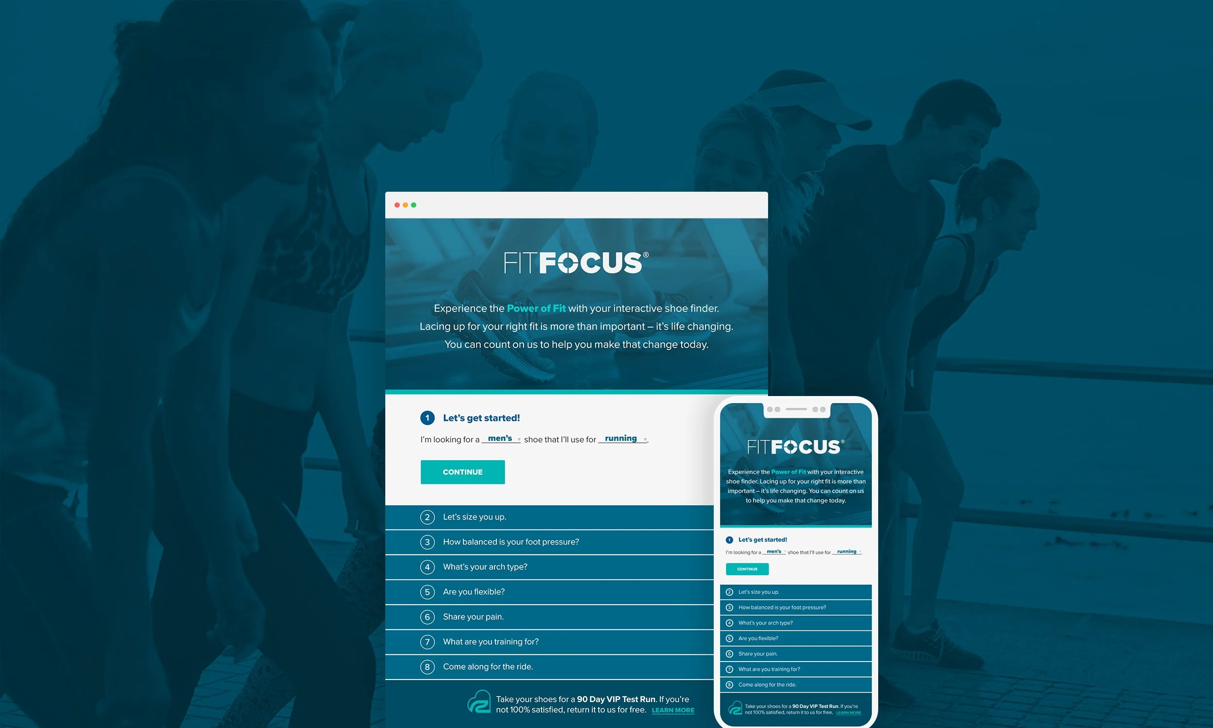
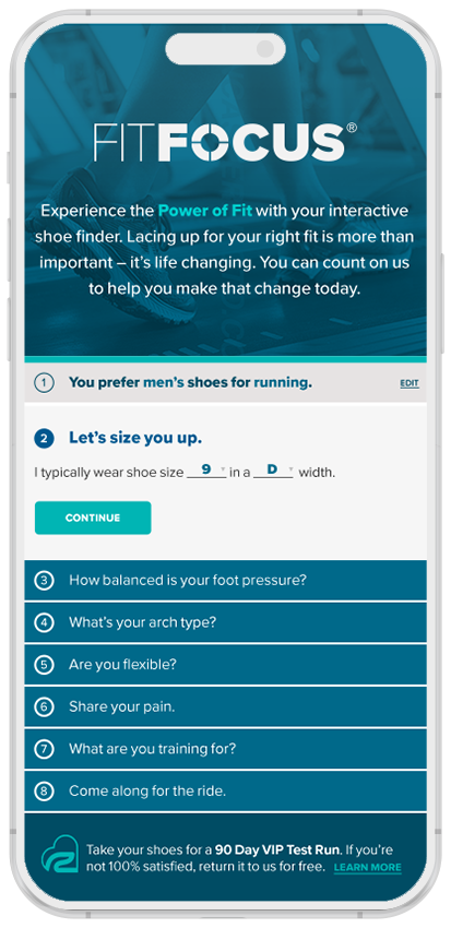
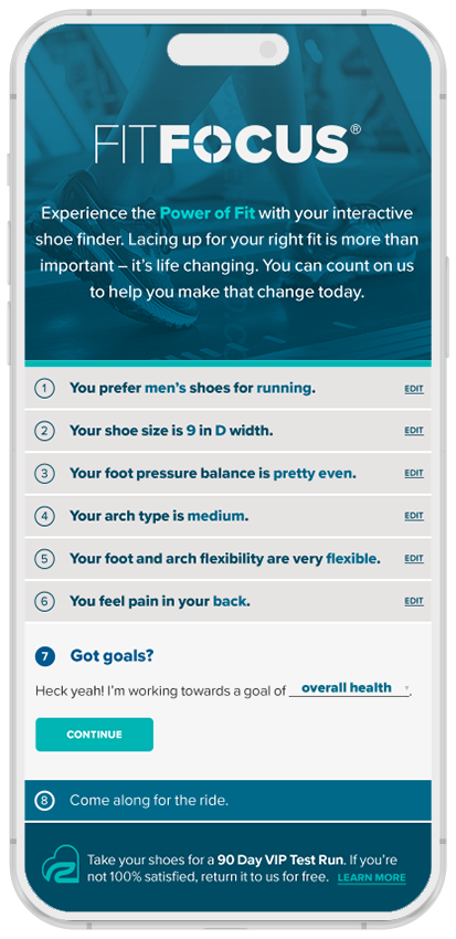
Streamlined Interaction Design
I redesigned the question flow from a static, multi-page format to a dynamic accordion layout, creating a more seamless and intuitive interaction. This update improved visibility of progress, reduced friction, and encouraged task completion within a single responsive experience.

Old Interaction Design

Redesigned Interaction Design
Modernized Results Page
The original results page offered only one product, creating a narrow and underwhelming experience. I restructured it to highlight a primary recommendation supported by alternative options and related accessories, expanding user choice and enhancing visual hierarchy to drive engagement and conversion.

Old Results Page

Redesigned Results Page


Business Impact
Modernized Performance-Driven Discovery Experience
Rebuilt the legacy shoe finder into a streamlined, brand-aligned discovery platform with clearer progression and improved mobile responsiveness.
Reduced cognitive load, strengthened usability, and enabled more confident product matching.
Improved Interaction Flow and Mobile Engagement
Redesigned the assessment flow into a dynamic, step-based experience that emphasized clarity, momentum, and task completion.
Accelerated user progression, minimized abandonment risk, and improved overall engagement across devices.
Expanded Decision Support and User Confidence
Expanded the results experience to highlight primary recommendations alongside alternatives and complementary options.
Increased transparency, reinforced decision confidence, and encouraged deeper product exploration.