
Bringing Direct-Response Thinking Across the Customer Journey
My Role Lead Designer • Direct-Response Design • Email Design • Digital Advertising
Project Breakdown:
Overview
Taking My Direct-Response Experience Somewhere New
DIRECT RESPONSE
LANDING PAGE DESIGN
EMAIL DESIGN
DIGITAL ADVERTISING
Miami MD was one of several brands under Brand Bolt, a direct-response company focused on building and scaling health, wellness and beauty DTC brands.
I joined them for a short freelance stint while I was still working full-time at Smashtech. By that point, direct response was very familiar territory. Landing pages. Emails. Display ads. Understanding how each piece moved someone toward a purchase.
For Miami MD, I brought that experience across the funnel. I designed a long-form landing page, ongoing email creative, and display advertising that all worked within the same conversion-focused system.
So, yes… all those years immersed in direct response. This was definitely in my wheelhouse.
The Challenge
Miami MD already had the product story. The challenge was figuring out how to sell it clearly.
Clinical skincare can get complicated fast. Ingredients. Benefits. Claims. Science. Proof. There was a lot to communicate, especially in a direct-response environment where every section needed to keep someone moving.
The creative had to make all of that easier to understand without losing credibility. Then that same story had to work across a long-form landing page, emails, and display ads with very different amounts of space.
Same strategy. Different formats. Different jobs to do.
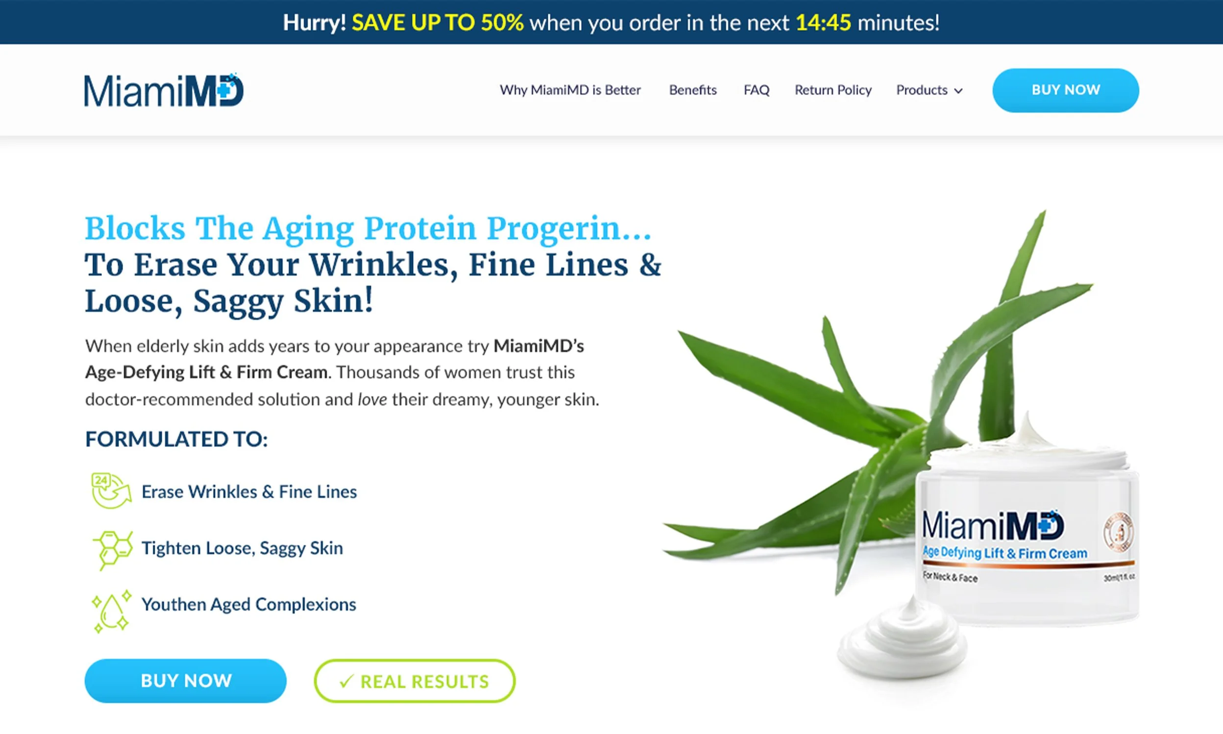
The Landing Page
Making the Science Easier to Understand.
And Easier to Buy.
Miami MD had a lot to explain. The science behind the formula. How aging affects the skin. Why the ingredients worked. And, of course, why someone should actually buy it.
The landing page had to organize all of that into a story that was easy to follow.
I used clear sections to move from problem to solution. Education into benefits. Benefits into proof. Clinical information was balanced with before-and-afters, testimonials, product details, guarantees, and repeated opportunities to purchase.
There was a lot of information. So hierarchy mattered. Every section needed to answer the next question without making the page feel like homework.
And because this was direct response, the page couldn’t just look polished. It needed to keep moving.
The Ultimate Goal: Make a lot of information feel like… not a lot of information.

Email Marketing
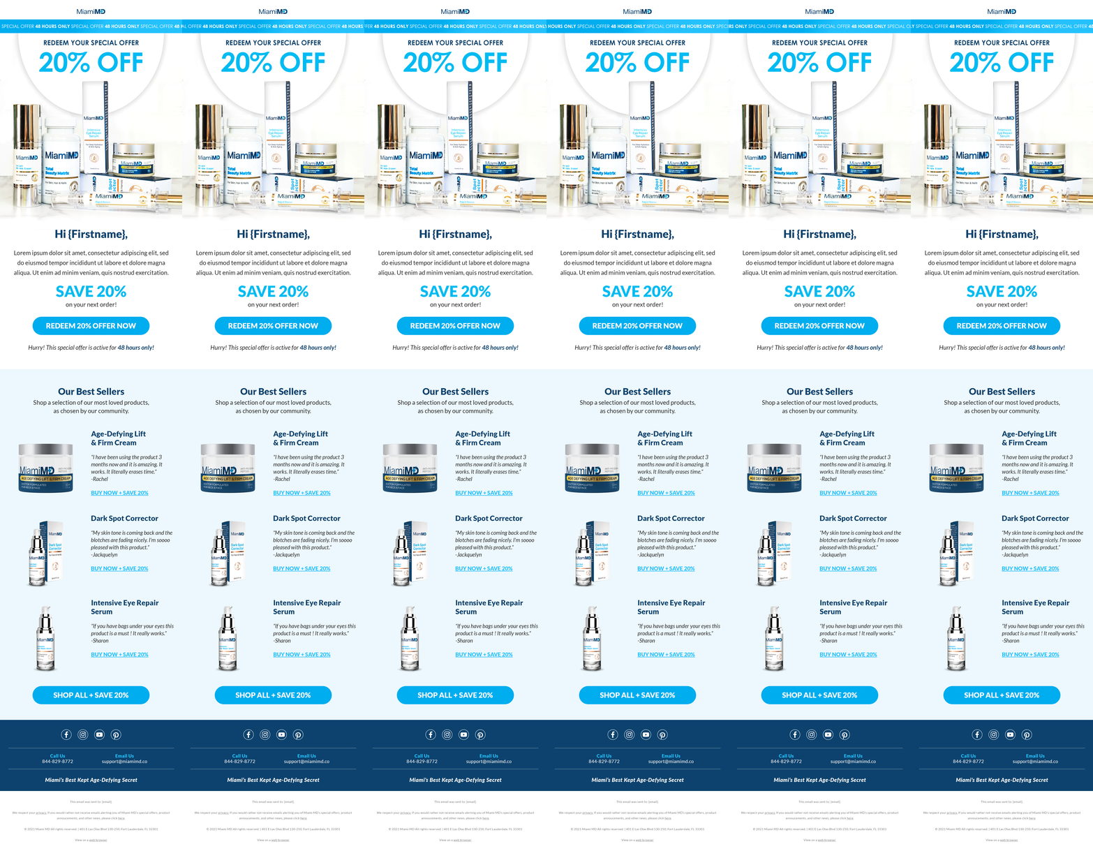
Welcome Series
Giving New Customers a Proper Welcome
One of my first initiatives for Miami MD was creating the brand’s first automated welcome series. The idea was simple. Someone just made their first purchase. Instead of ending the conversation there, we had an opportunity to introduce the brand, build a little more trust, and give them a reason to come back.
I developed a three-email flow that welcomed new customers, shared more of the Miami MD story, introduced other products, and finished with an offer toward their next purchase. It was designed, proposed, and launched pretty quickly. A small addition to the customer journey, but one that gave the brand a new way to keep the relationship going.
Because saying “thanks for your order” and disappearing felt like a missed opportunity.


Product Launch • Dark Spot Corrector
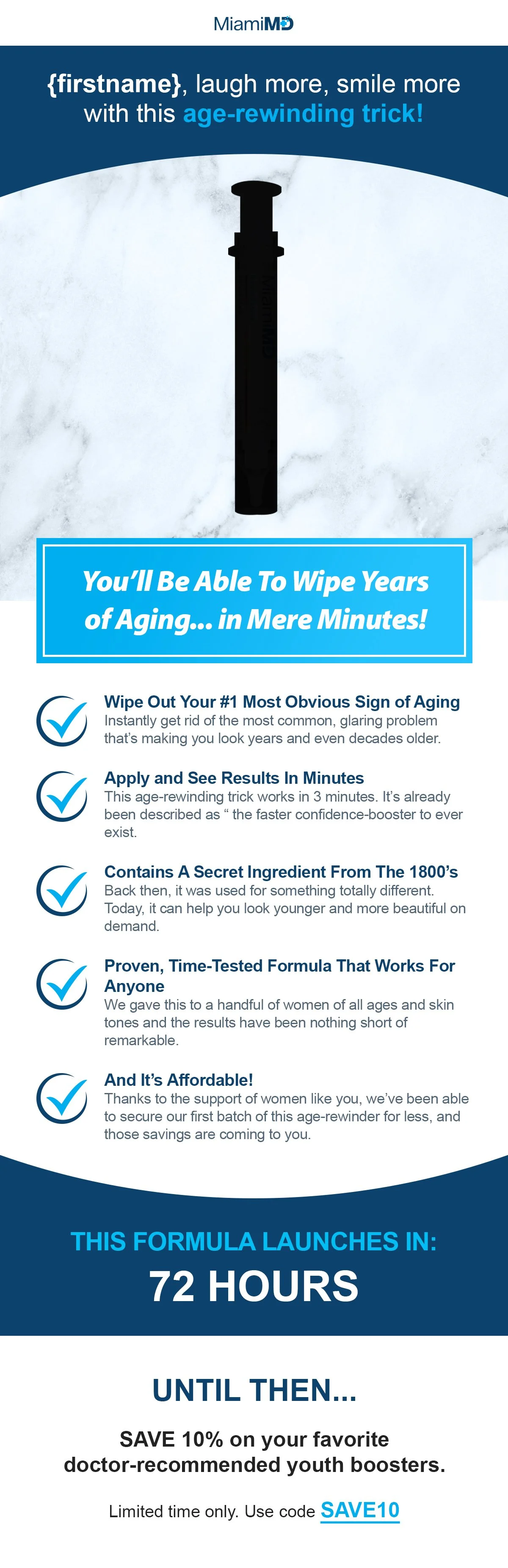
Building Anticipation Before the Product Even Dropped
For the launch of Miami MD’s Dark Spot Corrector, I designed a three-email series that introduced the product one step at a time.
The first email teased what was coming. The second brought the problem to life through a customer story and dermatologist credibility. Then the final email revealed the product, broke down the ingredients, and gave customers a reason to buy. Each email had its own job. But together, they built toward the same moment.



Product Launch • Rapid Revive
When the Product Needed a Little More Explaining
Rapid Revive needed a different approach. It was a lower-priced product, but there was more to explain. What it did. Why it worked. Where it fit into someone’s routine. So instead of keeping the emails short, we leaned into a longer direct-response format.
I designed a four-email series that gave the product story more room to unfold. The creative stayed simple. Clear hierarchy. Plenty of breathing room. And space for the copy to actually do its job. The goal wasn’t to cram everything into one message. It was to give customers enough information to understand the value before asking them to buy.



Digital Advertising
Taking the Campaign Beyond the Landing Page
I also created display advertising to support Miami MD’s broader direct-response campaigns. The challenge was fitting the same product story into much smaller spaces. Less copy. Faster hierarchy. One clear message.
Each campaign was adapted across multiple sizes and placements while keeping the offer, product, and call to action easy to understand at a glance.
There really wasn’t much room to overthink it.