Rebuilding Kelly’s Running Warehouse for Scalable eCommerce Growth
My Role: Lead Designer • Creative Direction • eCommerce Strategy
Inside This Project:
Overview
Modernizing the Commerce Architecture to Support Performance and Inventory Growth
WEBSITE DESIGN ECOMMERCE
Kelly’s Running Warehouse was an online retailer offering discounted athletic footwear, apparel, and gear from leading national brands. When I joined the team, the eCommerce experience was outdated and limiting growth. I partnered with the eCommerce Revenue Manager to lead a full platform redesign, modernizing the user experience, optimizing for mobile-first behavior, and rebuilding the site to better support inventory movement and performance-driven sales.
The Challenge
The existing site was non-responsive and difficult to navigate, creating friction throughout the shopping journey and restricting sales growth. Product discovery lacked efficiency, merchandising opportunities were underutilized, and mobile performance did not reflect modern ecommerce standards. The challenge was to reimagine the platform from the ground up, creating a streamlined, conversion-focused experience that improved usability, supported promotional strategy, and aligned with the company’s goal of accelerating inventory turnover.
The Pitch
From Pitch to Production:
How My Vision Was Chosen
Before the redesign began, I was invited to pitch my concept for a new Kelly’s Running Warehouse website. My goal was to present a clear creative direction that modernized the brand’s digital presence, enhanced usability, and delivered a clean, conversion-focused experience for value-driven shoppers. This pitch deck outlined my design rationale, competitive insights, and the user-centered strategy that shaped the final website.

The Approach
Kelly’s Running Warehouse needed more than a design facelift — it needed a strategic digital transformation. In an oversaturated eCommerce landscape filled with competing sports retailers, the site had to stand out through usability, storytelling, and visual appeal. The redesign focused on elevating the user experience to meet modern expectations: fast, mobile-first, and emotionally resonant.
Building on that foundation, my approach centered on uncovering what truly mattered to shoppers: simplicity, speed, and trust. By addressing mobile usability challenges, enhancing product filtering, and introducing bold, modern design elements, I aimed to create a seamless digital experience that motivated exploration, reduced bounce rates, and reestablished Kelly’s Running Warehouse as a reliable destination for deals and performance.

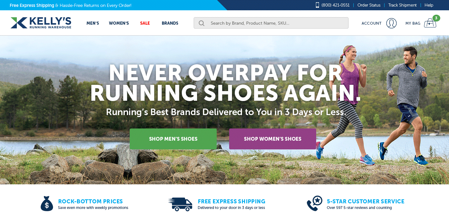
Header
The redesigned Header established a clear, intuitive framework for navigation while maximizing visibility for promotions and key user actions. A dedicated channel ribbon banner was introduced at the very top of the page to feature promotional offers in a visually engaging way—helping drive awareness, clicks, and conversions.
Below that, a new sticky navigation bar ensured effortless access to essential site functions, including Search, Cart, Shop By, Order Status, My Account, and Help. Centering the Kelly’s Running Warehouse logo provided visual balance and brand recognition, while the organized layout supported quick, goal-oriented browsing. Together, these updates enhanced usability, strengthened brand presence, and improved the overall shopping experience across all devices.


Hero
The Hero area serves as the primary storytelling space of the homepage — where product discovery, brand energy, and visual engagement meet. Road Runner Sports received new vendor creative on a weekly basis to promote the latest product launches and campaigns. By repurposing this existing creative for Kelly’s Running Warehouse, we were able to feature fresh, on-brand content without additional production time or cost, ensuring visitors always saw the newest and most relevant products.
From a UX standpoint, the redesigned hero carousel was limited to four banners to maintain focus and reduce cognitive overload. Each slide balanced bold imagery with clear messaging and a strong call-to-action, driving both engagement and conversion. This approach created an adaptable, data-informed framework that kept the experience dynamic while prioritizing usability and visual consistency across devices.


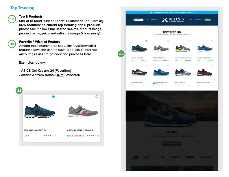
Featured Products & Wishlist
To highlight trending items and support repeat engagement, I designed a “Top 8 Products” section showcasing the most-purchased styles—complete with product imagery, pricing, and ratings for quick comparison. This provided social proof and guided users toward best-selling inventory.
In addition, I introduced a Favorites / Wishlist feature that allowed shoppers to save products of interest for later. From a UX perspective, this added personalization, encouraged return visits, and created a more seamless path from browsing to purchase.
Shop by Activity
The Shop by Activity section was designed to help users quickly find footwear tailored to their specific sport or lifestyle—whether running, hiking, training, or casual wear. By pairing each activity with vivid, scenic imagery that reflects its terrain, the design connects emotion and function, making the experience both visually engaging and purpose-driven.
From a UX standpoint, this section simplifies product discovery and guides intent-based browsing. Each category includes clear descriptions that answer what, how, and why—supported by direct calls-to-action linking to curated product collections. The result is a visually cohesive and intuitive layout that inspires exploration while improving path-to-purchase efficiency.


Brand Bar
The Brand Bar section highlights a curated selection of top-performing brands, giving visitors instant recognition and reinforcing Kelly’s Running Warehouse as a trusted retailer for leading athletic names. Displaying familiar logos builds credibility and helps users quickly identify the brands they know and love, while the “View All Brands” link provides an easy path to explore the full assortment.

Shop by Category
The Shop by Category section serves as both a shopping gateway and a storytelling opportunity—inviting visitors to explore Kelly’s Running Warehouse’s full range of footwear, apparel, and accessories in an engaging, visually organized format. More than just a navigation element, it positions the brand as a resource for discovery, highlighting the latest product trends, seasonal must-haves, and performance-driven essentials.
From a marketing perspective, this section bridges inspiration and conversion. Each category tile acts as a mini campaign—pairing compelling imagery, concise copy, and clear calls-to-action that motivate exploration and purchase. Designed to be responsive and highly visual, it encourages shoppers to browse across multiple product lines, increasing session duration and cross-category engagement. By aligning aesthetic appeal with commercial intent, the Shop by Category section transforms simple browsing into a guided, conversion-focused experience.


Sale
The Sale section highlights limited-time offers and discounted products, giving visitors a clear and compelling reason to convert. By showcasing the markdown price alongside the original retail value, the design emphasizes savings while reinforcing Kelly’s Running Warehouse’s position as the ultimate destination for high-quality gear at unbeatable prices.

Email Capture & Footer
The Email Capture module invites visitors to join the Kelly’s Running Warehouse community by offering an exclusive 20% off their first order in exchange for subscribing. This not only incentivizes immediate engagement but also supports long-term customer retention through ongoing email marketing campaigns. Strategically placed near the bottom of key pages, the form provides a low-friction way for users to stay connected and for the brand to build a qualified audience for future promotions.
The Footer serves as the website’s foundation for navigation and brand storytelling. It provides a concise introduction to Kelly’s Running Warehouse while offering quick links to essential areas such as Customer Care, Get to Know Us, Popular Brands, and Stay Connected. From a UX and marketing standpoint, the footer balances utility with brand personality—creating a consistent touchpoint that enhances trust, accessibility, and engagement across the entire shopping experience.


Key Features Redesigned
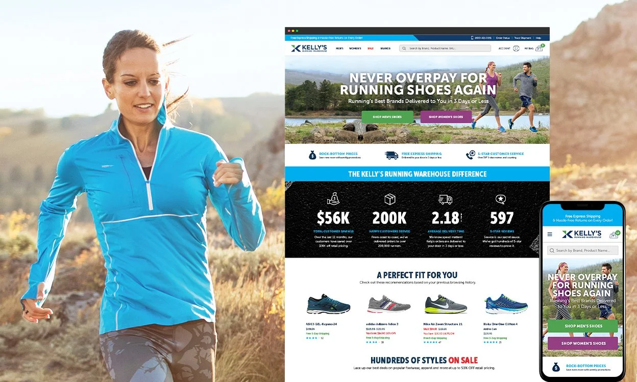
Homepage
Hero imagery, value propositions, and social proof come together to position Kelly’s Running Warehouse as a trusted destination for value and performance. The announcement bar reinforces the brand’s strongest differentiator — Free Express Shipping & Hassle-Free Returns on Every Order — while a simplified navigation and larger search bar streamline discovery. Lifestyle imagery connects emotionally with both men’s and women’s audiences, creating an engaging first impression.
Below the fold, data-driven proof points highlight customer trust and brand success, from $56,000 in annual savings to nearly 600 five-star reviews. Simplified sections for best sellers, sale items, and featured brands guide conversion, while a reorganized footer and cleaner email capture keep the experience focused, consistent, and distinctly Kelly’s Running Warehouse.

Navigation
The navigation was redesigned for a cleaner, more intuitive experience that helps users find what they need faster. Core categories were simplified to four — Men’s, Women’s, Sale, and Brands — reducing clutter and improving focus. The expanded search bar supports brand, product, and SKU queries, while streamlined account access and a simplified “My Bag” enhance usability. The result is a navigation system that feels effortless, focused, and built for conversion.
Product Listing Page
The Product Listing Page was redesigned for clarity and ease of navigation. A cleaner UI with consistent typography, refined spacing, and simplified filters made browsing and comparing products effortless. From a UX standpoint, intuitive sorting, clear pricing, and responsive layouts created a seamless, conversion-focused shopping experience across all devices.

Product Detail Page
The Product Detail Page was simplified to create a clear, conversion-driven experience that highlights what matters most — the product. Meta navigation was introduced to organize content such as descriptions, specs, reviews, and sizing into easily accessible tabs, reducing scroll fatigue and visual clutter. Clean typography, strong imagery, and clear calls-to-action guide users naturally toward purchase, while the layout adapts seamlessly across devices to maintain consistency and trust throughout the shopping journey.

Old Website Design

Business Impact
Modernized the eCommerce Experience
Redesigned the site into a responsive, mobile-first ecommerce platform with clearer navigation, stronger hierarchy, and streamlined product discovery.
Reduced friction, elevated brand credibility, and aligned the shopping experience with modern retail expectations.
Strengthened Conversion and Merchandising Strategy
Introduced conversion-focused merchandising, enhanced filtering, improved PDP structure, and optimized promotional placements.
Improved product discoverability, clarified purchase paths, and supported stronger engagement from both new and returning shoppers.
Reinforced Brand Trust and Repeat Engagement
Elevated visual cohesion and strengthened value messaging, including free shipping, hassle-free returns, curated shopping experiences, wishlist functionality, and email capture incentives.
Increased trust signals, encouraged repeat interaction, and positioned the brand as a competitive, modern retail destination.