Transforming Legacy Partner Portals into a Cohesive Rewards Platform
My Role: Lead Designer • Creative Direction • UX & UI Design
Inside This Project:
Overview
Aligning Multi-Brand Portals with Enterprise UX and Brand Standards
INTERACTIVE DESIGN UI DESIGN
Rewards Network powers dining rewards programs for major travel and hospitality brands, enabling members to earn points seamlessly while dining out. As the Interactive and UI Designer, I led the visual and UX modernization of multiple partner portals, aligning each experience with its respective brand guidelines while improving usability, cohesion, and long-term scalability across the ecosystem.
The Challenge
Over time, each partner portal had evolved independently, resulting in inconsistent design systems, outdated UI patterns, and experiences that no longer reflected the visual standards of brands such as Hilton, IHG, and Orbitz. The lack of alignment created friction in brand perception and reduced the sense of trust and cohesion across the rewards ecosystem.
The challenge was to bring strategic brand consistency to each platform while respecting individual partner identities, delivering unique yet unified experiences that elevated usability, reinforced credibility, and aligned with enterprise-level brand expectations.

The Goals
Increase Membership Sign-Ups
Design an intuitive, conversion-focused experience that simplifies the sign-up flow and encourages new users to join the dining rewards program. Clear calls-to-action, visual hierarchy, and trust-building design elements were key to driving enrollment across each partner portal.
Improve the Loyalty Dining Member Experience
Enhance usability and engagement for existing members by streamlining navigation, refining content structure, and ensuring seamless access to account details and dining offers. The goal was to create a rewarding, user-friendly journey that encouraged continued participation.
Align Loyalty Dining Websites with Partner Branding
Bring each partner portal—Hilton HHonors, IHG Hotels, and Orbitz—into visual harmony with its parent brand. This required translating distinct brand guidelines into cohesive digital designs that maintained consistency while preserving each brand’s unique identity.
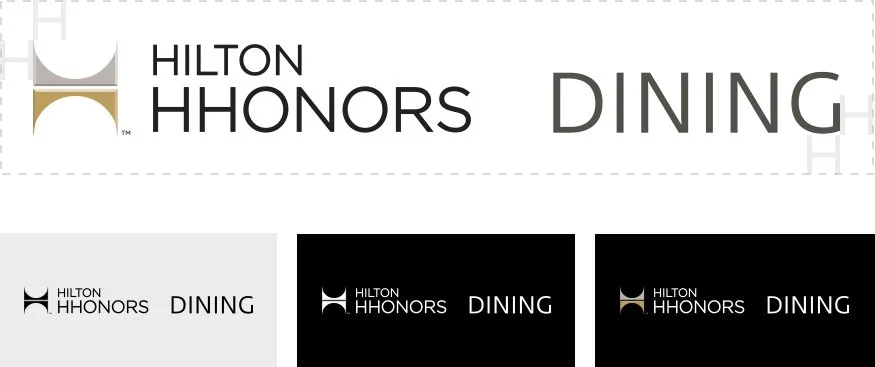
Brand Guidelines: Hilton HHonors
The HHonors Logo
All communication materials should feature the Hilton HHonors logo. Use the horizontal beveled logo whenever possible. On light backgrounds, use the black Hilton HHonors logo; on dark backgrounds, use the reversed version.
Typography
Large word or words of the main headline are in Benton Sans Bold; all other copy is set in the Fedra Sans Alt Pro typeface.

Color Palette
Hilton HHonors communications use a warm, sophisticated palette of tans and blues. Gradients should be applied to add depth and warmth, using the provided color values as a guide to achieve the desired tonal range.

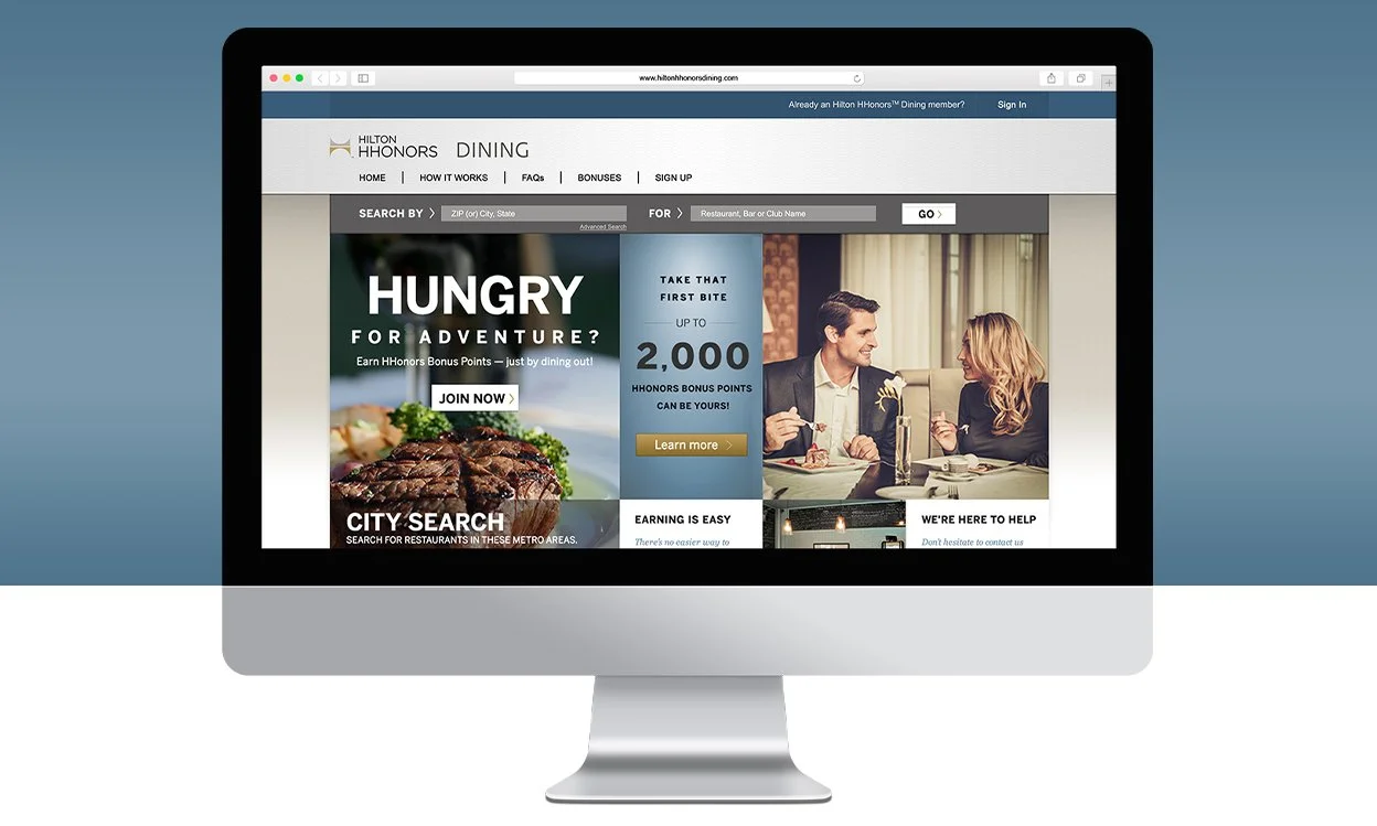
Hilton HHonors Dining
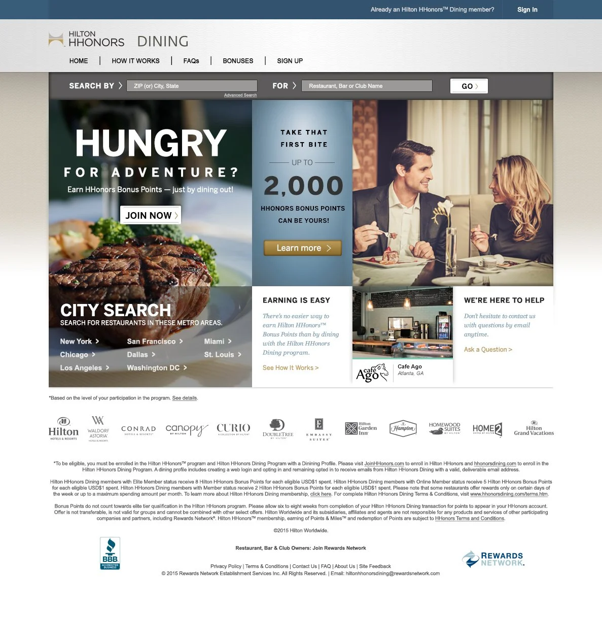
Homepage (Logged Out)

Homepage (Logged In)
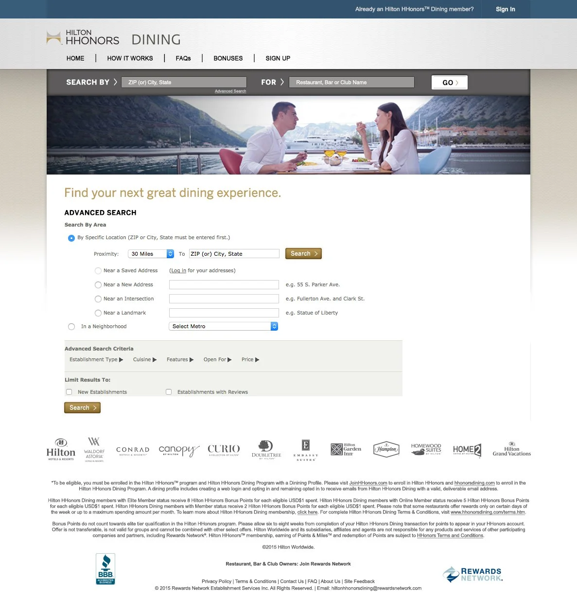
Advanced Search
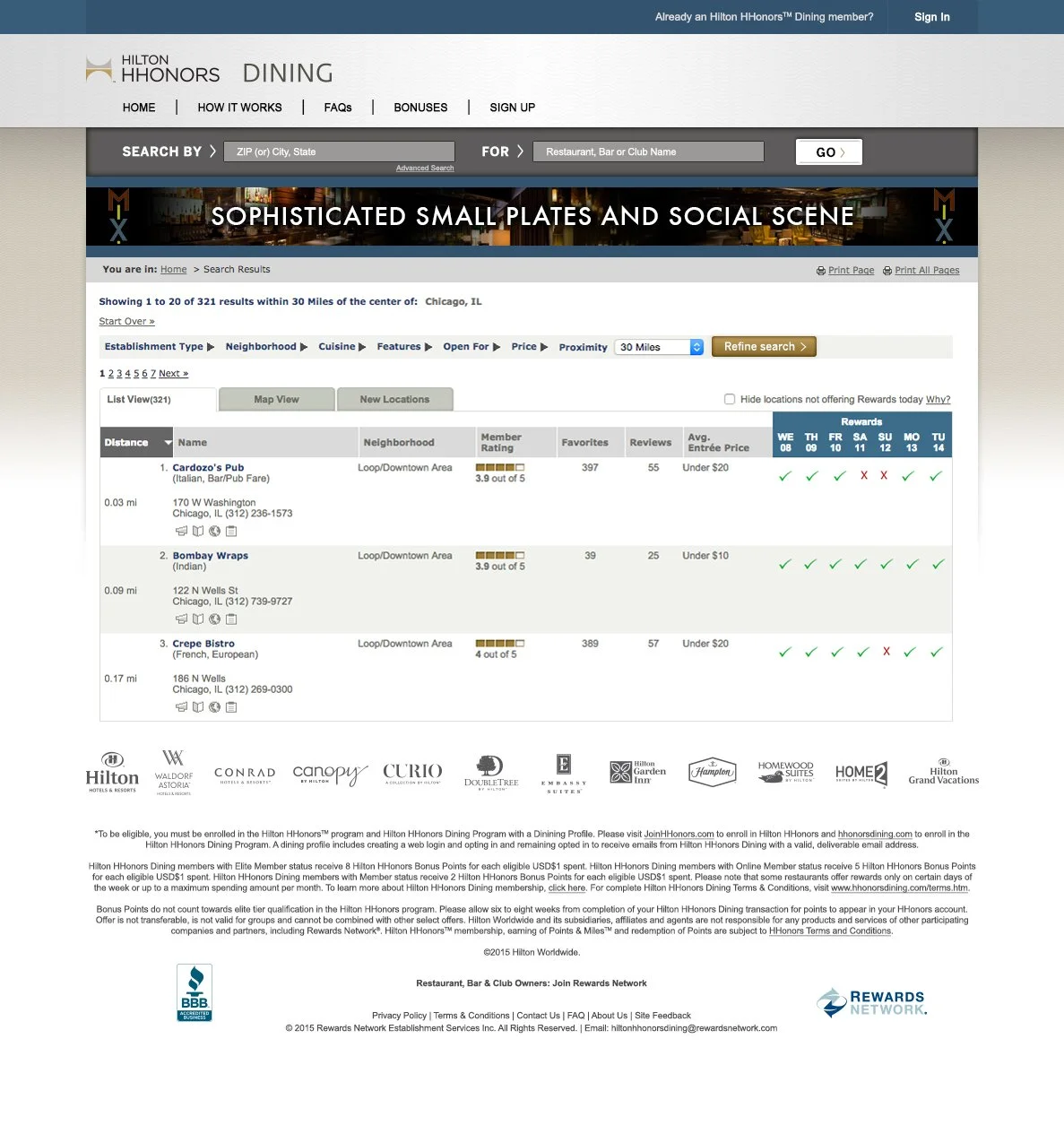
Search Results

Restaurant Detail Page
Brand Guidelines: IHG Rewards Club
The IHG Brand Mark
The brand mark is the signature of IHG’s visual identity, combining strong, modern typography with overlapping forms and warm color to express confidence, connection, and humanity.

Typography
IHG uses Chronicle Display for headlines, DIN for subheads and body text, and FS Clerkenwell for highlighted elements such as pull quotes.

Color Palette
IHG’s color palette is simple, bold, and distinctive, defined by three primary colors: Cherry, Grey, and Orange.

IHG Rewards Club Dine & Earn
Homepage (Logged Out)

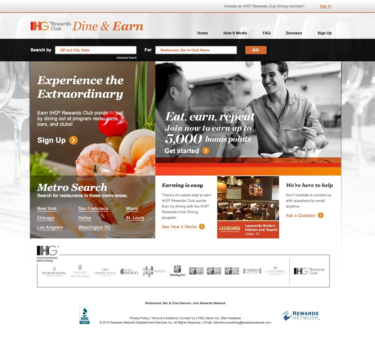
Homepage (Logged In)
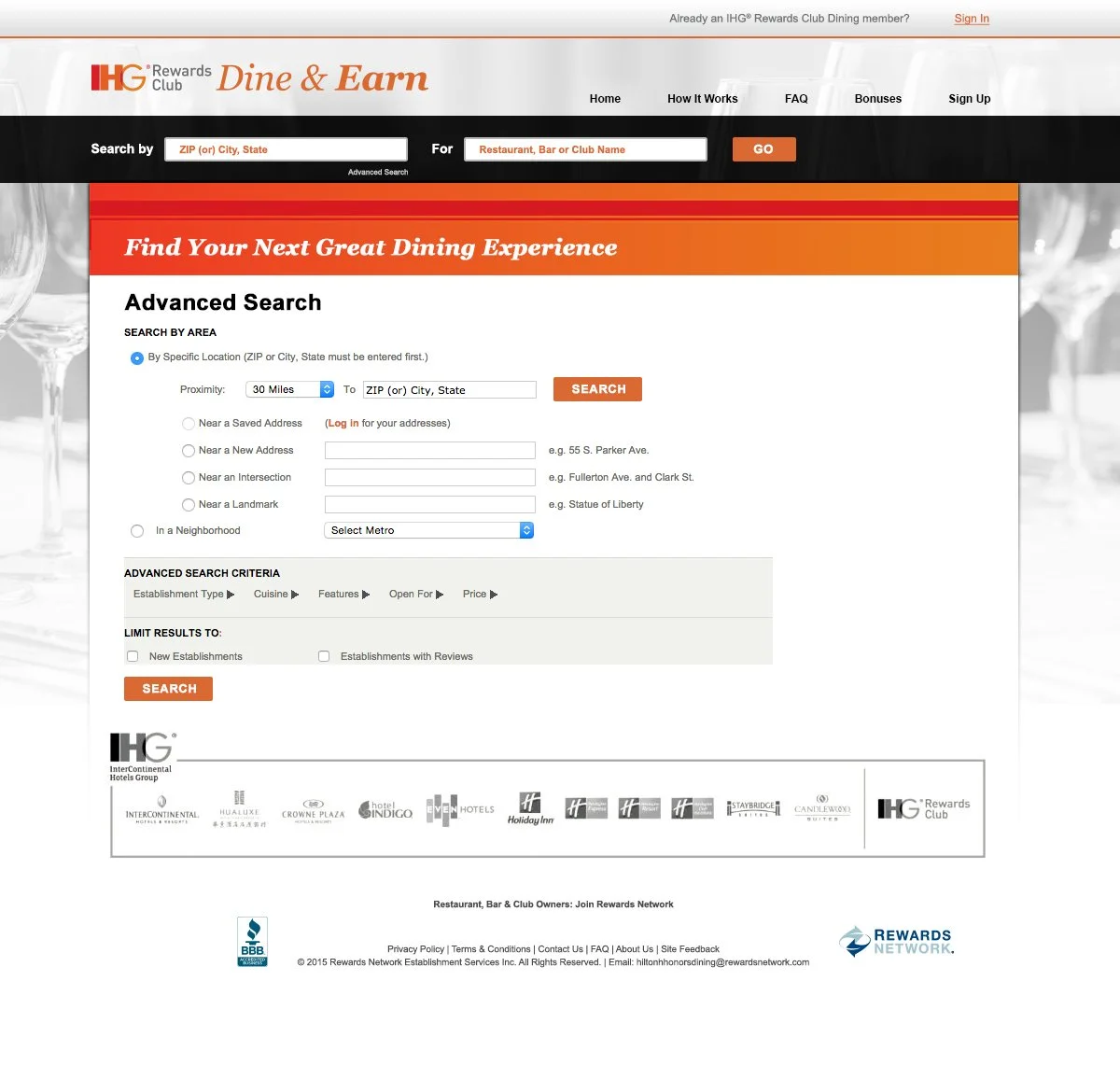
Advanced Search
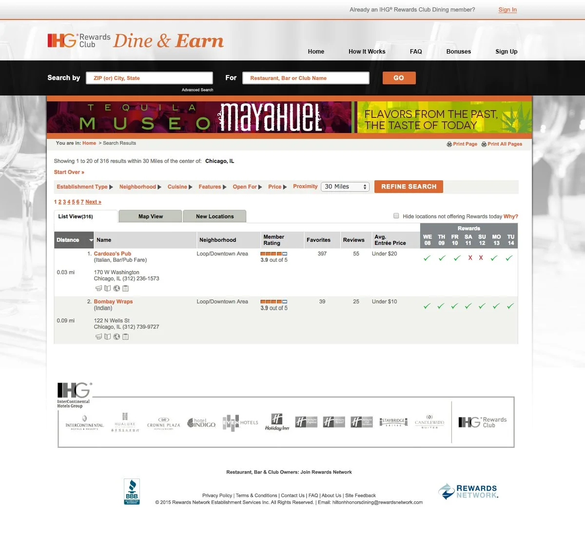
Search Results
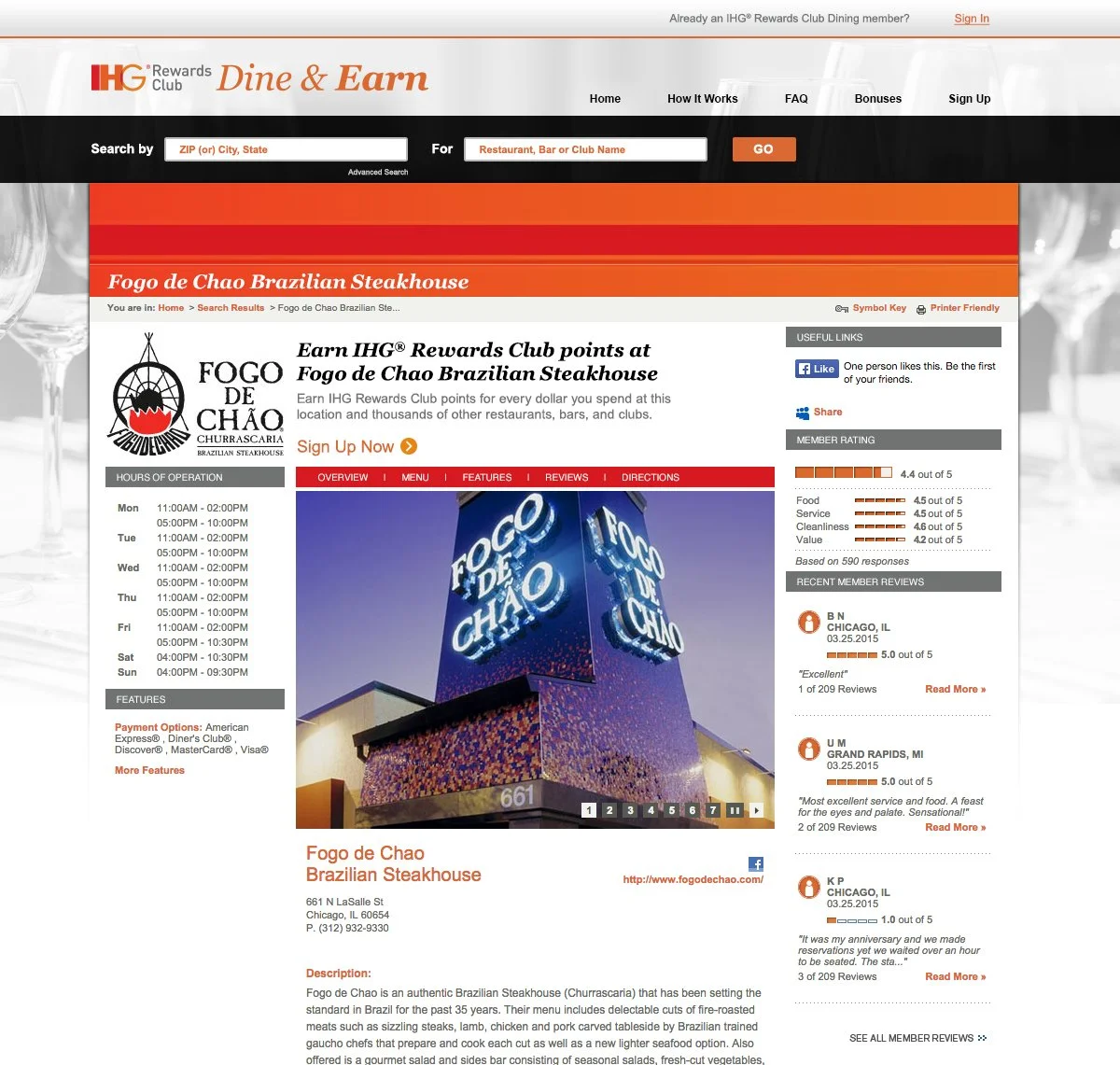
Restaurant Detail Page
Brand Guidelines: Orbitz Rewards
Orbitz Logotype

Typography

Color Palette

Orbitz Rewards Dining

Homepage (Logged Out)
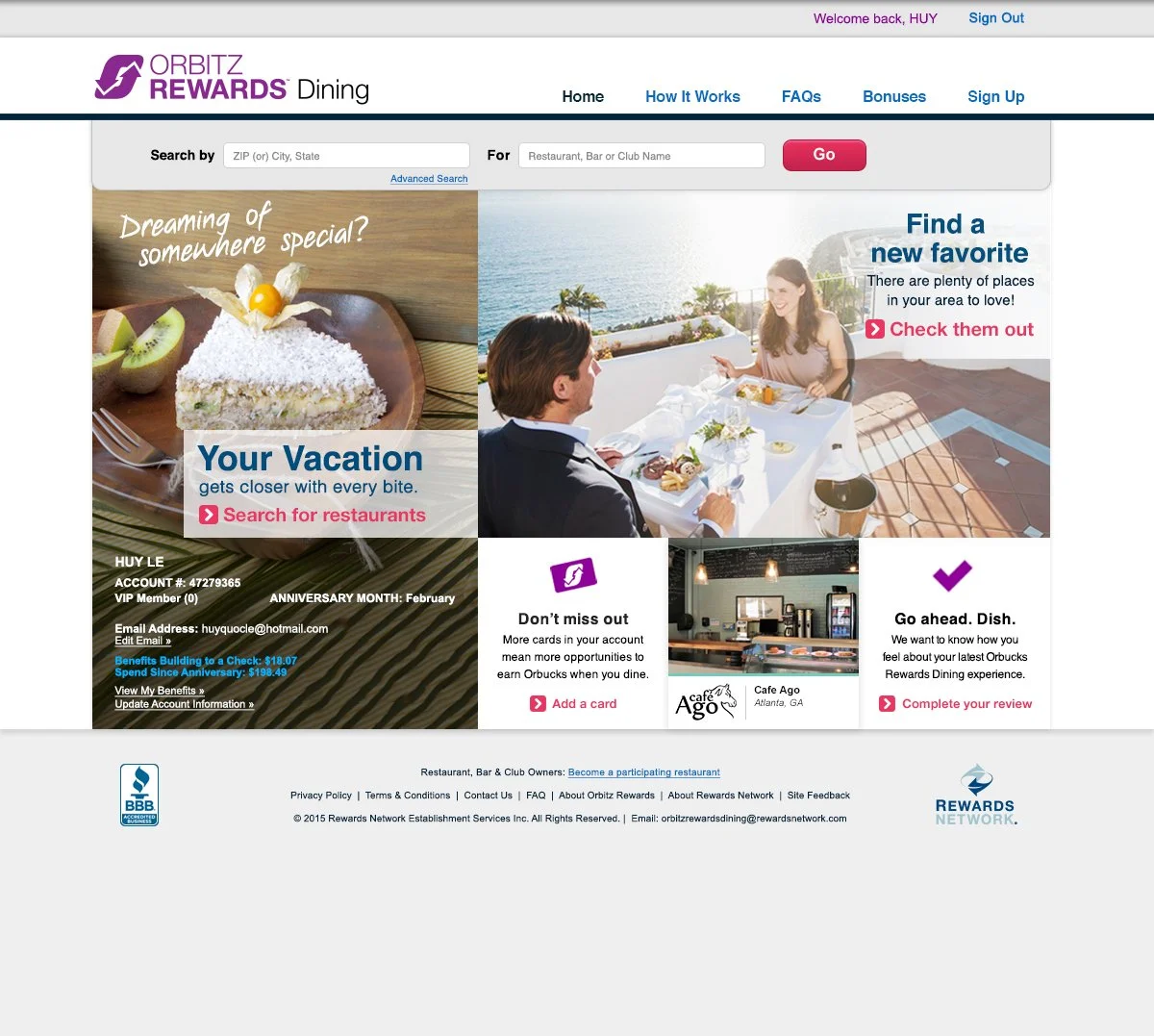
Homepage (Logged In)
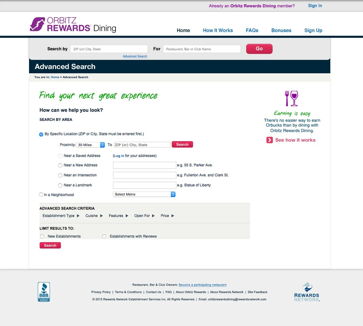
Advanced Search
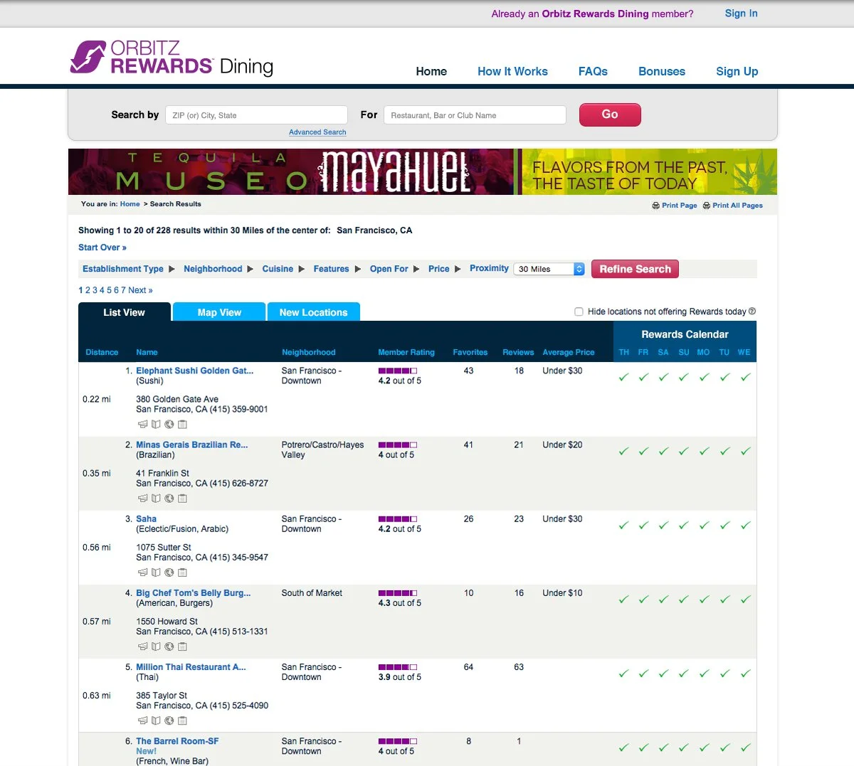
Search Results
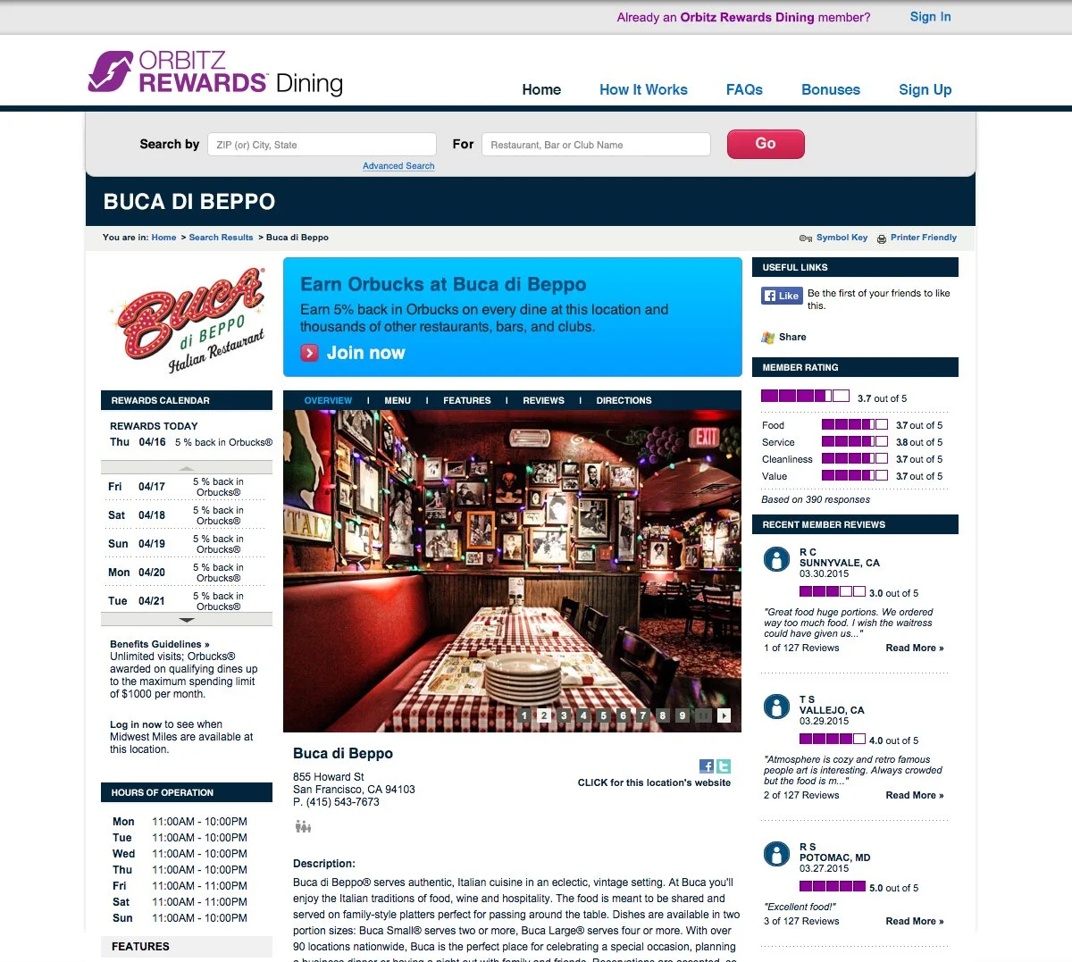
Restaurant Detail Page
Business Impact
Unified Multi-Brand Partner Portals
Modernized legacy partner portals across Hilton, IHG, Orbitz, and other brands while aligning each experience with enterprise-level brand standards.
Established visual and UX cohesion across the rewards ecosystem, strengthening credibility and consistency at scale.
Strengthened Brand Alignment and User Trust
Balanced strict partner brand guidelines with improved usability, clarity, and modern interface standards.
Reinforced trust and legitimacy across platforms by elevating visual quality and reducing friction in the member experience.
Created a Scalable Portal Framework
Standardized core layout systems and interaction patterns to support long-term partner growth and easier future updates.
Enabled more efficient onboarding of new partners while maintaining cohesive UX architecture across the ecosystem.