Building a Connected DTC Campaign From Brief to Handoff
My Role Creative Director • Campaign Strategy • Art Direction • Copywriting • Email Design • Landing Page Design • Paid Social Design
Project Breakdown:
Overview
Translating Strategy Into a Creative System Built to Scale
CREATIVE DIRECTION
DTC
CAMPAIGN STRATEGY
ART DIRECTION
CONCEPT DEVELOPMENT
META ADS
EMAIL DESIGN
LANDING PAGE DESIGN
COPYWRITING
BrightCircle brought me in to help elevate creative for Louisville Jerky Co. It started as a trial run. The scope felt straightforward enough: five Meta ad concepts, a four-part email series, and one landing page. All built around one campaign idea, “Vegan Jerky, Nailed.”
Then came the brief. They called it the “mega brief.” They weren’t kidding. Audience research. Consumer behaviors. Seven core objections. Proof points. Messaging priorities. Brand guardrails. And detailed direction for every deliverable. There was a lot to unpack before I ever opened a design file.
It was a lot. But also… I kind of love this stuff.
So I dug in. I studied the brand, the website, and the ads already running. I signed up for email and SMS. I looked at how Louisville Jerky Co. showed up across every touchpoint. Then I started pulling the brief apart. Finding the strongest ideas. Grouping them. Looking for ways to expand the campaign without losing the strategy behind it.
What started as a one-week trial quickly grew into an ongoing creative partnership. The work expanded beyond executing a single campaign. It became an opportunity to help shape the creative month after month. Building the foundation first. Then learning, adapting, and pushing it further.
The Challenge
The challenge wasn’t finding direction. There was plenty of it. The challenge was figuring out what mattered most. Then turning all of that information into creative people could understand in seconds.
For July, I started wide. Really wide. I only needed five Meta concepts, but I explored around 17. I grouped them by strategy, looked for overlap, killed the weaker ideas, and kept narrowing. Then I carried that thinking into email and landing page. Different touchpoints. Different jobs. One connected campaign.
But the work also needed to move beyond me. BrightCircle’s overseas team would use these concepts to execute, version, and expand the creative. So I documented everything. Objectives. Why it works. Creative direction. Designer notes. Design files. The Figma presentation needed to make sense whether I was there to explain it or not.
And as the partnership continued, the challenge evolved. Each new campaign meant learning the brand a little deeper. Responding to feedback. Giving clearer direction. Knowing when to push an idea and when to let it go. The goal wasn’t to repeat what worked in July. It was to build on it.
Getting Up to Speed
Building My Own Playbook Before I Started Designing
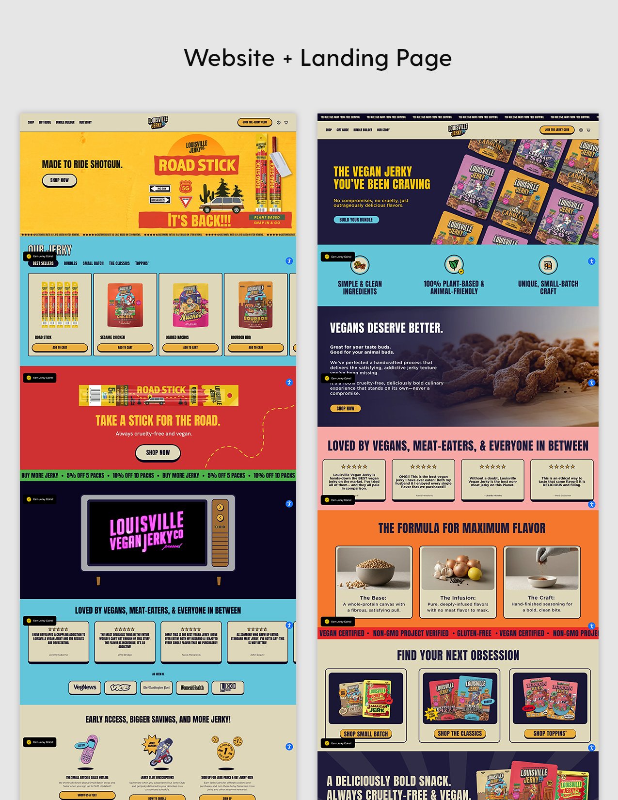
Before jumping into concepts, I needed to understand how Louisville Jerky Co. already showed up in the world. The brief gave me the strategy. Now I needed to see the brand in action.
So I went digging. I studied the website and active Meta ads. I signed up for email and SMS flows to see what landed in my inbox. I reviewed past landing pages, existing creative, brand guidelines, and the visual details that made Louisville Jerky Co. feel like Louisville Jerky Co.
I wasn’t looking to copy what already existed. I was looking for patterns. What felt consistent? What could be pushed? Where were the opportunities? And just as important, what shouldn’t I mess with?
Basically, I was building myself a cheat sheet.
That little playbook became my reference point as I moved into concepts. It helped me make faster decisions, stay grounded in the brand, and start pushing the creative without losing what made it recognizable.
Casting the Net
Exploring More Ideas Than the Brief Asked For
With the research behind me, it was time to start pulling ideas out of the brief. I needed five Meta concepts. I brainstormed 17.
I cast a wide net on purpose. Some ideas came directly from the FUD map and consumer insights. Others came from patterns I found during research. I started writing, grouping, and looking for different ways into the same campaign. Flavor. Texture. Trust. Protein. Belonging. Each concept needed its own reason to exist.
Then came the editing. Some ideas overlapped. Some felt too expected. Others sounded good on paper but weren’t strong enough once I started pushing them visually. So I cut. Combined. Refined. And kept asking the same question: Are we actually saying something different here?
For me, thinking bigger comes naturally. I’ve always found it more useful to have more to work with rather than less. And I’m no stranger to being asked to reel it in later.
I narrowed the initial set down to seven concepts for the first presentation. From there, feedback helped narrow the campaign even further. Five concepts moved forward, giving us different ways to reach the same audience without losing the thread that connected them.

Meta Ads
Refining Five Concepts Into Final Creative
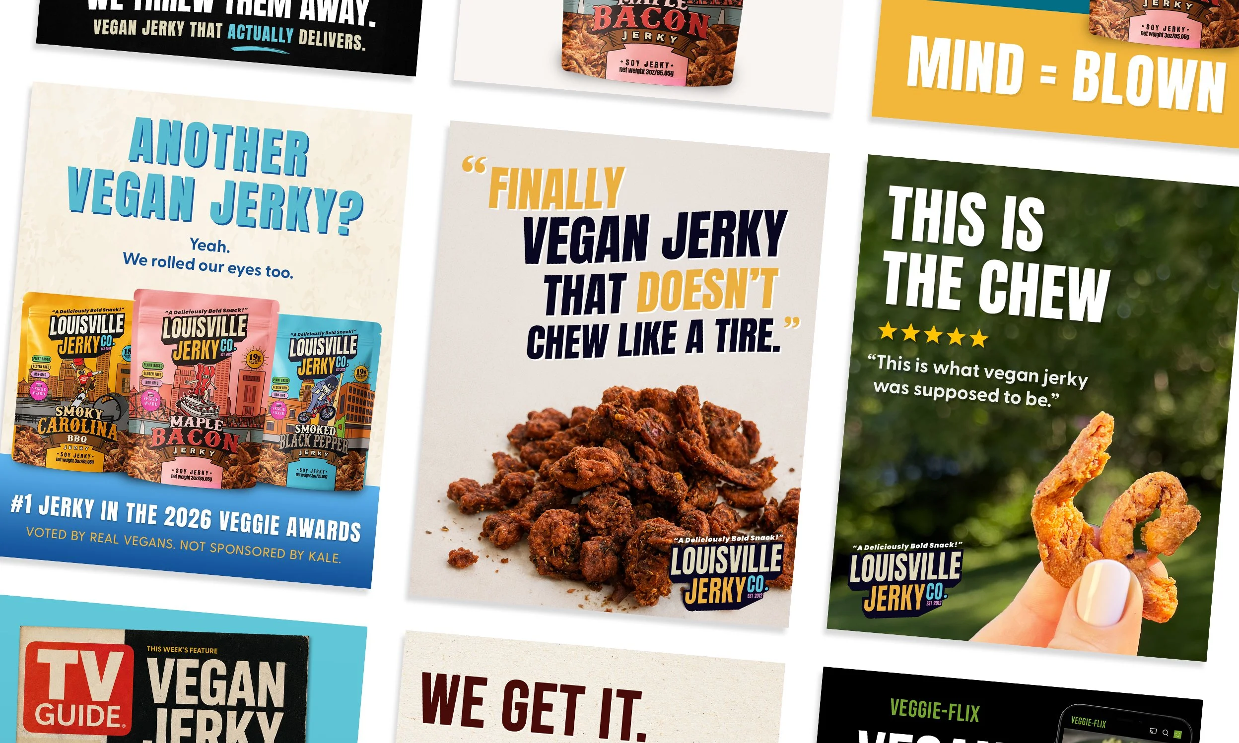
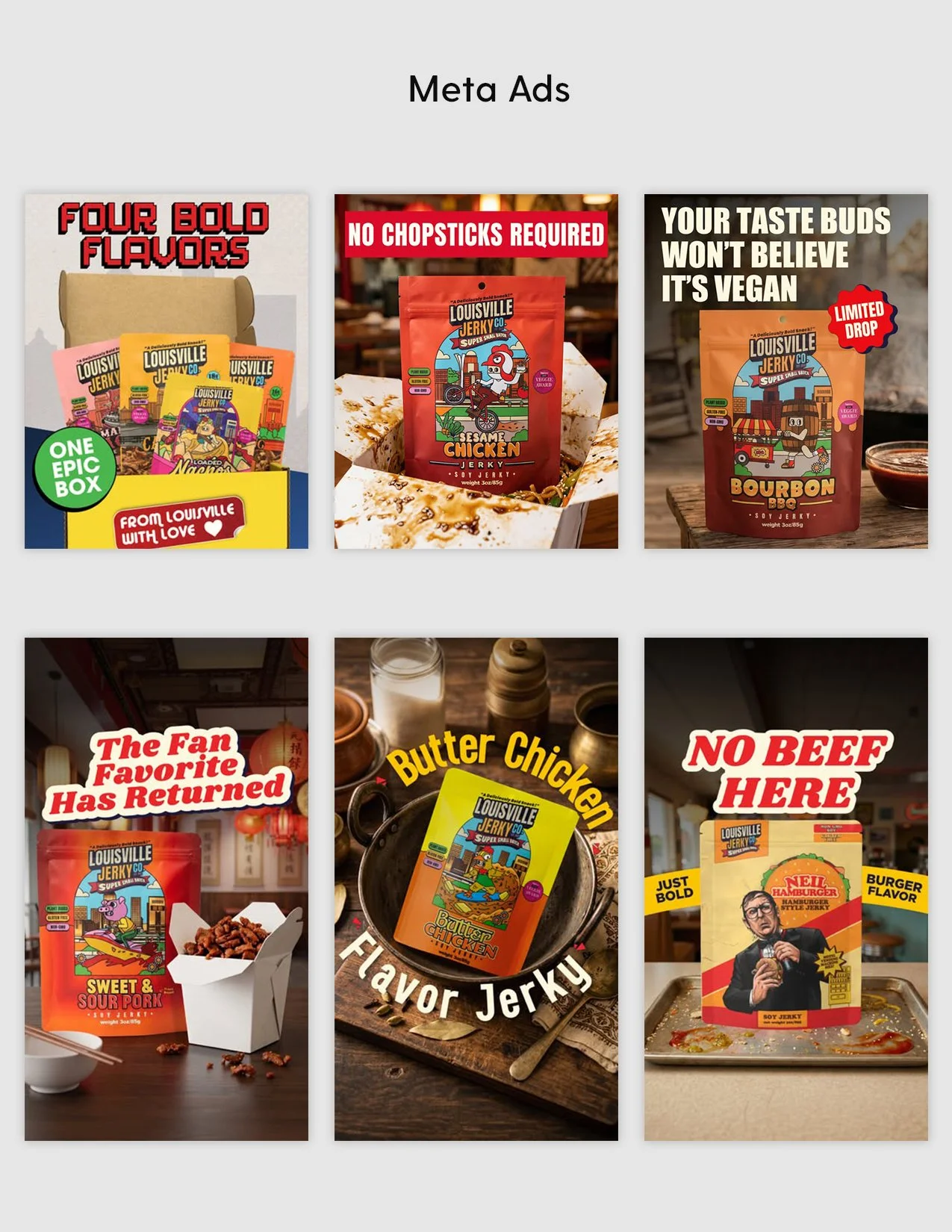
Five concepts moved forward. From there, the focus shifted from exploration to refinement. Some needed small adjustments. Others needed a little more pushing. I went back into the work, tightened the executions, and kept moving each one forward without losing the idea that made it worth pursuing in the first place. The goal was simple. Make each concept feel distinct, while still feeling like part of the same campaign. Different hooks. Different ways into the audience. One connected story.
What you’re seeing here is where those five concepts ultimately landed. Final client creative, shaped by the original strategy and strengthened through review.
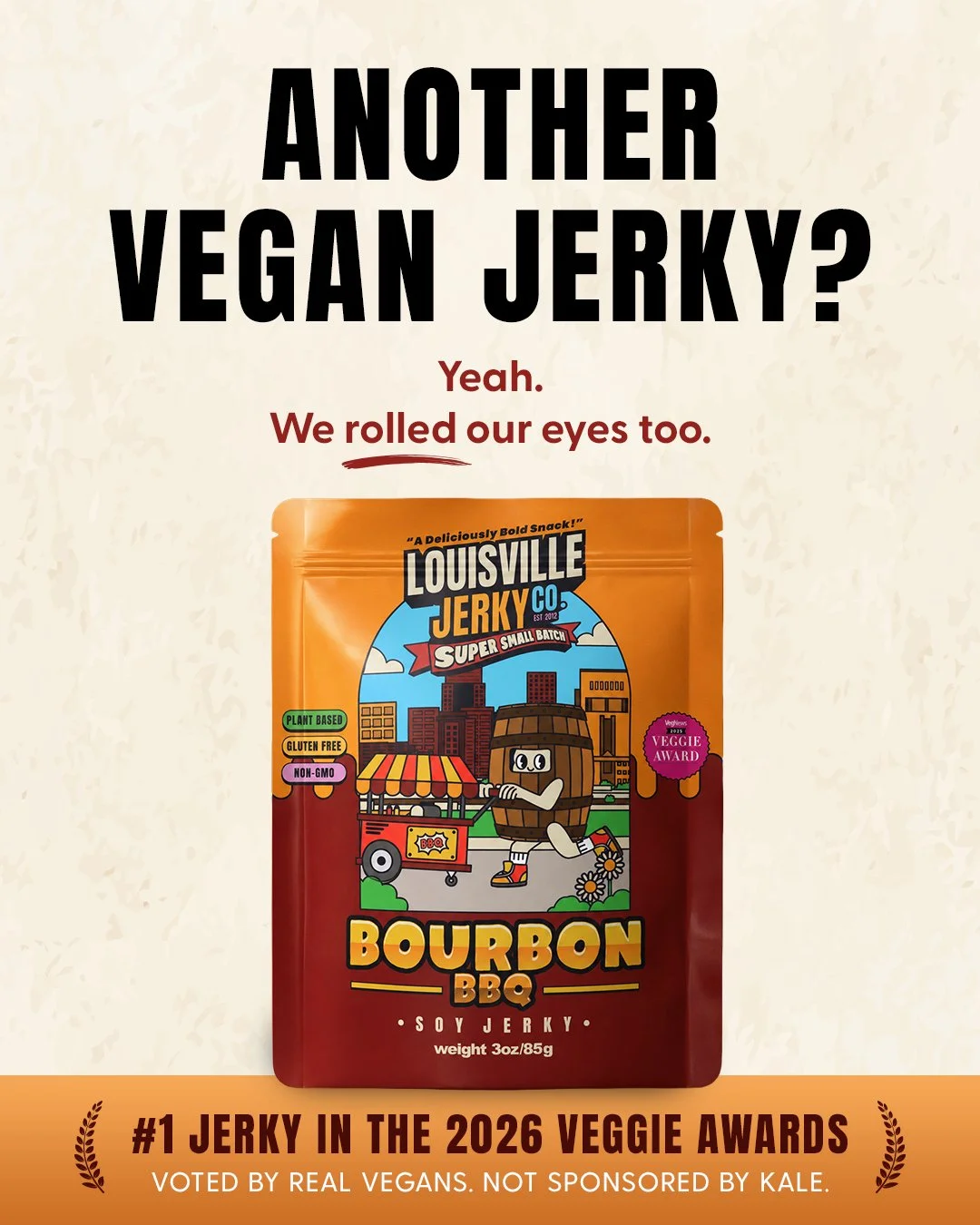
Concept 1: Eye Roll
Insight
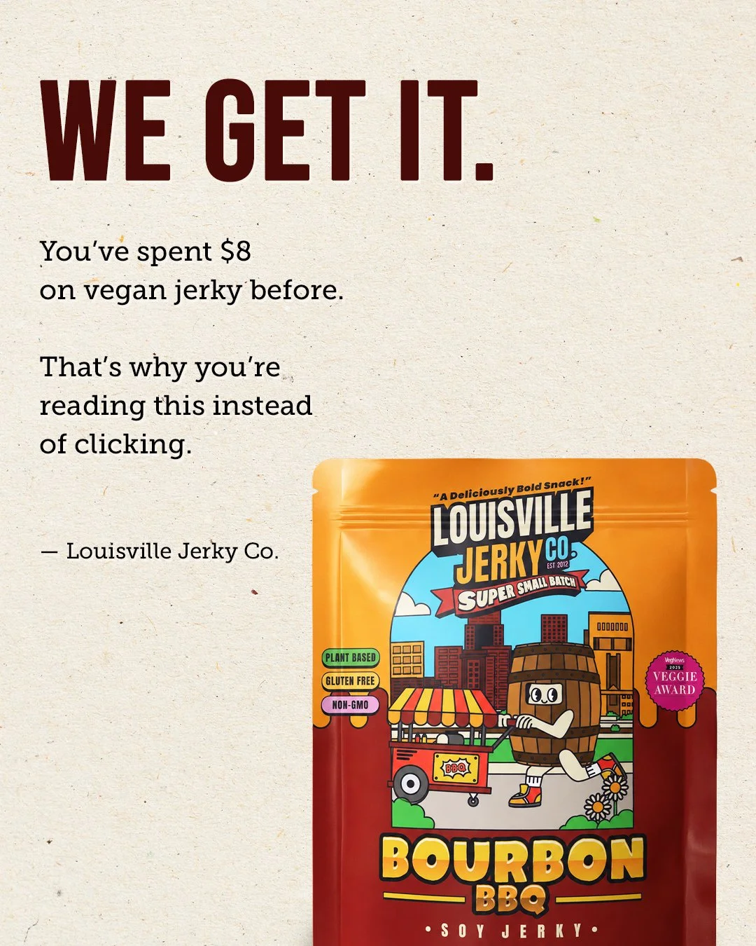
Vegans have tried a lot of disappointing vegan jerky, so a new brand often earns an eye roll before it earns a chance.
Hook
ANOTHER VEGAN JERKY?
Why It Works
Instead of pretending skepticism doesn’t exist, we acknowledge it first. That creates curiosity and credibility before introducing Louisville Jerky Co. The product lineup and award proof reinforce that this isn’t just another vegan jerky brand.
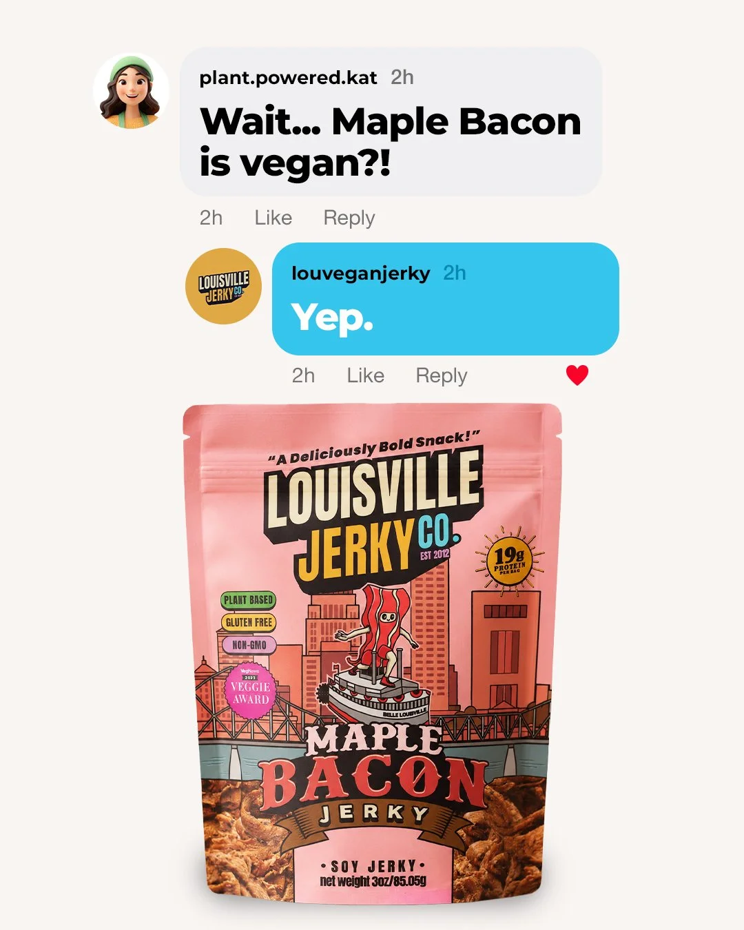
Concept 2: Mind = Blown
Insight
Most people assume flavors like Maple Bacon can’t possibly be vegan. That moment of disbelief is universal—and surprisingly memorable. Instead of explaining the product, we recreate the exact feeling of discovering it for the first time.
Hook
Wait… Maple Bacon is vegan?!
Yep. 🙂
Why It Works
The ad taps into the nostalgia of early internet chat, recreating a conversation that feels like it could have happened on AOL Instant Messenger. The familiar interface sparks curiosity before the product even enters the conversation. By the time the bag appears, the surprise has already landed.
The bold “MIND = BLOWN.” headline becomes the emotional payoff, reinforcing the reaction many consumers have when they realize Maple Bacon is completely plant-based.
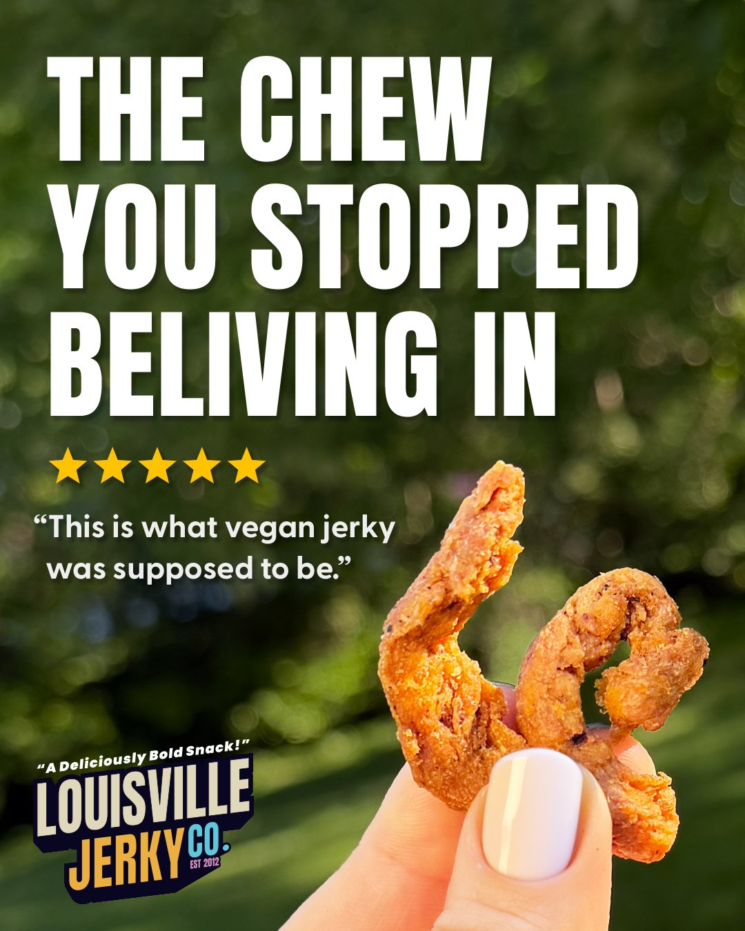
Concept 3: This Is The Chew
Insight
Many vegans have lowered their expectations when it comes to plant-based jerky. After years of disappointing texture, they’ve come to expect flavor claims—but not a satisfying chew. This concept uses the product itself to restore confidence.
Hook
THIS IS THE CHEW
Why It Works
Rather than leading with flavor or nutrition, this concept puts texture front and center. The oversized close-up immediately demonstrates the product’s satisfying chew, while the customer review reinforces what the image already communicates. Together, they validate a common category frustration and position Louisville Jerky Co. as the product that finally delivers.
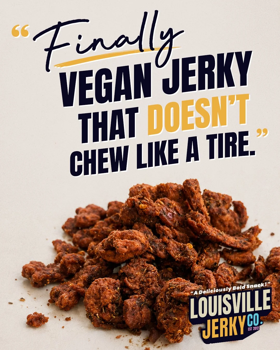
Concept 4: Rubber Isn’t A Flavor
Insight
Many vegans have lowered their expectations when it comes to jerky texture. Tough, rubbery, overly processed jerky has become so common that disappointment is often expected.
Hook
FINALLY VEGAN JERKY THAT DOESN’T CHEW LIKE A TIRE.
Why It Works
Instead of politely talking around a category problem, the ad calls it out directly. The headline uses humor and relatability to acknowledge a frustration many vegans have experienced firsthand. The blunt honesty makes the brand feel more human while creating curiosity around what makes Louisville different.
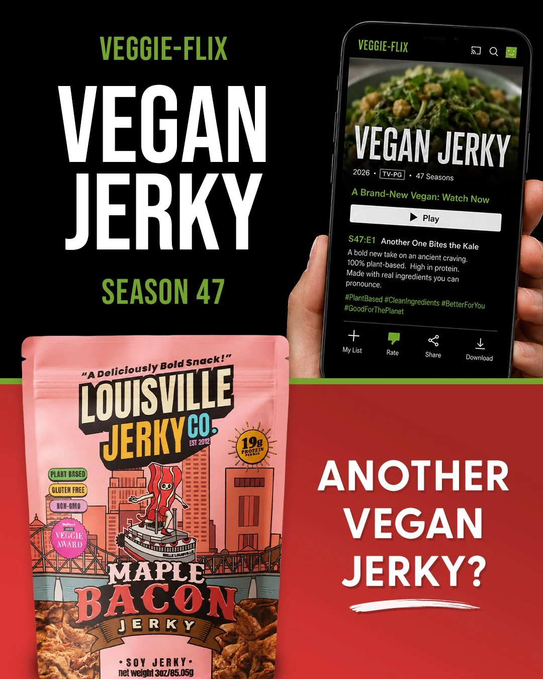
Concept 5: TV Guide
Insight
Louisville Jerky Co. isn’t just another plant-based snack—it’s a brand built around nostalgia. By reimagining the product as the featured attraction on the cover of a classic TV Guide magazine, the ad taps into a familiar cultural icon while positioning vegan jerky as this week’s can’t-miss feature.
Hook
THIS WEEK’S FEATURE
VEGAN JERKY
Why It Works
Instead of feeling like a traditional product advertisement, the creative presents Louisville Jerky Co. as the cover story of a beloved piece of pop culture. The nostalgic TV Guide format invites consumers to slow down and explore the details—from the “Channel Highlights” to “What’s Inside”—making the ad feel collectible, playful, and rewarding to read.
The concept also reinforces the brand’s growing lineup through television-inspired language like “Renewed for Another Season,” turning flavor variety into a memorable visual metaphor.
Initial Presentation Pitch Concepts
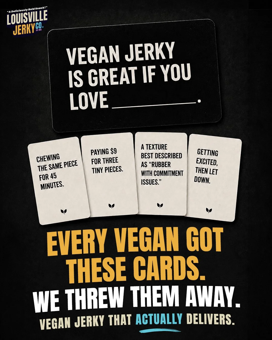
Email Series
Building a Story That Could Unfold One Send at a Time
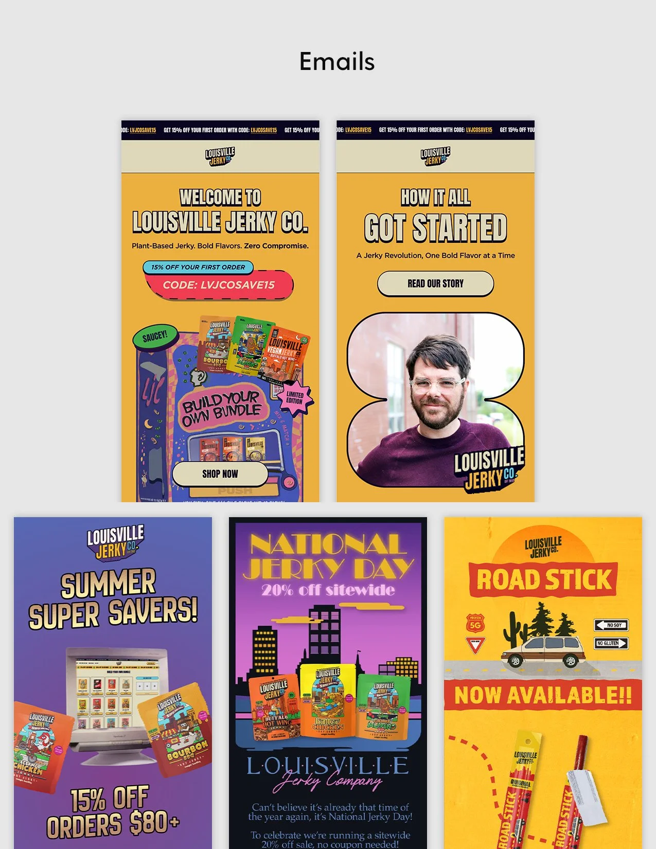
Meta gave us different ways into the campaign. Email gave me more room to tell the story.
Instead of treating the four emails as standalone sends, I wanted them to build on each other. Each one could tackle a different hesitation from the brief. Belonging. Flavor and texture. Trust. Consistency. One email opened the conversation. The next gave you another reason to believe.
I also saw an opportunity to push Louisville Jerky Co.’s illustrated world further. The brand already had its characters, landmarks, and personality. I started connecting those pieces across the series so each email could feel different while still clearly belonging to the same campaign.
The result was a connected series that moved the story forward week after week. Same campaign. Same audience. But a new reason to keep paying attention with every send.
01 — Belonging
02 — Trust
03 — Flavor + Texture
04 — Consistency

Email 01 — Belonging
We Nailed the Vegan Jerky You Actually Want
Its Job
Make vegans feel understood before asking them to believe the product.
Subject Line
For Everyone Who Stopped Trusting Vegan Jerky.
Preview Text
We did too. That’s why we made ours.
The Story
The series starts with empathy. Instead of leading with claims, Email 01 acknowledges the disappointment a lot of vegans already feel toward the category. Louisville Jerky Co. gets it. Because they’ve been there, too.
From there, the email starts earning trust. Real chew. Bold flavor. 100% plant-based. A six-flavor lineup gives people an easy way to explore, while the VegNews award adds outside proof that Louisville isn’t the only one saying the jerky is good.
Visually, this is also where I introduce the illustrated Louisville world that will carry through the series. Bright. Optimistic. A little weird. And proudly vegan.

Email 02 — Trust
Yes, It’s Actually Vegan.
Its Job
Remove the second-guessing and give vegan consumers a reason to trust what’s on the bag.
Subject Line
Yes. It’s Actually Vegan.
Preview Text
Even the Maple Bacon.
The Story
Email 01 opened with empathy. Email 02 follows with reassurance. This one is for the label readers. The people who flip the bag over, scan the ingredients, and make sure “vegan” really means vegan.
So the proof becomes the story. 100% plant-based. Dedicated vegan facility. No cross-contamination. Even flavors like Maple Bacon get put under the microscope, turning something that might raise an eyebrow into another reason to trust the brand.
Visually, the Louisville Jerky Co. world expands from the city into the neighborhood. Badges, labels, and ingredient callouts become part of the environment, giving people proof at every step without losing the personality of the campaign.

Email 03 — Flavor + Texture
This Isn’t That
Its Job
Challenge what people have come to expect from vegan jerky and prove Louisville Jerky Co. can actually deliver on flavor and texture.
Subject Line
You Lowered Your Standards.
Preview Text
We don’t think you should have to.
The Story
By Email 03, it was time to go after the product itself. Rubbery texture. Bland flavor. The kind of disappointments that taught vegan consumers to expect less from the category.
Instead of just saying Louisville Jerky Co. is different, I built the email around contrast. Familiar frustrations get exaggerated, then flipped into proof. Real pull-and-bite texture. Bold flavor. Customer reviews from people who already took the chance.
Visually, the campaign moves into a Louisville Jerky Co. skate park at sunset. More movement. More attitude. More product. The characters come alive while texture shots and reviews do the convincing. Same illustrated world, but with the energy turned up.

Email 04 — Consistency
Never Settle Again
Its Job
Turn the trust built throughout the series into habit by positioning Louisville Jerky Co. as the vegan jerky worth keeping around.
Subject Line
You Found The One.
Preview Text
Don’t go back to settling.
The Story
The first three emails did the convincing. Email 04 looks at what happens next. You found the flavor. You trust what’s in the bag. You know it actually delivers. Now, just keep it stocked.
The story shifts from trial to routine. Favorite flavors become everyday staples, while simple subscription messaging makes consistency and convenience feel like the natural next step. No hard sell. Just an easier way to keep something you already love within reach.
Visually, the series comes in for a softer landing. Louisville Jerky Co. moves to the waterfront at night. The pace slows down. Product and routine take over. It’s a calmer close to the campaign that leaves you with the same idea we started with: you don’t have to settle anymore.
Landing Page
Bringing the Entire Campaign Together in One Conversion Journey
The landing page was the final piece of the campaign. By this point, I knew the audience. I knew the objections. And after building Meta and email, I knew exactly what questions the page needed to answer.
So I worked backward from four of them: Is it actually good? Is it really vegan? Why Louisville Jerky Co.? And where do I start? The goal was to answer each one as someone moved down the page, building confidence along the way.
Rather than reinventing the existing experience, I focused on making it work harder. Category comparison addressed the skepticism. Awards and reviews brought in outside proof. Vegan standards and product education built trust. Fan favorites made choosing a flavor easier. Then multiple purchase paths gave people a clear next step when they were ready.
And honestly, this was the fun part for me. I had all the pieces. Now I just needed to connect them.
The final wireframe became the campaign’s conversion roadmap. One page that brought the story, proof, education, and product together, then carried someone from “Vegan jerky, really?” to “Okay, where do I start?”
High-Fidelity Landing Page Wireframe
Ready for Handoff
Building the Files So the Work Could Keep Moving
Finishing the creative was one thing. Handing it off so someone else could actually run with it was another.
So I built the Figma boards with that in mind. Every deliverable had an objective. Why it worked. Creative direction. Designer notes. Copy. Working files. Everything the team needed was right there.
I kept thinking while building these boards: Damn! I wish someone had handed me something like this when I was the designer.
I organized everything so the thinking was easy to follow. What mattered. What could flex. And what needed to stay intact as the work moved into someone else’s hands.
By the end of the week, I wasn’t just handing over finished creative. I was handing over the thinking behind it. Ready for someone else to pick up and keep moving.
July 2026 — Meta Ad Concepts
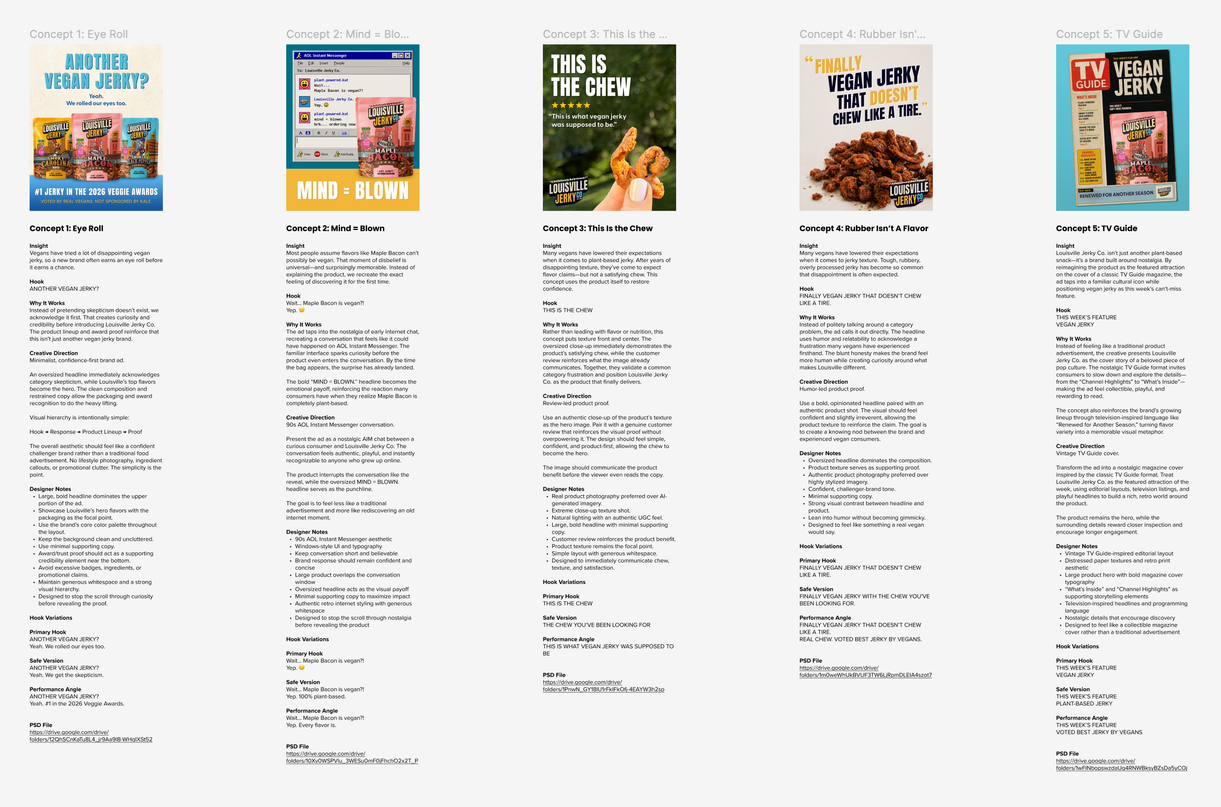
Each concept was packaged with its insight, strategic rationale, creative direction, designer notes, copy, and working files.
July 2026 — Email Concepts
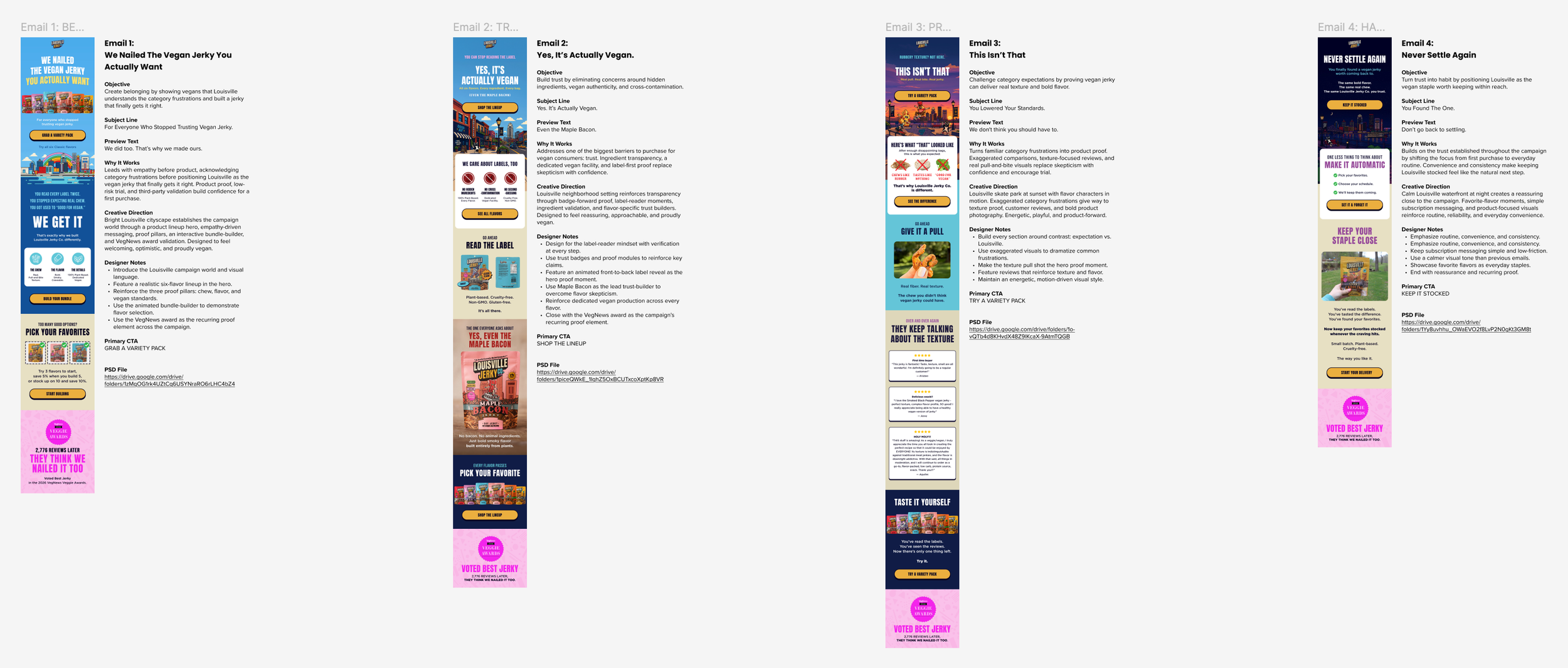
Each concept was packaged with its objective, subject line + preview text, strategic rationale, creative direction, designer notes, and working files.
July 2026 — Landing Page Wireframe
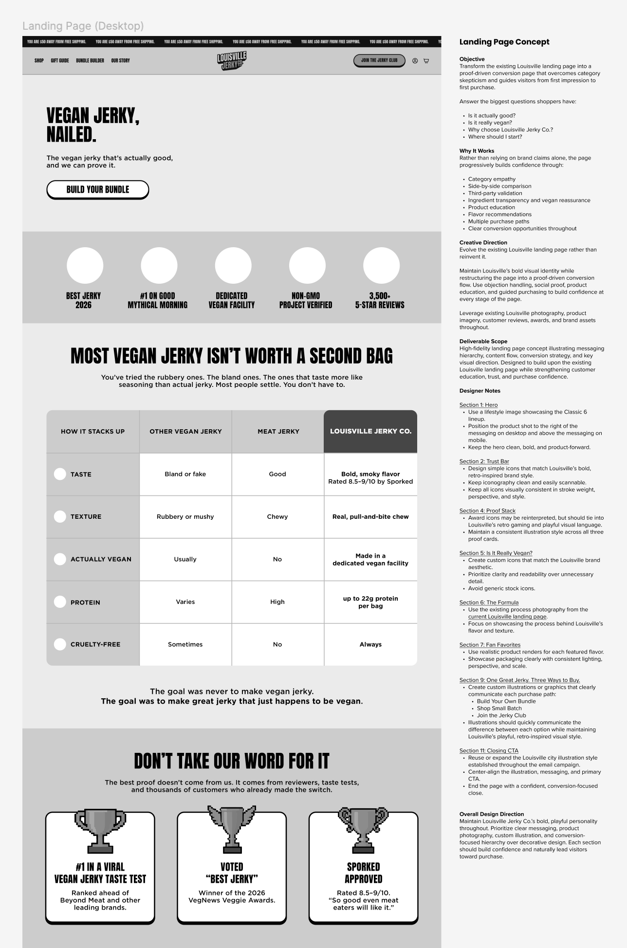
The landing page wireframe was packaged with its objective, strategic rationale, creative direction, deliverable scope, section-by-section designer notes, and working files.
Seeing the Work Deliver Results
For an initial trial, my goal was pretty simple. Build strong creative. Give every concept a reason to exist. And create a system BrightCircle and Louisville Jerky Co. could keep building from.
Then the work started going live.
And we started seeing signs that the thinking was working. A Meta concept from the campaign emerged as a strong performer. One of the emails did too. Different channels. Different jobs. Same campaign strategy behind them.
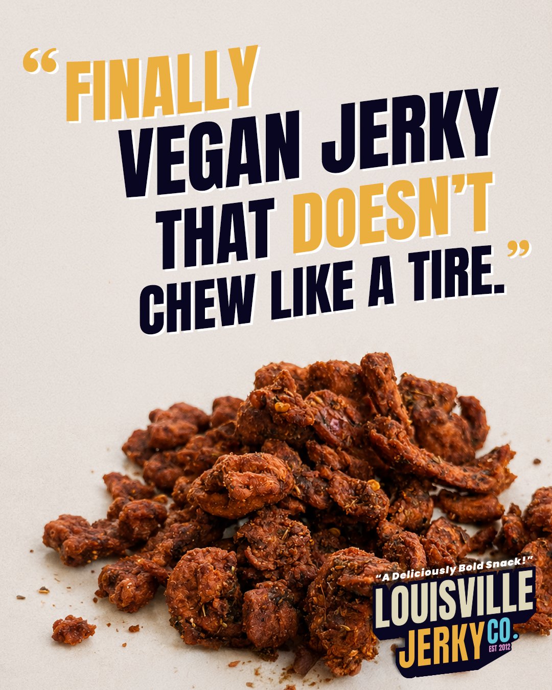
Meta Ad — Rubber Isn’t A Flavor
A New Top Performer
The idea was simple: call out one of the biggest frustrations with vegan jerky and have a little fun with it.
It worked.
The creative was called out as one of the brand’s new top-performing ads, with the witty take on the competition specifically noted as something that resonated with customers.
Give me a weird food shot and an inside joke and I’m pretty happy. There’s just something about making someone think, “Wait… what am I looking at?” And if you’ve ever eaten rubbery vegan jerky, you already get the joke.
Email 04 — Consistency
$3,278.99 Revenue
56 Orders
72.22% Open Rate
The final email shifted the campaign from trial to routine. No huge promotion. No heavy discount. Just a simple reason to keep Louisville stocked.
It delivered $3,278.99 in revenue across 56 orders and hit a 72.22% open rate. The strongest engagement of the campaign.
I remember seeing “Subscribe & Save” in the mega brief and immediately thinking, this is cringe. It just sounded so transactional. So I kept asking myself: How would I sell the idea of subscribing without actually saying “Subscribe & Save”?
I’ve always found confidence in a brand way more attractive. It made me think of that very millennial phrase we’ve all heard a million times: “don’t be basic.” So I kind of ran with that attitude. You found the one. You know it’s good. Why go back? Never settle again.
The results were exciting. But the bigger win for me was what happened next. What started as a one-week trial didn’t end after the handoff. BrightCircle asked me to keep going.
My role continued to grow. More campaigns. More creative direction. More opportunities to work with the team and keep learning the Louisville Jerky Co. brand.
I went into that first week wanting to prove I could do the job. And then getting asked to stick around? I felt pretty damn good.
What started as a trial became an ongoing creative partnership. And for me, July was just the beginning.