hello eleni.
Thank you again for taking the time to share your story and the vision behind BRYTR DAYS. Hearing how the product was born from real burnout and the need for restoration made the mission feel especially meaningful and timely.
I put this page together to share my honest thoughts on where the brand and website are today, how we could work together, and how I can contribute from a UI/UX and digital experience standpoint to help get BRYTR DAYS to a strong, confident MVP and post-MVP. I truly believe in the story behind BRYTR DAYS and the opportunity to translate that purpose into a clear, intuitive, and emotionally resonant digital experience.
Brand Overview
Naked Nutrition
Naked Nutrition is built on the belief that better nutrition starts with honesty, simplicity, and ingredients you can trust. In an industry crowded with fillers, flavorings, and exaggerated claims, the brand takes a deliberately stripped-down approach—creating performance and wellness supplements with minimal, thoughtfully sourced ingredients and full transparency into what goes into every product. Founded to serve athletes and health-conscious consumers alike, Naked Nutrition focuses on supporting real goals like strength, recovery, gut health, and weight management through clear formulations and consistent standards. By pairing clean products with a straightforward, educational voice, the brand establishes a scalable foundation rooted in trust—one that prioritizes clarity, long-term credibility, and a cohesive experience across every touchpoint.
Current Website
Homepage
Site Header
Search Bar
Account Login
Cart
Navigation
Shop
Ingredients
Science
Logo
FAQ
About Us
Journal
Hero
Image: Product (Bag) + Glass of Water + Powder
Headline
CTA: Try Now
Benefits
Information Block
Claims (Scrolling Bar)
Science / Ingredients
Infographic
Shop (PDP module)
Testimonials
Email Capture
Value Propositions
Footer
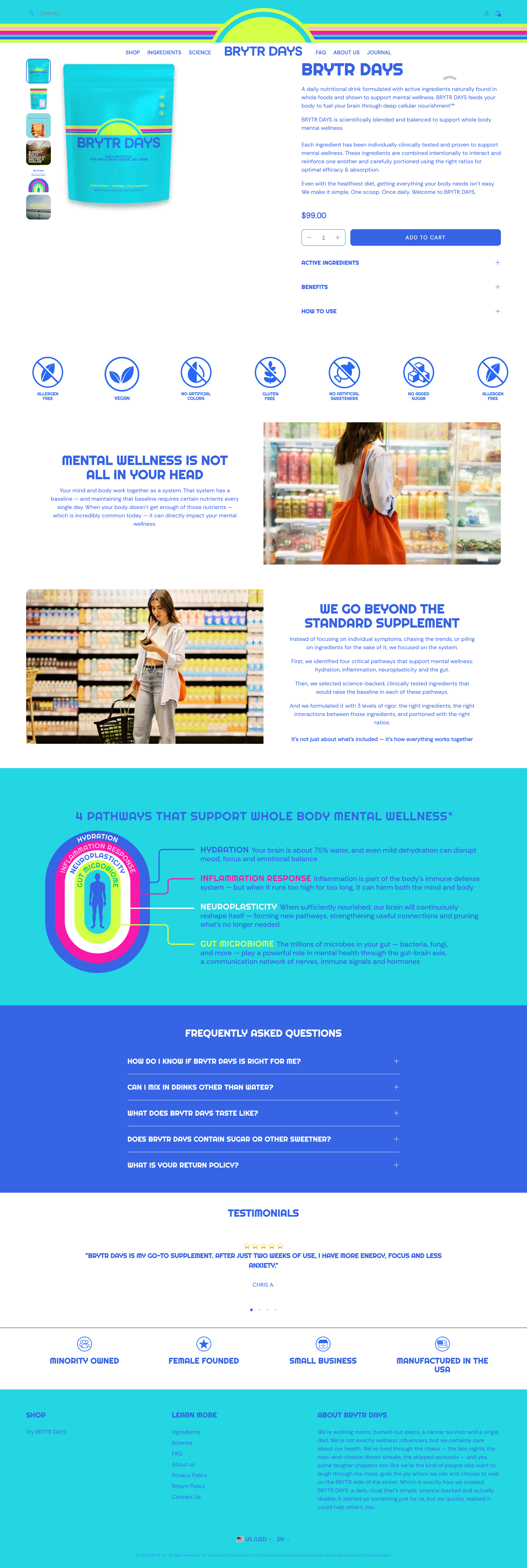
Product Detail Page
Hero
Listing Images
Product Rendering (Front)
Product Rendering (Back)
Product in use (drink)
Problem → Solution
Infographic
Claims
Product Name
Description
Pricing
CTA: Add to Cart
Additional Product Info
Active Ingredients
Benefits
How to Use
Claims
Information Block 1
Information Block 2
Infographic
FAQ
Testimonials
Value Propositions
Footer
Ingredients Page
Hero
Product Rendering (Front)
Science-Backed Framework Description
FDA Exclusionary Messaging
Ingredients (x 18)
Claims
FAQ Redirect
Infographic
Shop (PDP Module)
Testimonials
Footer
Science Page
Hero: “Formulated for How Your Body Works”
“Burnout Doesn’t Happen Overnight” Section
“Feed Your Body to Fuel Your Mind” Section
“Your New Daily Ritual” Section
Infographic
“Intentionally Designed” Section
“The Right Ingredients” Section
“The Right Interactions” Section
“The Right Ratios” Section
Shop (PDP Module)
Citations
Footer
Frequently Asked Questions Page
FDA Exclusionary Messaging
Questions + Answers
Contact Form
Shop (PDP Module)
Footer
About Us Page
Image Collage
Introduction
Product
Origin Story
Team
Team Personal Bio
Contact Form
Shop (PDP Module)
Footer
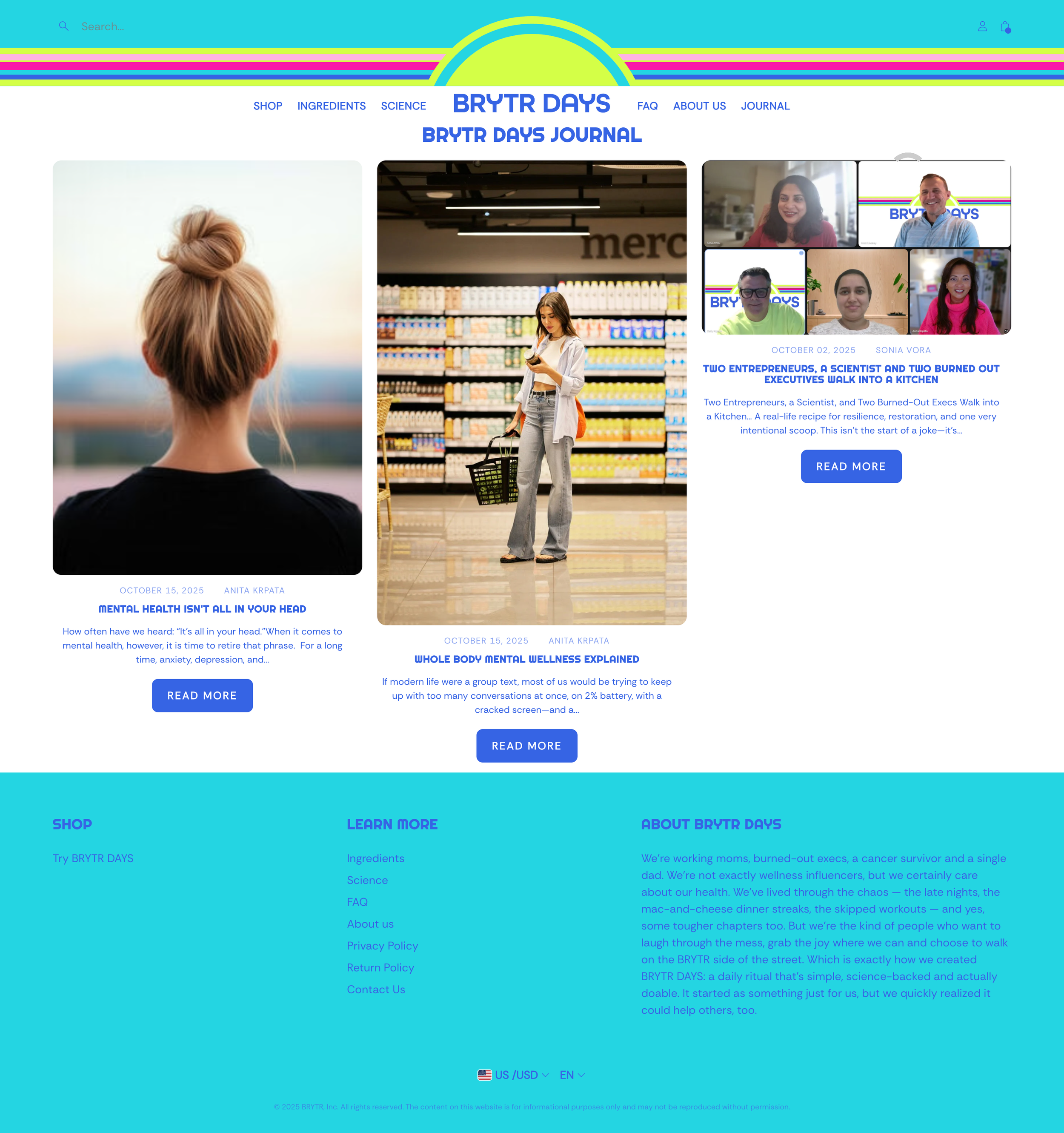
Journal (Blog)
Thumbnail
Title
Description
CTA: Read More
Website Audit Summary
Goal: Confident MVP launch that clearly communicates purpose, trust, and usability
Brand Clarity & First Impression
(Above the Fold)
Current Observation:
The brand identity is vibrant and optimistic, but the core value proposition requires more immediate clarity. Visitors may not instantly understand what the product is, who it’s for, and why it exists within the first few seconds.
Do I immediately understand what the product is?
Is the core benefit clear without scrolling?
Does the language speak to mental wellness + restoration, not just nutrition?
Is the brand tone calm, confident, and human?
MVP Opportunity:
Refine the hero message to introduce BRYTR DAYS as a daily mental wellness drink focused on restoration rather than stimulation. Pair this with a supporting subheadline that speaks to intentional simplicity, highlighting that one scoop of BRYTR DAYS brings together 19 thoughtfully chosen ingredients to support whole body mental wellness.
Example hero copy:
Pre-headline: Thoughtfully formulated for daily mental wellness
Headline: The Daily Mental Wellness Drink
Sub-headline: One scoop of BRYTR DAYS delivers 19 ingredients formulated to support whole body mental wellness—bringing together calm support, clarity, and daily balance.
CTA 1: Try BRYTR DAYS <links to PDP>
CTA 2 (Optional): See the Science <links to Science page>
Storytelling & Origin
Current Observation:
The brand story exists but feels secondary to product information. The emotional “why” behind BRYTR DAYS could be surfaced more intentionally.
Is the origin story present and easy to find?
Does the site explain why this product exists, not just what it is?
Is burnout → restoration clearly communicated?
Does the brand feel human or transactional?
Post-MVP Opportunity:
Surface the origin story earlier on the homepage to quickly connect the problem (burnout), the solution (restoration), and the habit (a daily ritual). By condensing key moments from “Two Entrepreneurs, a Scientist, and Two Burned-Out Executives Walk Into a Kitchen” into a short, scannable section, the story can strengthen both credibility and emotional connection without overwhelming the user.
The goal of this section is to humanize the brand by introducing who is behind BRYTR DAYS, reinforce why the product exists, and invite deeper exploration for those who want it—without forcing a long read.
I’d recommend placing this section immediately after the hero and before deep product education. This ensures visitors emotionally understand why BRYTR DAYS exists before being asked to engage with ingredients or science, creating a more natural and compelling flow into the rest of the page.
Here is an example:
Headline: When Burnout Became the Signal to Build Something Better
Sub-headline: BRYTR DAYS was created by people who felt the effects of burnout firsthand—and wanted a daily way to restore balance, not push harder.
Card 1 — The Problem
Headline: Burnout Was the Common Thread
Copy: Long days, constant pressure, and no real reset. The people behind BRYTR DAYS knew something had to change.
Card 2 — The Shift
Headline: Restoration Over Stimulation
Copy: Instead of another energy boost or quick fix, the idea was simple: support the mind and body gently, every day.
Card 3 — The Build
Headline: Built With Science and Intention
Copy: Entrepreneurs and burned-out executives partnered with a scientist to thoughtfully formulate a daily mental wellness drink.
Card 4 — The Habit
Headline: A Daily Ritual
Copy: One scoop. One glass of water. A small, consistent act of care designed to fit into real life.
Copy: Formulated by a team of entrepreneurs and scientists with experience in wellness, nutrition, and real-world burnout.
CTA: Read the Full Story
Product Understanding
Current Observation:
The product benefits are present, but may require too much interpretation from the user. The concept of “whole body mental wellness” could be simplified.
Is it clear how it works?
Do I know what’s inside and why it matters?
Is “whole body mental wellness” explained in plain language?
Are benefits scannable?
Post-MVP Opportunity:
Explain how the product works in clear, benefit-first language, with science as support. Add simple ingredient callouts, use icons over dense text, and avoid scientific overwhelm.
UX Flow & Structure
Current Observation:
The page includes the right elements but could benefit from a clearer scroll narrative and hierarchy.
Is the scroll experience logical?
Do sections feel intentional or stacked?
Are key sections missing (social proof, reassurance)?
Is the page optimized for mobile first?
Post-MVP Opportunity:
Create a more intentional page flow that guides users from understanding → trust → action. Evaluate section order, reduce scroll fatigue, eliminate redundancies or gaps, and ensure mobile spacing and tap targets are user-friendly.
Trust & Credibility
Current Observation:
Trust signals exist but are understated and not always placed where decision-making happens.
Are certifications or standards clearly surfaced?
Is manufacturing quality explained?
Are FAQs doing real work or just filler?
Is there enough reassurance before asking for purchase?
Post-MVP Opportunity:
Introduce reassurance earlier in the experience to lower friction and build trust. Evaluate opportunities for credibility markers (badges, certifications), assess tone for confidence over defensiveness, clarify sourcing and quality standards, and identify areas to include early real-world proof.
Conversion Readiness
Current Observation:
CTAs are present, but value framing and confidence-building could be strengthened before purchase.
Is there a clear primary CTA?
Do I know what happens after I click “Buy”?
Is pricing and value obvious?
Does the page reduce hesitation or increase it?
Post-MVP Opportunity:
Strengthen the value narrative before conversion asks. Assess CTA clarity, hierarchy, and placement, update CTA color to better contrast with the site, emphasize value over price, and identify moments that may cause decision anxiety.
Current State vs Post-MVP Opportunity
Current State
BRYTR DAYS already has a strong visual identity and a meaningful product concept rooted in real human need. The foundation is there, but the website currently asks visitors to work a bit too hard to fully understand the story, value, and confidence behind the product—especially for first-time visitors unfamiliar with the brand.
Post-MVP Opportunity
The opportunity after MVP is not to add more, but to clarify and refine. By tightening the story, simplifying the user journey, and strengthening trust signals, the website can clearly communicate what BRYTR DAYS stands for and why it deserves a place in someone’s daily routine. The goal is a site that feels calm, credible, and intentional—one that reflects the restorative purpose of the product while supporting early traction and growth.
How I Can Help
My role would be to partner with you to help BRYTR DAYS translate its purpose into a clear, intuitive, and trustworthy digital experience—one that feels calm, intentional, and ready for MVP without overbuilding.
Building on the current site, my focus would be on working together to tighten the story, simplify the user journey, and elevate the overall UX and UI so visitors quickly understand what BRYTR DAYS is, why it exists, and how it fits into their daily routine. This includes clarifying messaging, improving page flow, strengthening trust signals, and ensuring the Shopify experience feels cohesive and conversion-ready across devices.
Rather than introducing large structural changes that could impact launch timing, I’d prioritize high-impact refinements within the existing Shopify setup. Together, we could focus on improving image sizing and presentation within the Product Detail Page modules, refining spacing and hierarchy, and making targeted UX adjustments that add clarity without slowing progress.
After launch, I’d be happy to continue supporting BRYTR DAYS with thoughtful, incremental enhancements—using real-world learnings to evolve the user experience, storytelling, and conversion over time. This approach keeps the MVP focused and efficient, while creating space to grow and improve intentionally beyond launch.


